uHoo Businesses users can only monitor their uHoo Air Monitor Devices using their Desktop. If they are away from the computer they can’t monitor their devices status.

Objectives
Design a mobile app that share similar experience to their web counterpart
Make interaction that will help users access certain features that are essential to monitor uHoo devices
Organize the information architecture from web and make it work on mobile app version
Create a design system that will help the team to add new features independent
1 week
Research
In my first use of their web app, it feels overwhelming because there too many buttons, colors, copy and buttons that is grabbing all my attention. The web dashboard will be the primary source of information to be able to design this product. It was challenging to do because air monitor is unusual in my country therefore to have clarity, I have to do research.
To expand my understanding about it Air Monitor, I created research tasks which involve understanding the product, know how air monitor works, what are the different kind of sensors and impact of Air Monitor to people. Research helped me to empathize with users and be familiar with the vision for this project.
2 weeks
Our primary objective is to turn this into a compact experience and make it more accessible.
We cannot fit all information in a single screen. Using information architecture and user flows, we breakdown the interaction into mobile screens.
When the team identified what user would prioritize to see, we proceed in crafting Lo-Fi wireframes to conceptualize various layouts and interactions.
3 weeks
Although uHoo has been in business for years, they haven’t created an existing design system for mobile apps, therefore our initial goal when proceeding to visual design is to create a design system that the team could use.
Once we are able to set the colors, typography and grid of our design system applied it to the Hi-Fi wireframes create during discovery.
1 week
We submitted the design to stakeholders and gather review. After few revisions we are happy that the stakeholders approved then bring the develop into development.
Our
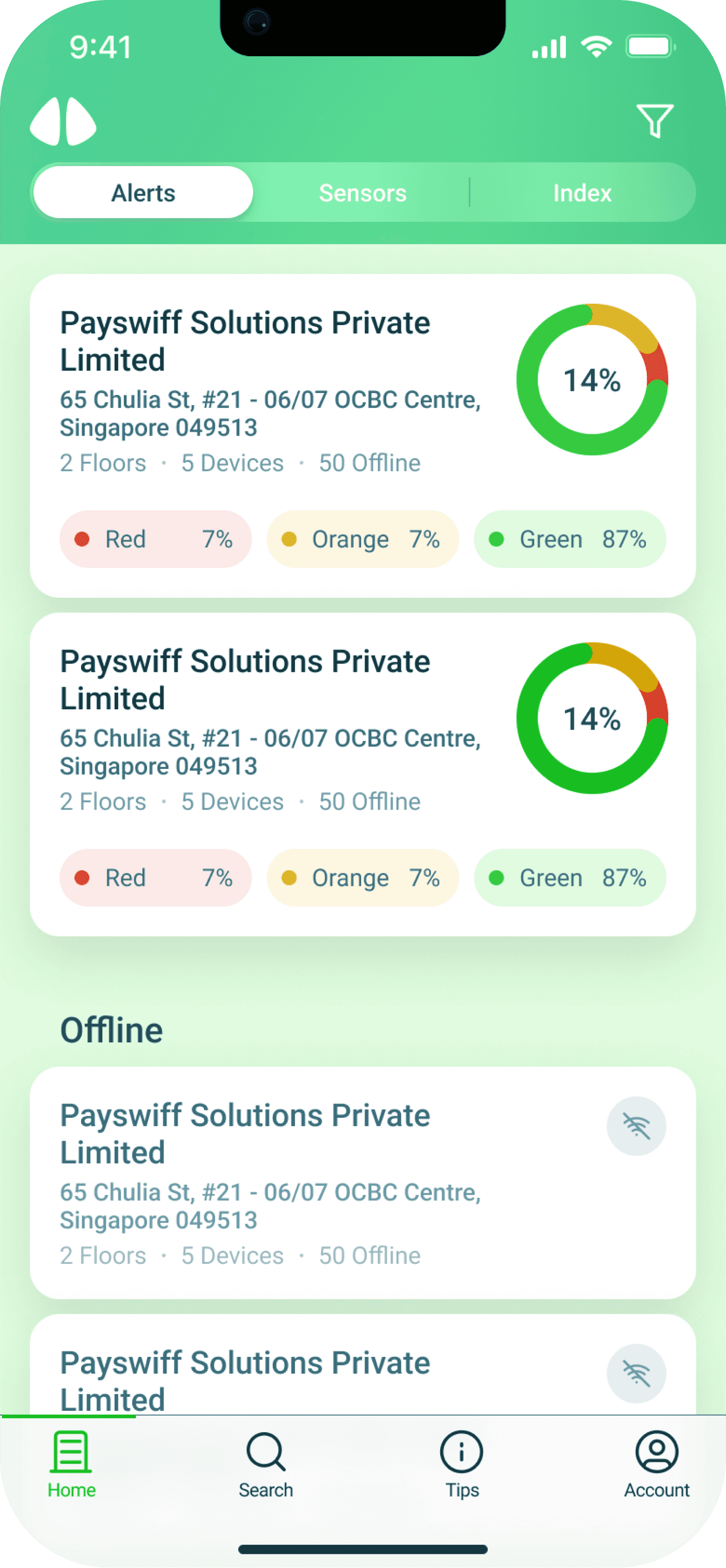
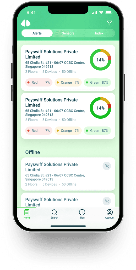
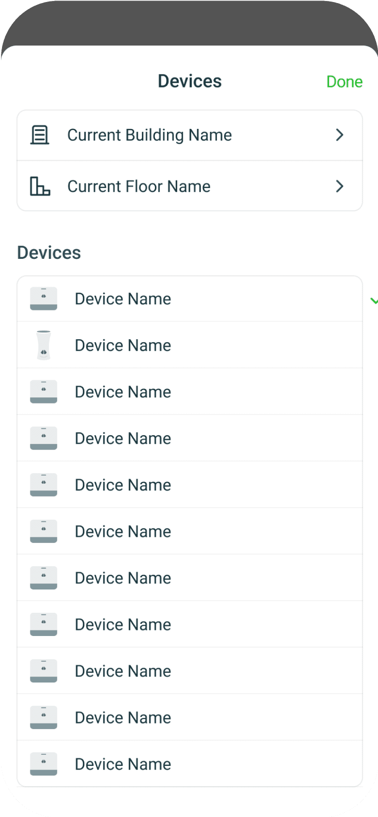
Buildings List
Home-screen is one of the most important screen because it gives user an overview of the current state of each buildings. It is it the portal to access devices and floors. We made sure that it is visually simple and easy read to avoid making user feel overwhelmed when they are on home-screen.
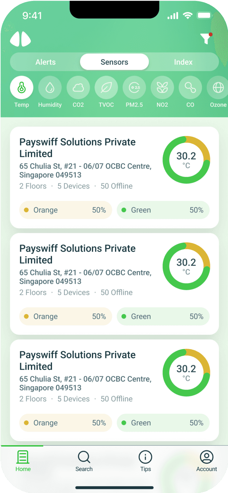
Sensors Tab
There are cases where users needs to focus on devices, we made the devices tab available so they can easily the status of each devices and immediate see if a devices is not working.
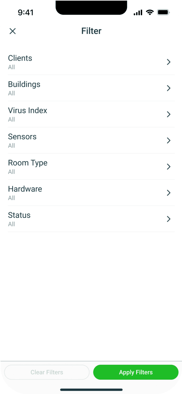
Filter
If user wants to see specific buildings, we made the filter accessible.
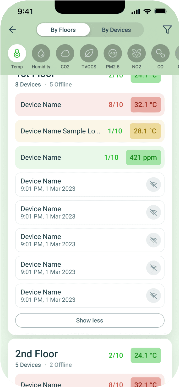
Floors List
Each buildings has multiple floor using hierarchy we create a design that is visually easy for users to scan despite the variety of information. Users can easily switch to different sensors. We want users to easily see the devices per floor, using switch tab interaction they can easily have a view devices.
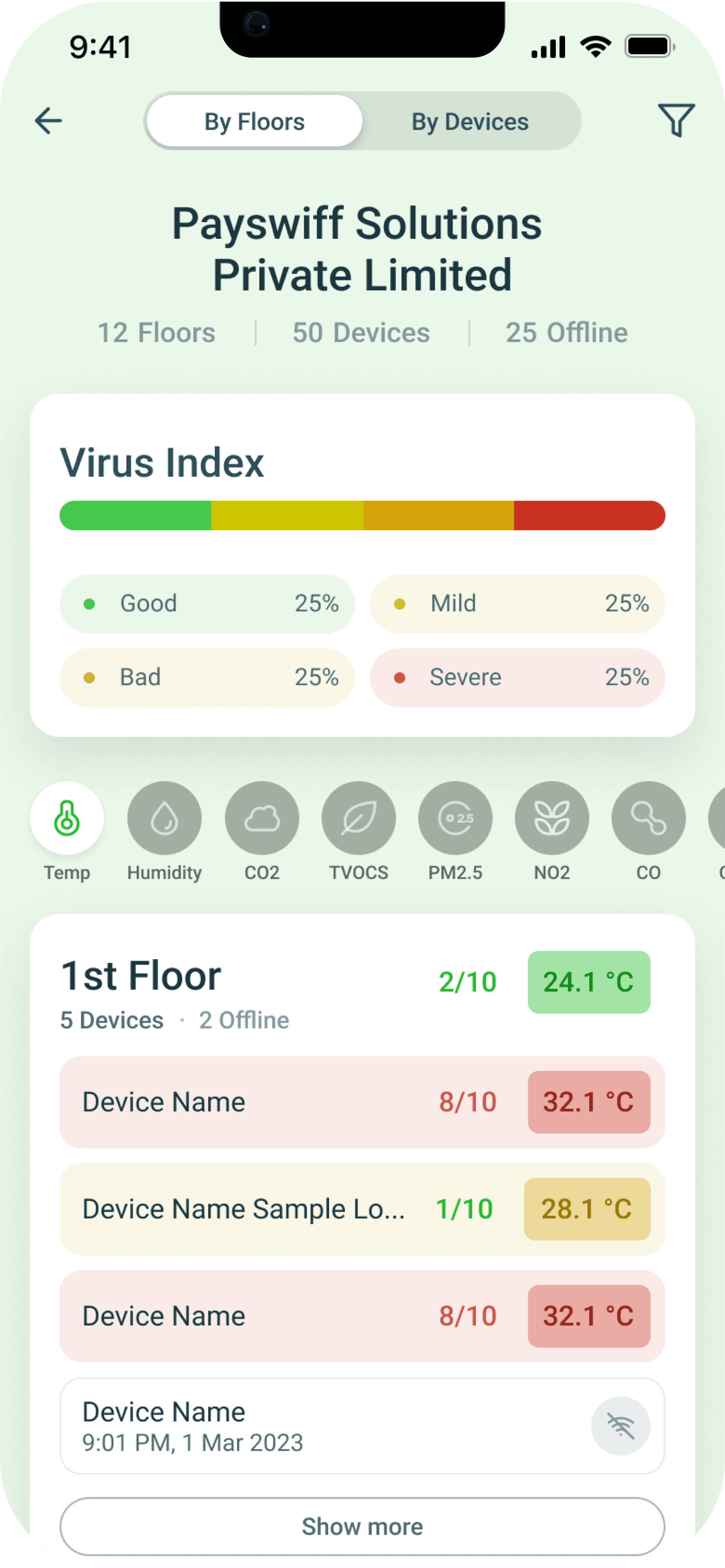
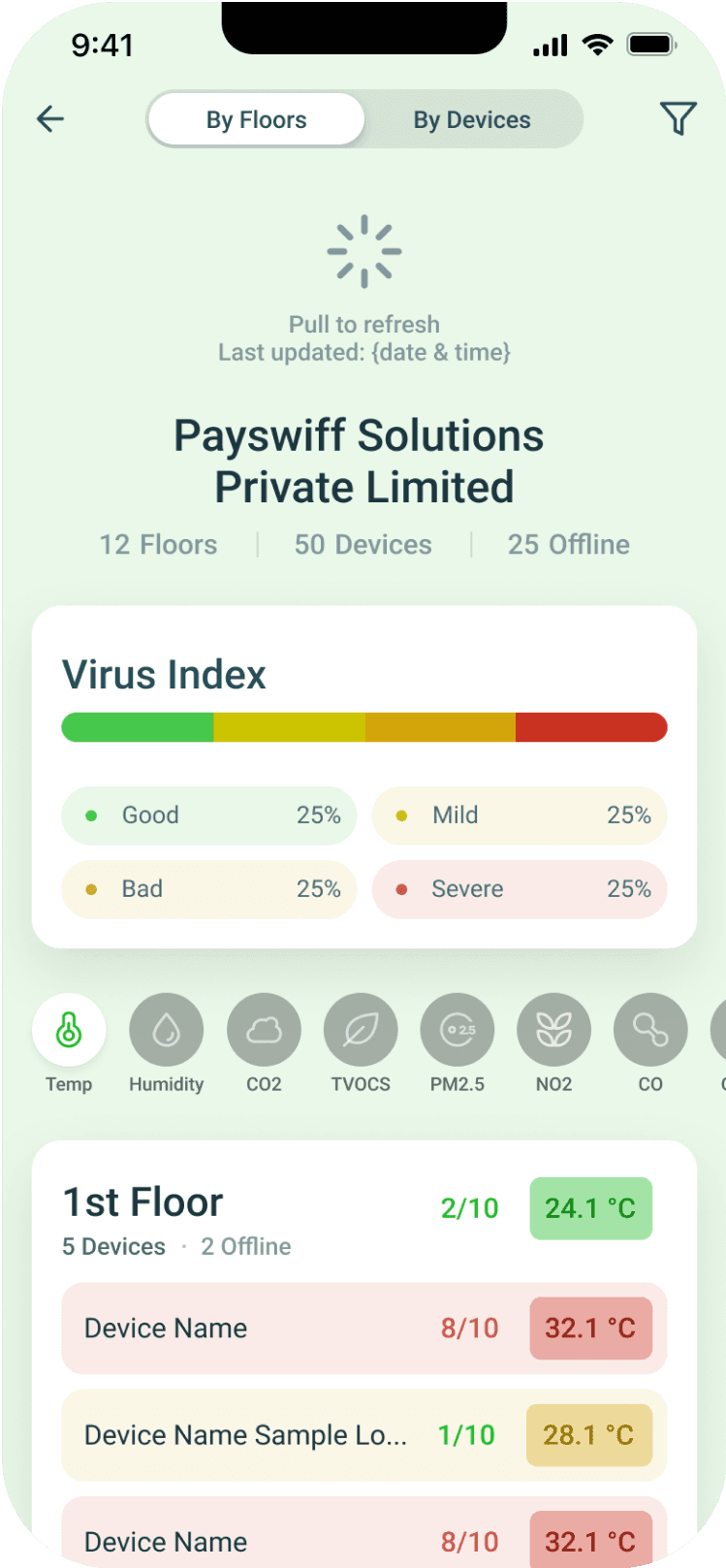
Refresh Status
It is crucial for every users to see the updated status of each floors. Using ‘Pull to Refresh’ interaction, they can quickly see the recent status instead of closing the app or wait for it to automatically change.
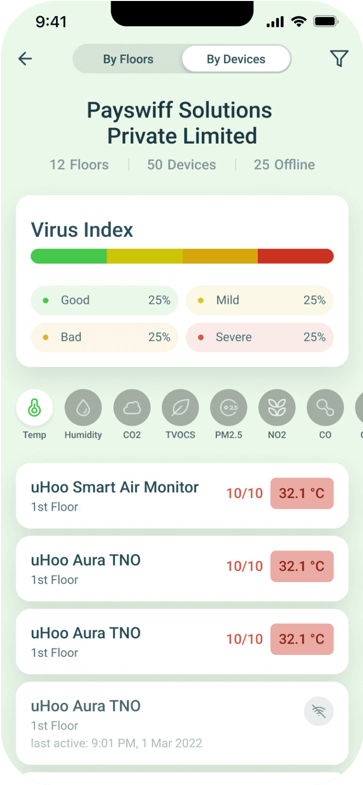
Devices Tab
The ‘Floor View’ only provides general overview of the floor, users can’t immediately see the status of each devices. Providing ‘By Devices’ gives the user an option to see the devices and see if there are malfunctioning devices.
Sticky Navigation
It can be frustrating when you to scroll up constantly in order to change the view of building “By Floors” or “By Devices”. Using sticky navigation, we made it easy for them change tab.
3
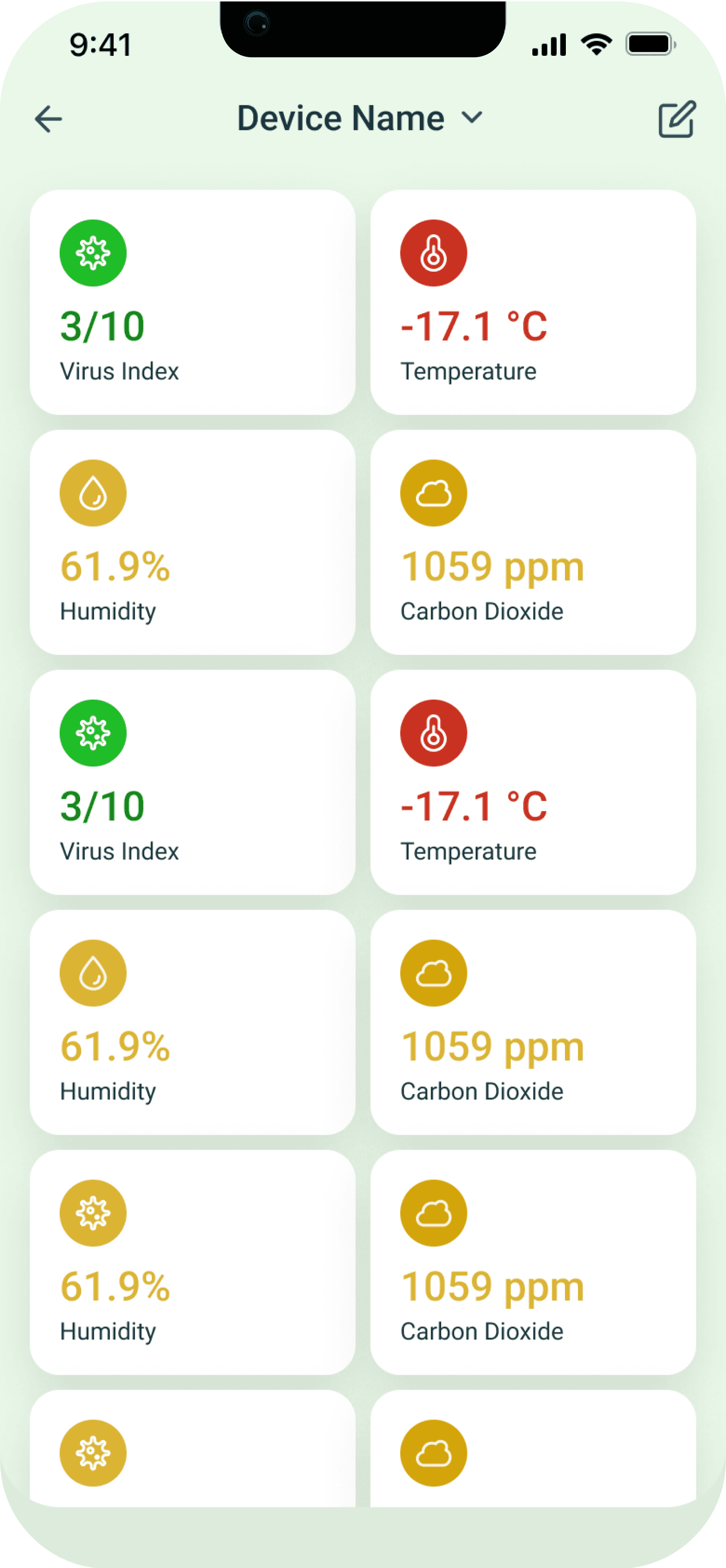
Device Details
Each building has devices that provide different sensor data. On web app the text is small and requires more focus to see. We designed it in a view that user can see immediately in a single view.
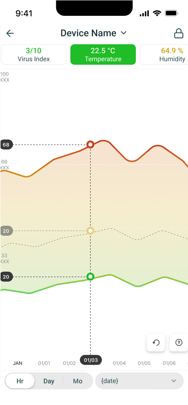
Chart View
We simply adapted the same chart from web and use it on mobile so save development cost and time, with minimal tweak, we made the chart work on mobile that user could interact with. Chart provides an overview of each sensor. They can set the date and time based on specific the timeline.
Switch Devices
Instead of going to floors to see each devices. We provide users a tool to quickly change the view to building, floor and another view device
Search
Search where users can immediately look for devices. Using tested design patterns, we designed search to a simple and familiar interaction that user can immediate use.
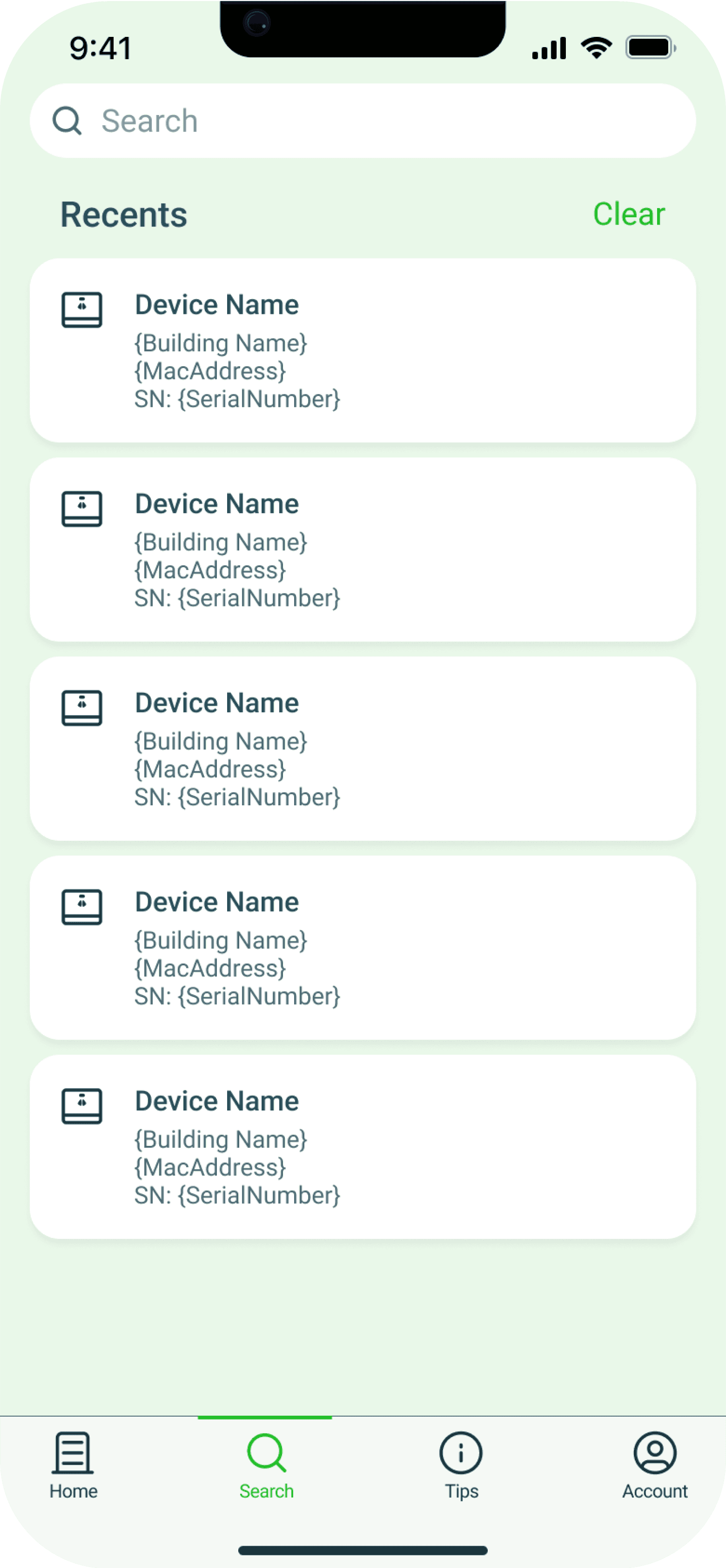
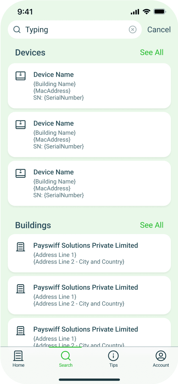
Search Result
The list of results from each keywords can be lengthy we provide multiple options if they only want to see buildings, devices or mac address
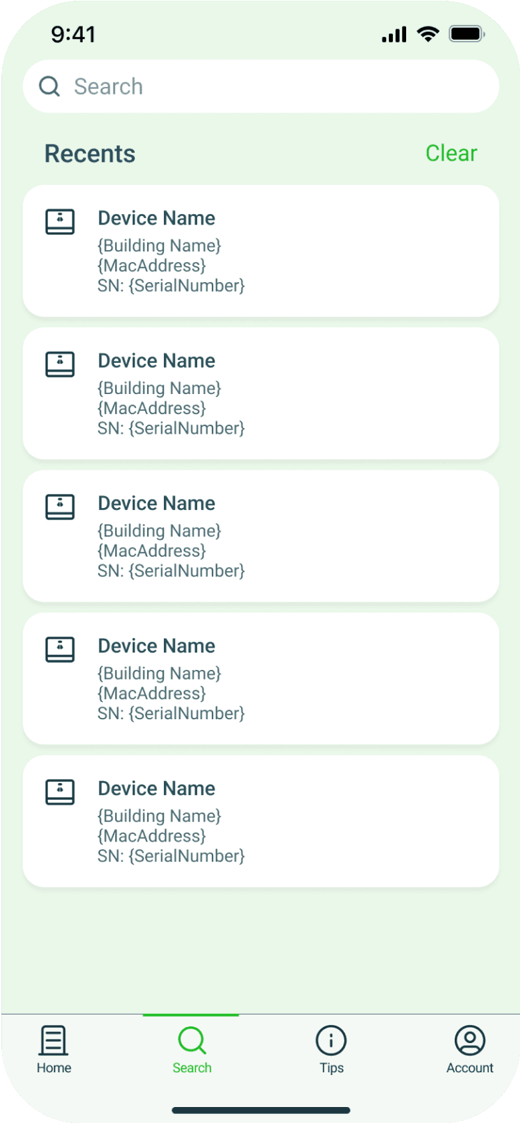
Recent Searches
Users has a pattern of looking for specific device, show recent gives them quick way to access device they frequently want to see.
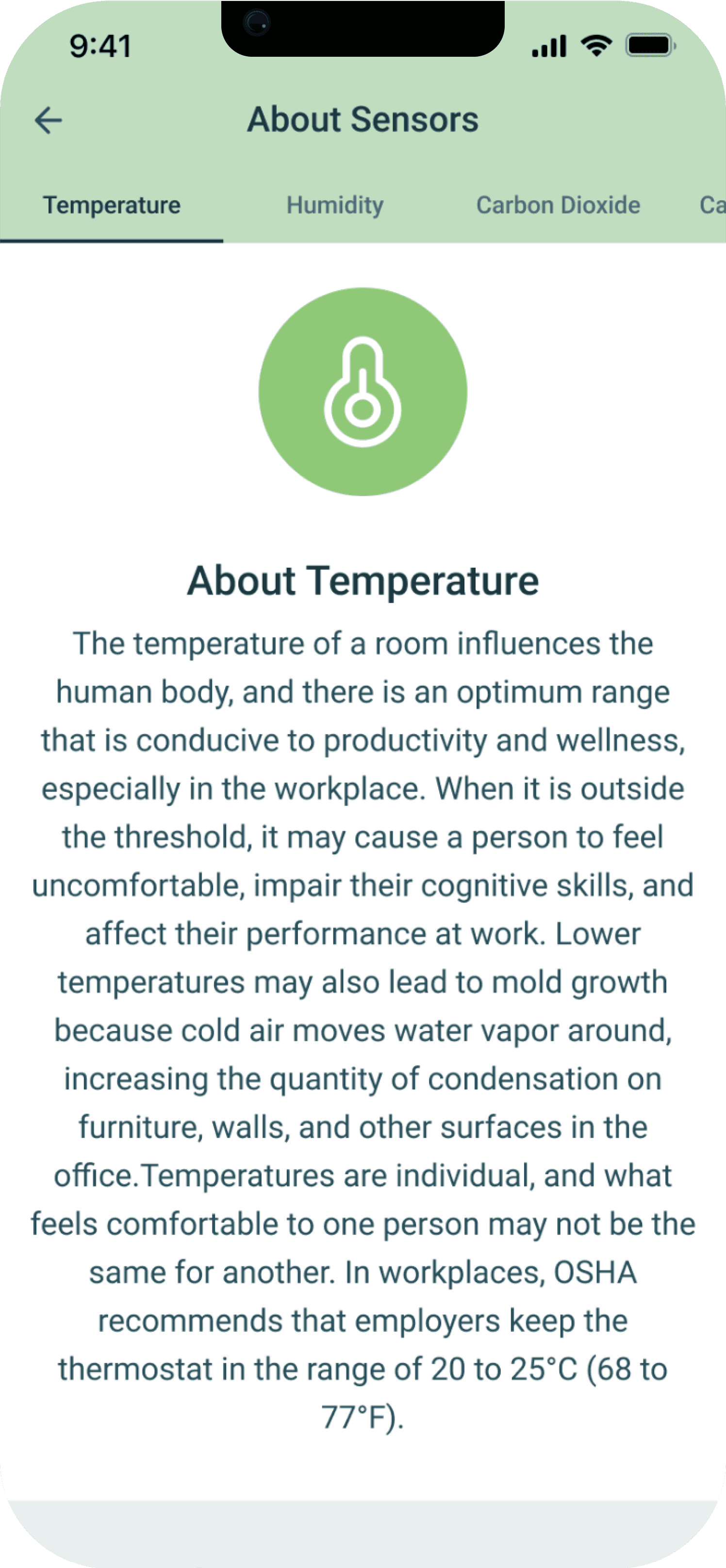
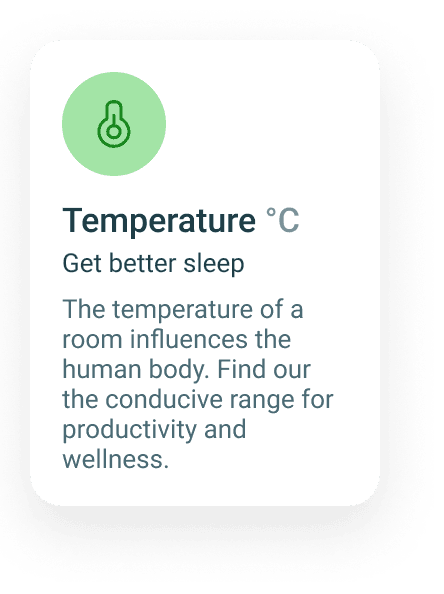
Sensor Guide
Sensors and certain terms can be too technical for some users. We designed the tips section where users could see more information about each sensor
Summary
Working with uHoo was fun and full of learning experiences. I collaborated with my co-designers to bring this project to life. Time was the biggest constraint at uHoo, which sometimes impacted project timelines. However, I was happy to work with a team that helped manage time effectively and still produced a product aligned with the business goals.
I wish I had more time during the project to explore many possibilities with the app, such as designing a smartwatch app for users to get updates from uHoo devices or creating an interface for uHoo devices.
Need Design Help?
Hire Me