Metrobank, officially known as Metropolitan Bank and Trust Company, is a prominent universal bank based in the Philippines. Established in 1962, Metrobank has grown to become one of the largest and most reputable banks in the country, offering a wide range of financial products and services to individuals, businesses, and corporations.
For this challenge, I thought using Metrobank as an example would be a great way to create a user experience that improves the design. They are one of the Philippines' leading banks, yet their mobile app is not user-friendly, visually outdated, and lacks features that could be valuable to a new generation of users.
When I start designing any project, it always begins with understanding what the client is trying to solve, asking important questions regarding their challenge, and providing an estimate of how long it will take and the cost involved.

Hey Ramil!
Hello James!

Hope you are doing well!
We need a design help! We want to improve the experience of our mobile app?
Are you available to help us to design the experience?
Sure James! Can we have call our fill this form to help me estimate how long it will take?
Outgoing Call
Done! Let me know how long it will take to finish and give us a qoute!
Providing stakeholders with an overview of how long it will take and a list of deliverables gives them a clear vision of the timeline, processes involved, and the amount of time required to complete the project.


If both parties agree on the cost and timeline, a simple contract can seal the deal and allow the project to proceed 😎.
Hey James!
I have sent you an email regarding contract and quotation. Let me know if you have further questions 😎
Got it! Sent you the 50% payment to start this project tomorrow. Thank you.
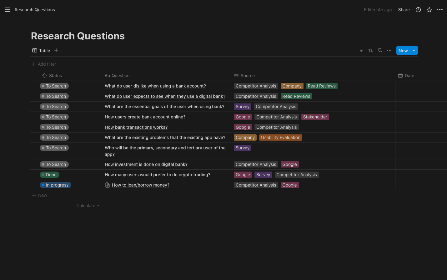
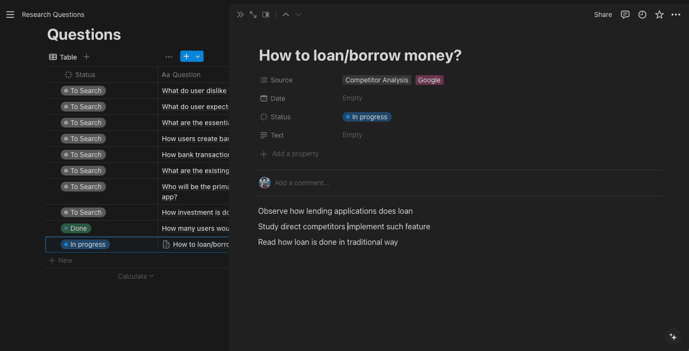
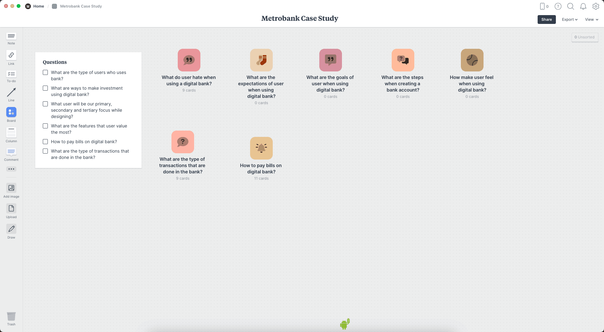
Research
Critical Questions
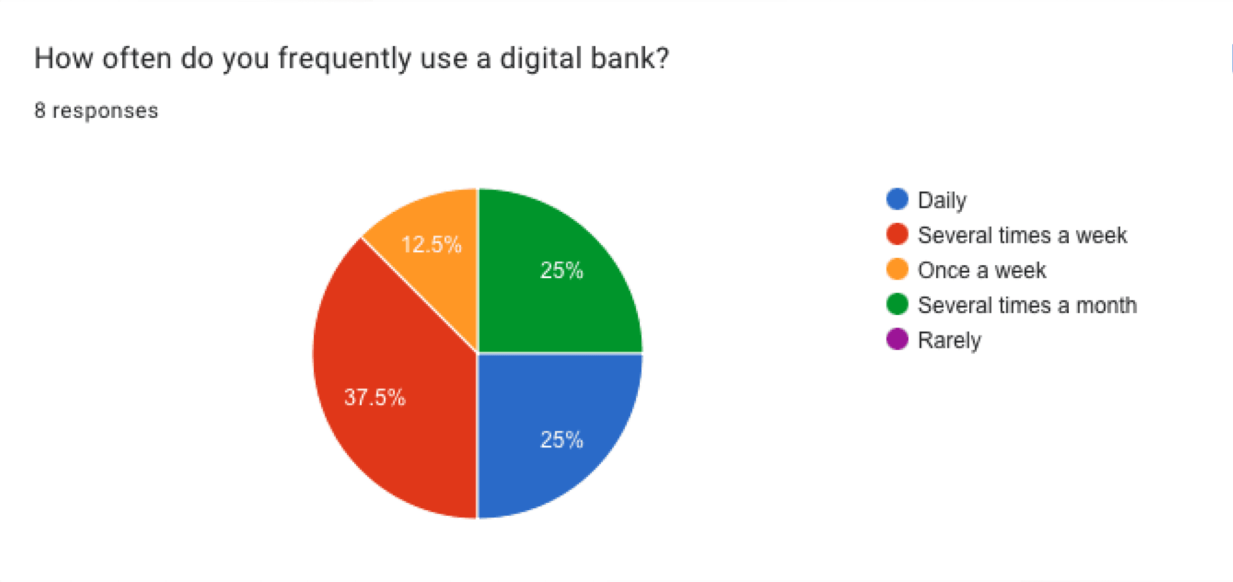
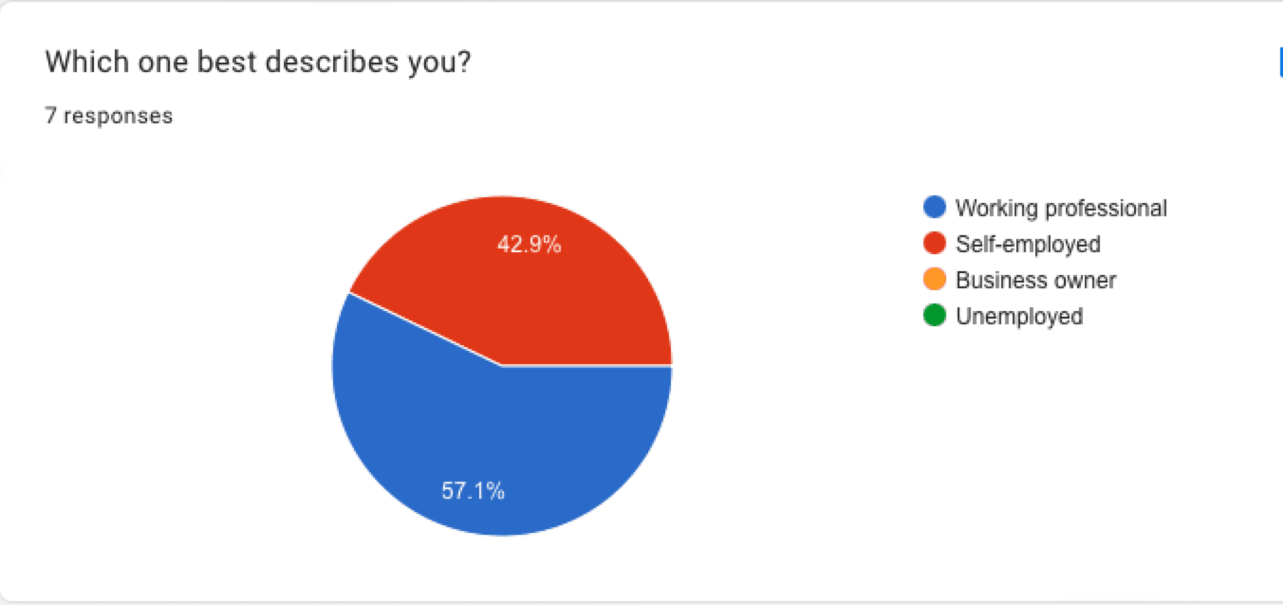
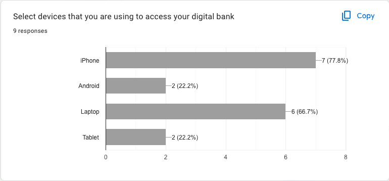
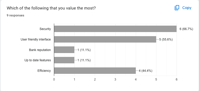
It can feel overwhelming to know where to start, especially if the project is in a realm where I have no prior knowledge. Using tools like Notion helps the team to organize and prepare questions that we will search for later. This includes planning how to conduct the research, such as competitor analysis, user surveys, interviews, etc.
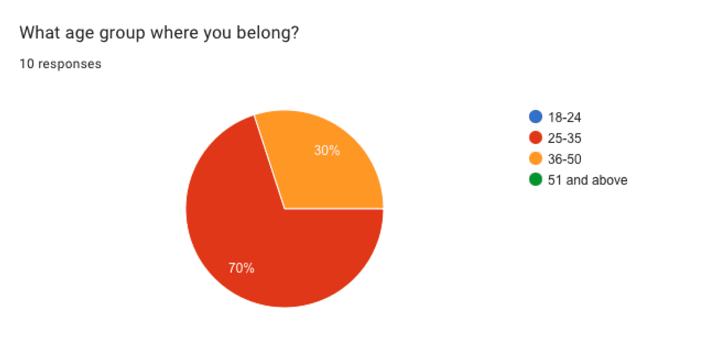
Survey Insights
Tools like Google Docs help save time and cost when gathering information, providing insights that assist in making decisions regarding the user, product features, and other questions that require validation.
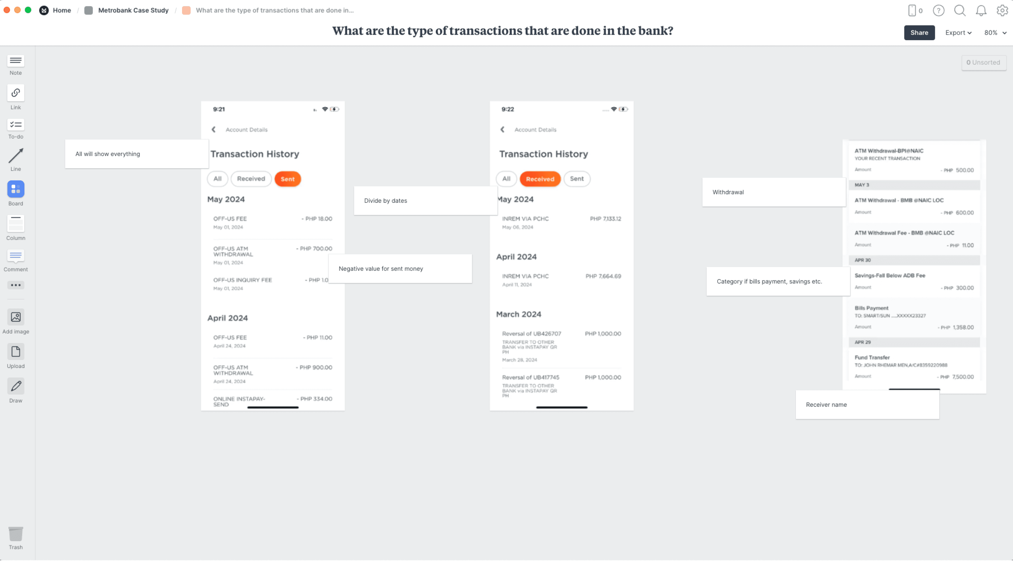
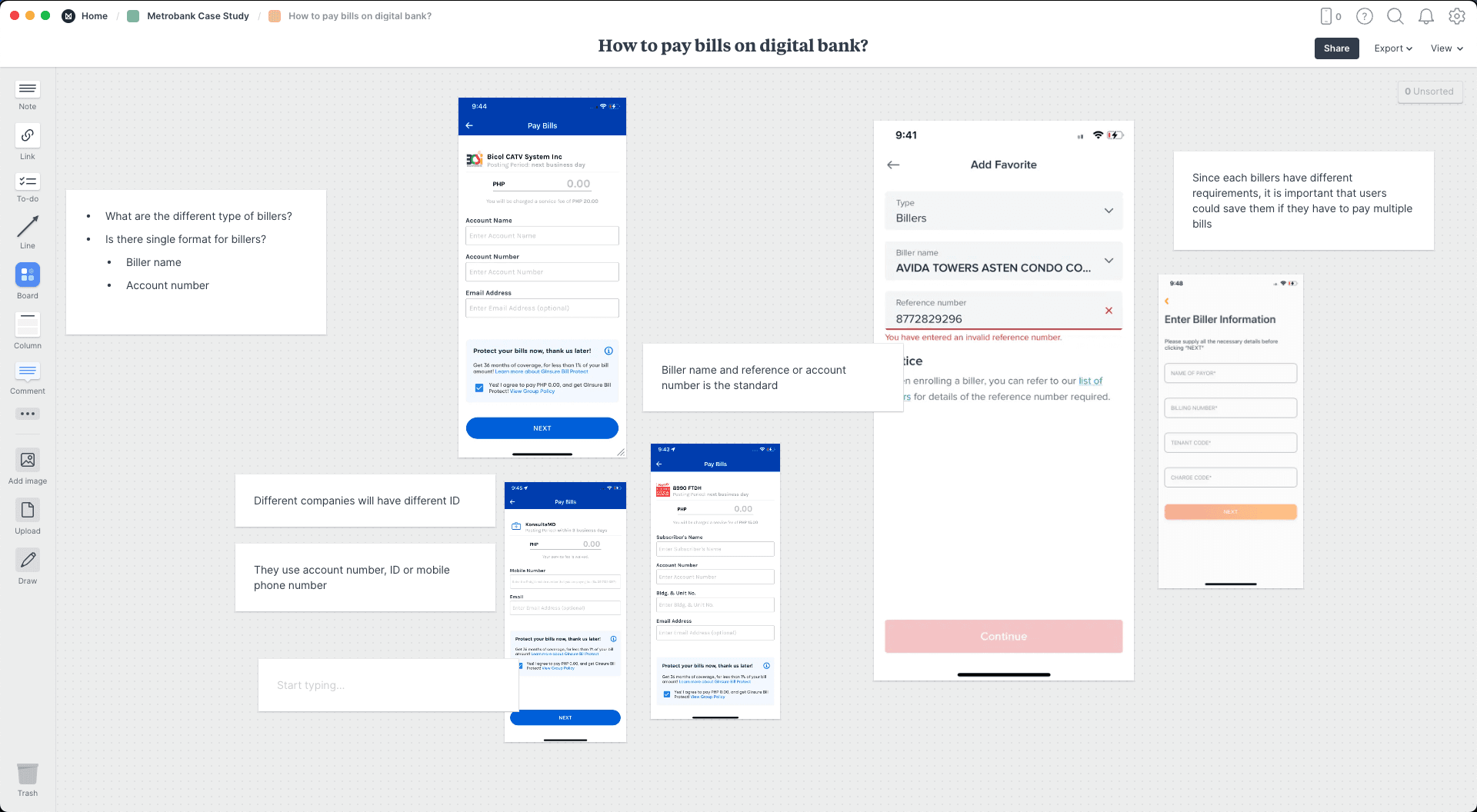
Notes and Sources
We use Milanote to organize answers to the research questions.
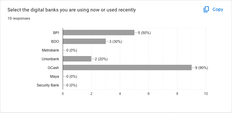
Competitors Analysis
Conducting competitor analysis helps gain valuable insights to identify opportunities based on competitors' strengths and weaknesses. This phase involves SWOT analysis, feature analysis, and observing competitors' products.
Curate and Learn
Strength and Weakness
Companies
Strength
Weakness
Opportunity
BPI
Great navigation
Gives user options to design
Fast and seamless login using FaceID
Has investment
User could manage debit and credit card
Pay bills on the app
User could subscribe to investment
User requires many steps to make transactions
Confusing navigation hierarchy
Poor visual contrast
Visual hierarchy could be improve
Difficult to read
Inconsistent visual design
Doesn’t feel cohesive
Typography could be better
Improve navigation contrast
Not focus on essential features
Feels bloated
Some good features are hidden and not prioritisings which user would care the most
Bad information architecture
Confusing investment feature
Redundant content architecture
QR code in under utilized
We could make our navigation clearer
Utilize to QR generator since most people are using it for seamless transactions
User could do investment using the only app
Use could login immediately using FaceID
Gcash
Great flow of borrowing money
Great contrast and hierarchy
Transparent transaction history
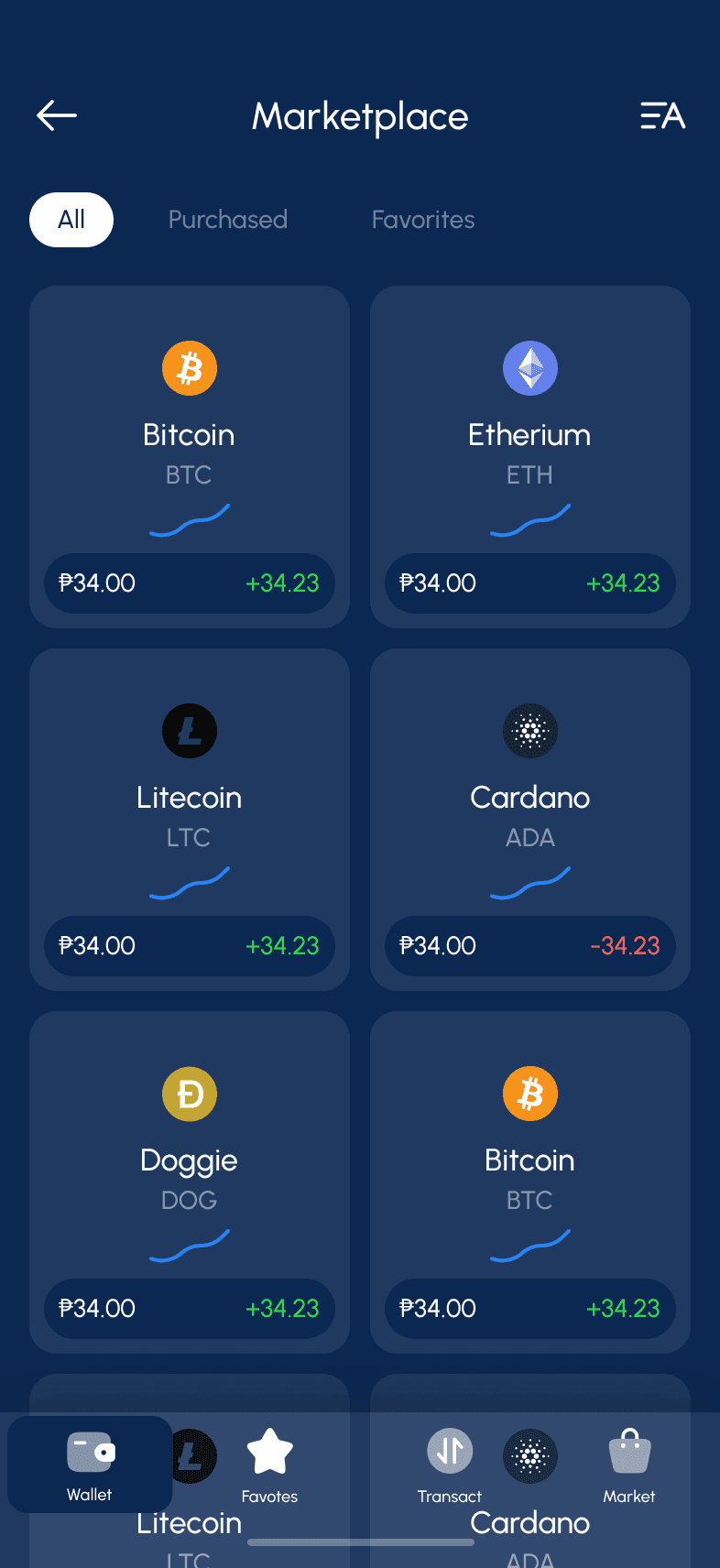
Allow stocks tradings
Different ways to make investment
Great transfer screen
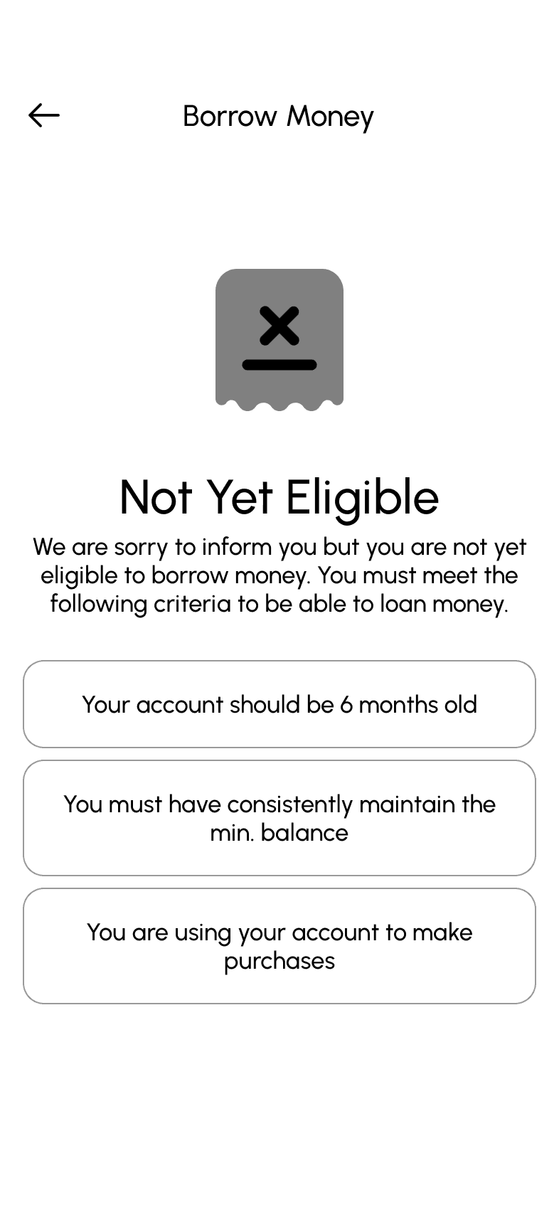
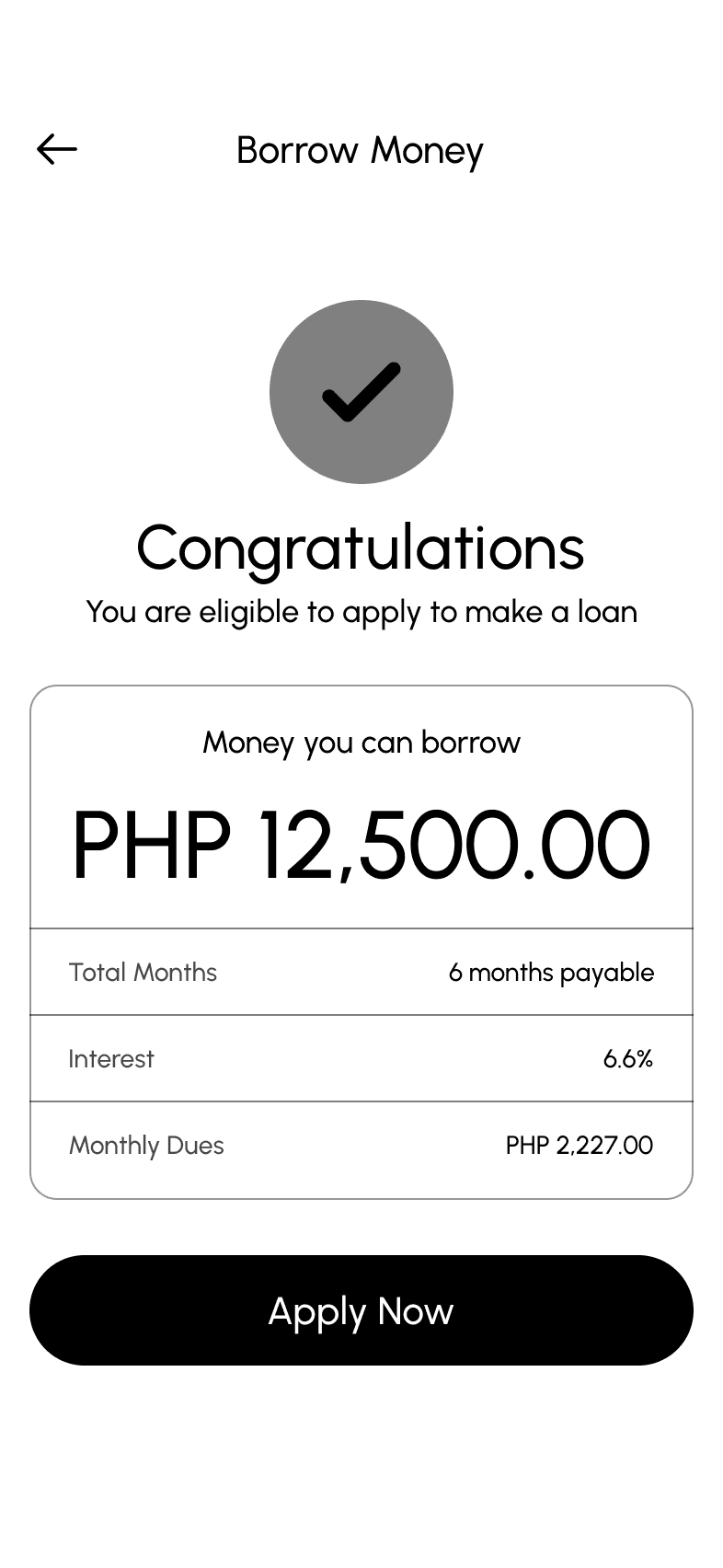
Complex loan process
Feels bloated
Too much features that is not relevant
Messaging is used as notifcation
Inconsistent UI layouts
We could implement utilize QR in same way
Use their flow when making loans
I like how they listed the top banks to make quick select where to send the money
We could simplify the loan process and use the steps that are safe
Unionbank
Great pay bills flow feature where they are showing the recent
User could save account
Great animation
Great use of branding
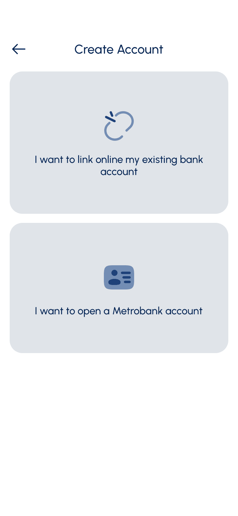
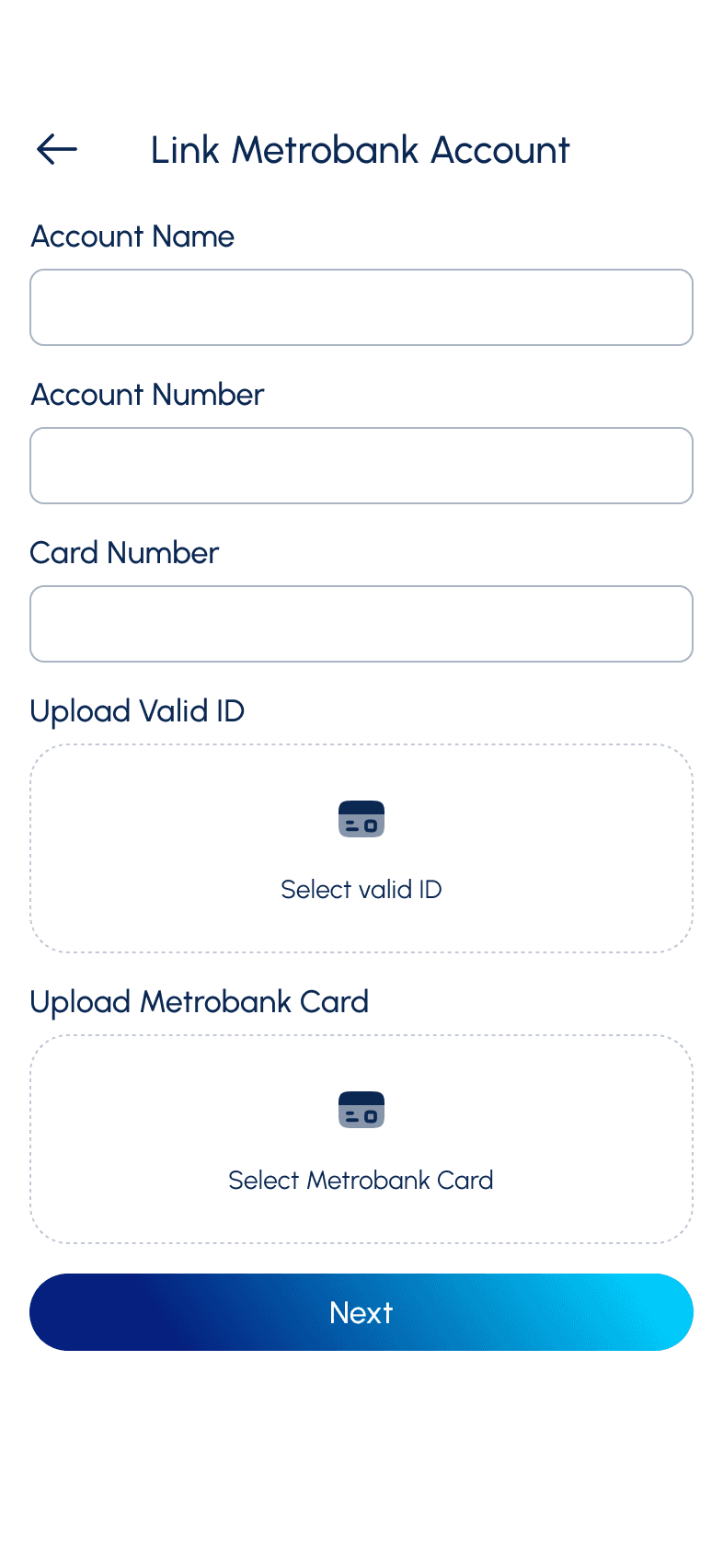
User could create account online
Complex interface when sending and receiving money
Limited Features
Maybe user could make transaction again to the recent payments
We could so last bills into list instead of swipe
Use their sorting of transactions
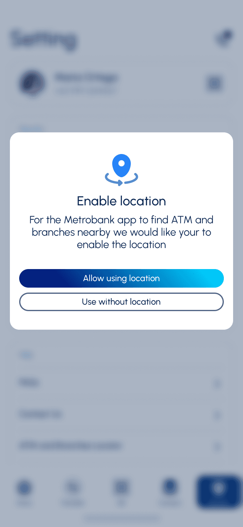
Show ATM locations?
Maya
Beautiful user interface
Strong branding
Great emphasis on cash in and sending
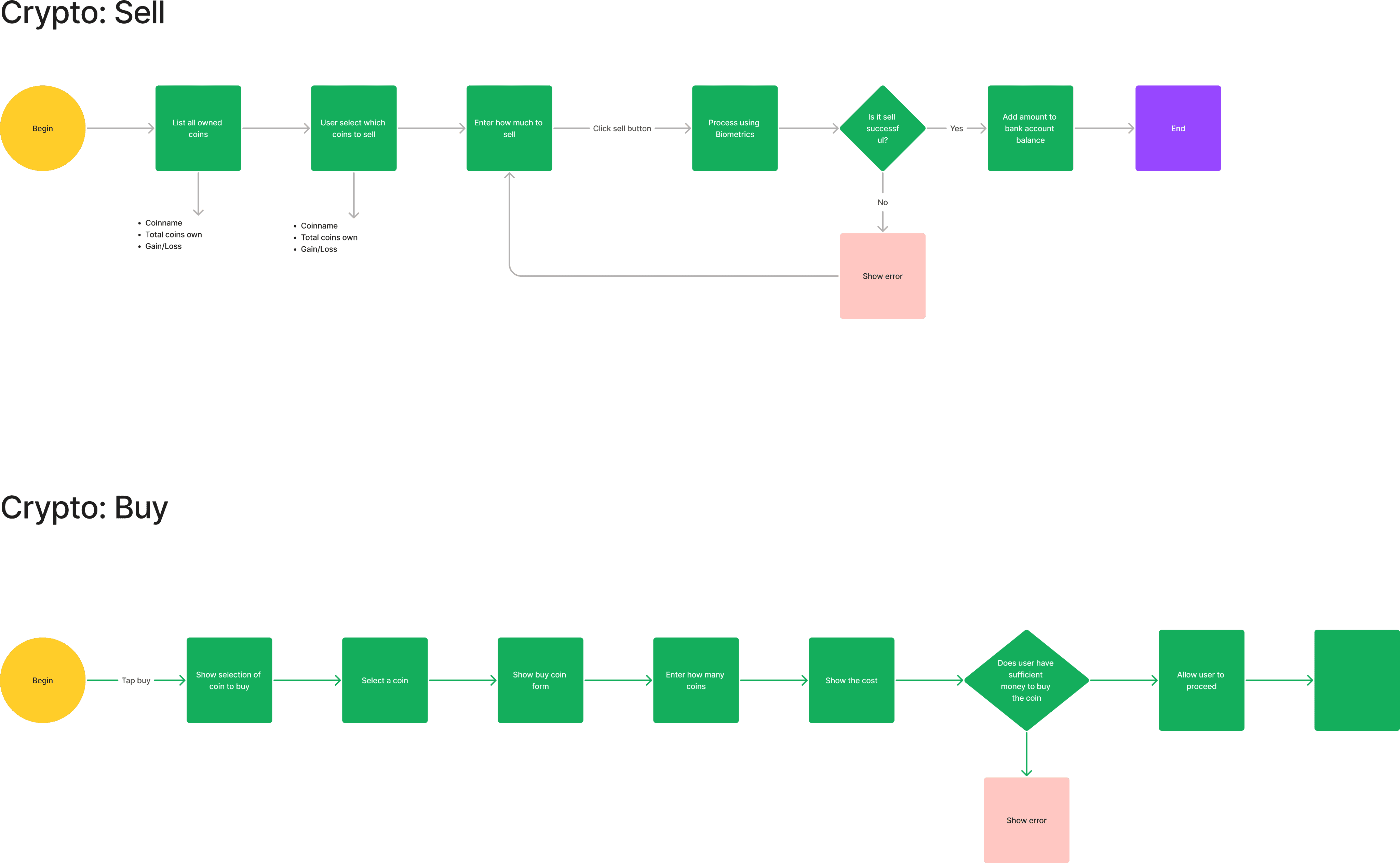
Amazing crypto trading
Real time chat support
Consistent visual
Strong branding
Might be too minimalist and unfriendly for technophobes
Too niche
Can have usability issue for technophobes
We could create the account section section as wallet that shows the account balance
We would emphasis the receive and send money button
Below are the features that the company want to focus on
Use their Crypto for the userflow
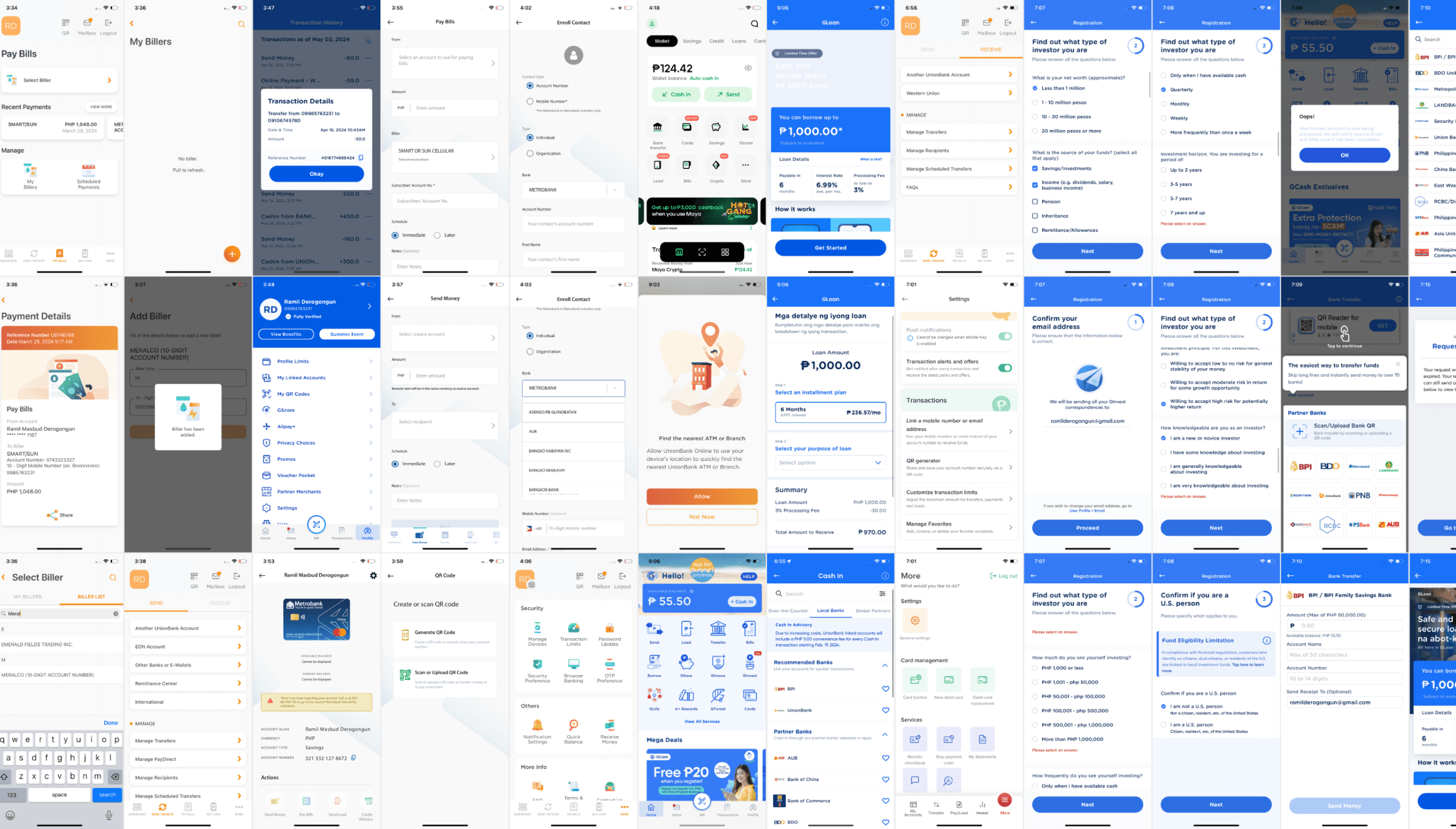
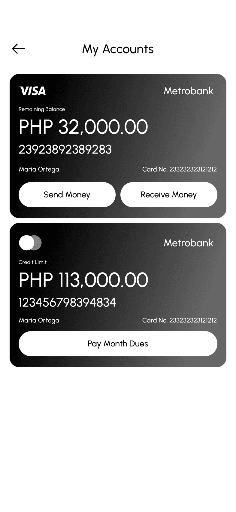
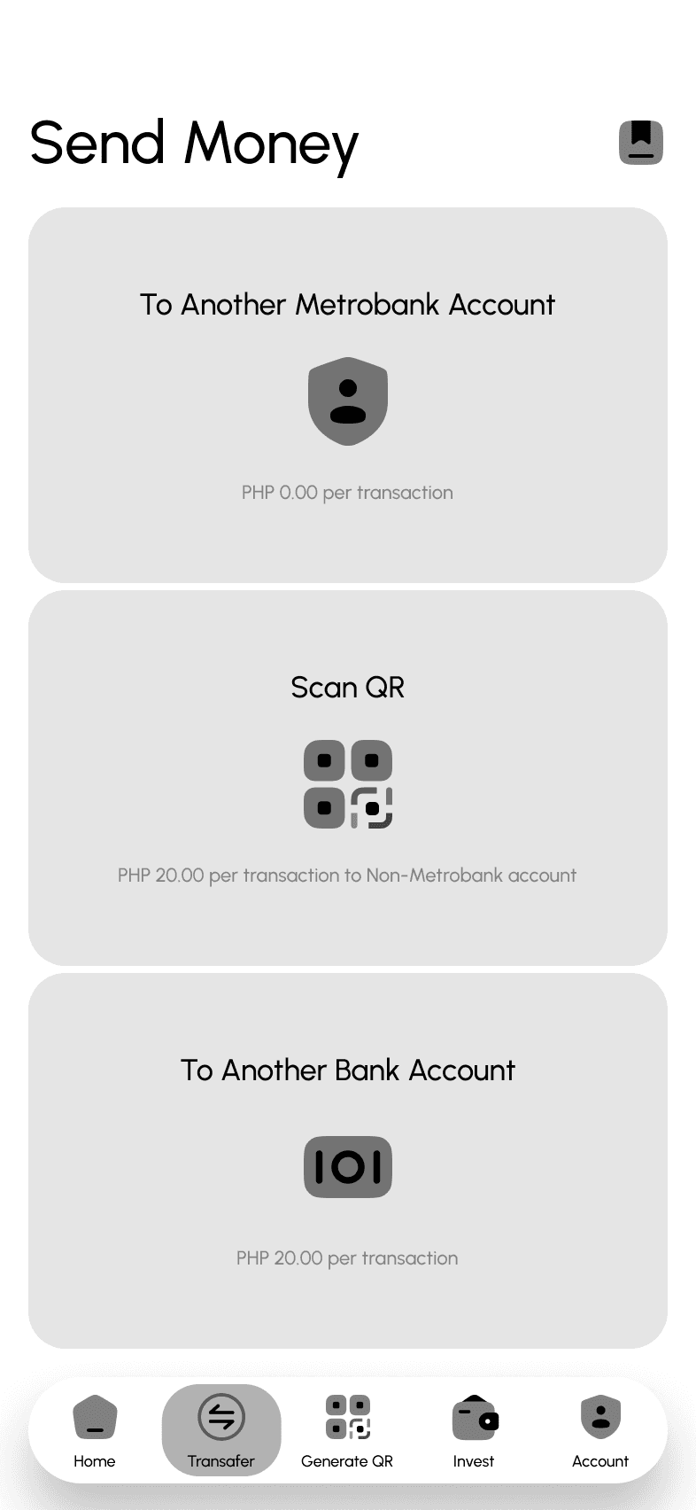
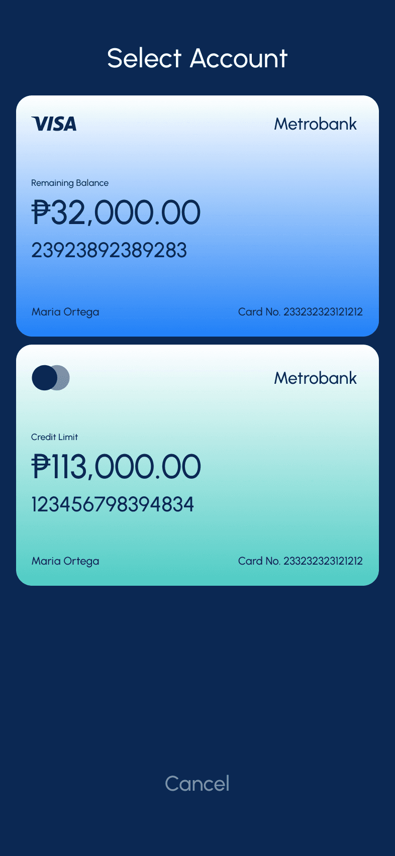
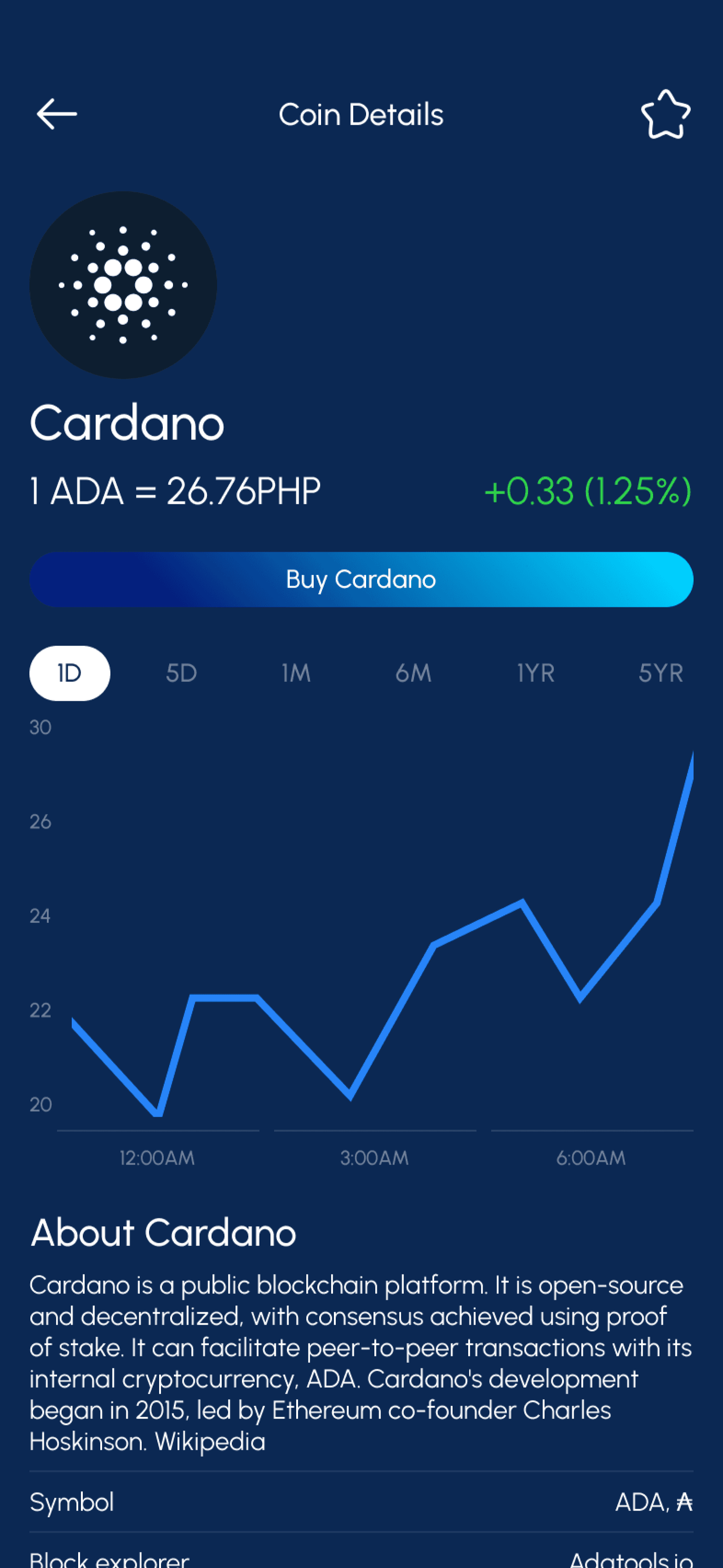
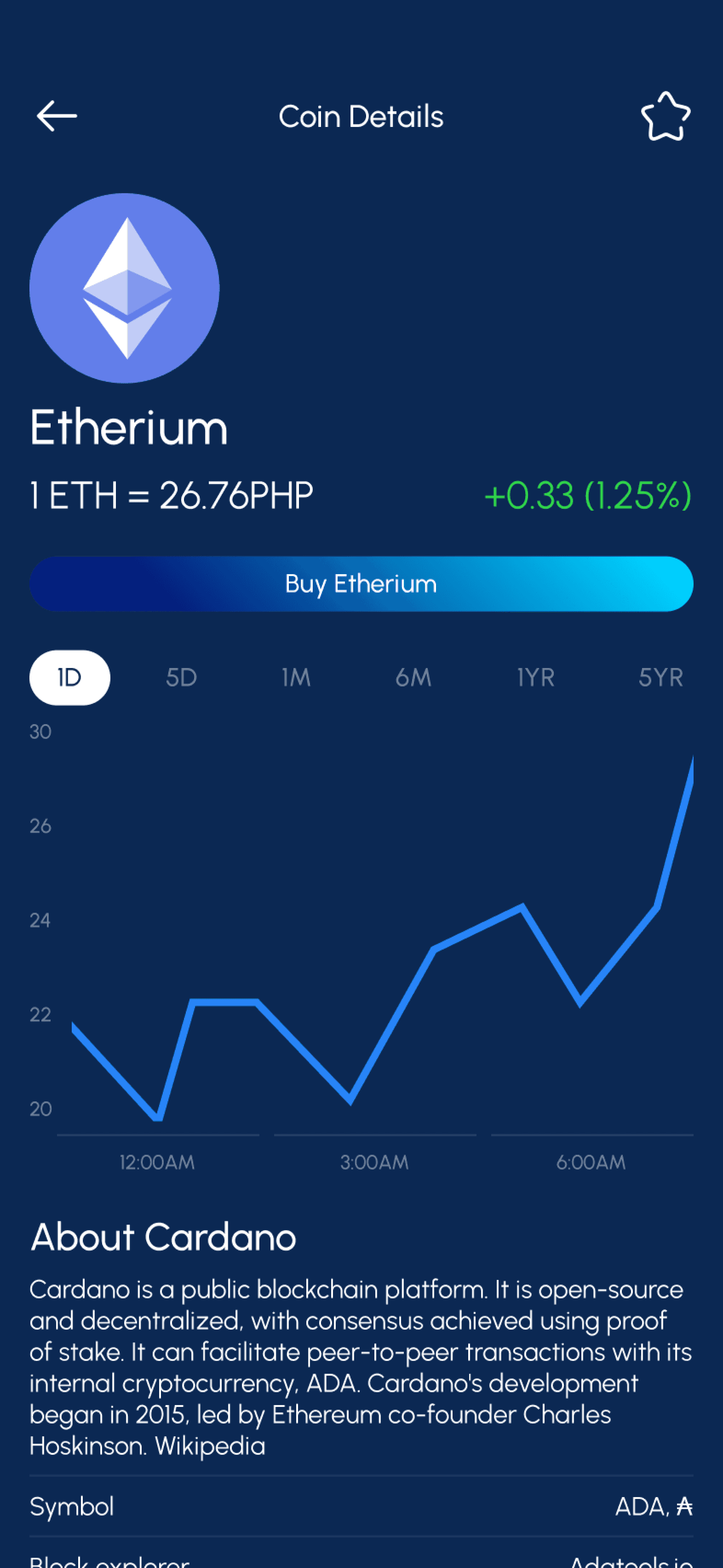
Metrobank
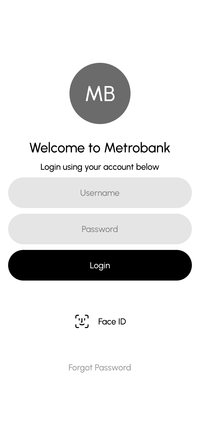
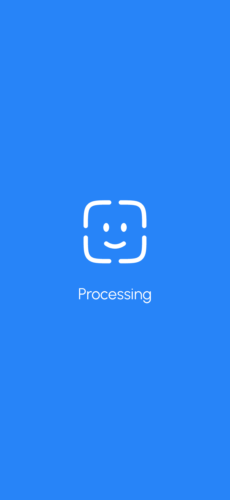
Easy biometrics login
Has bank essential features
Poor visual hierarchy
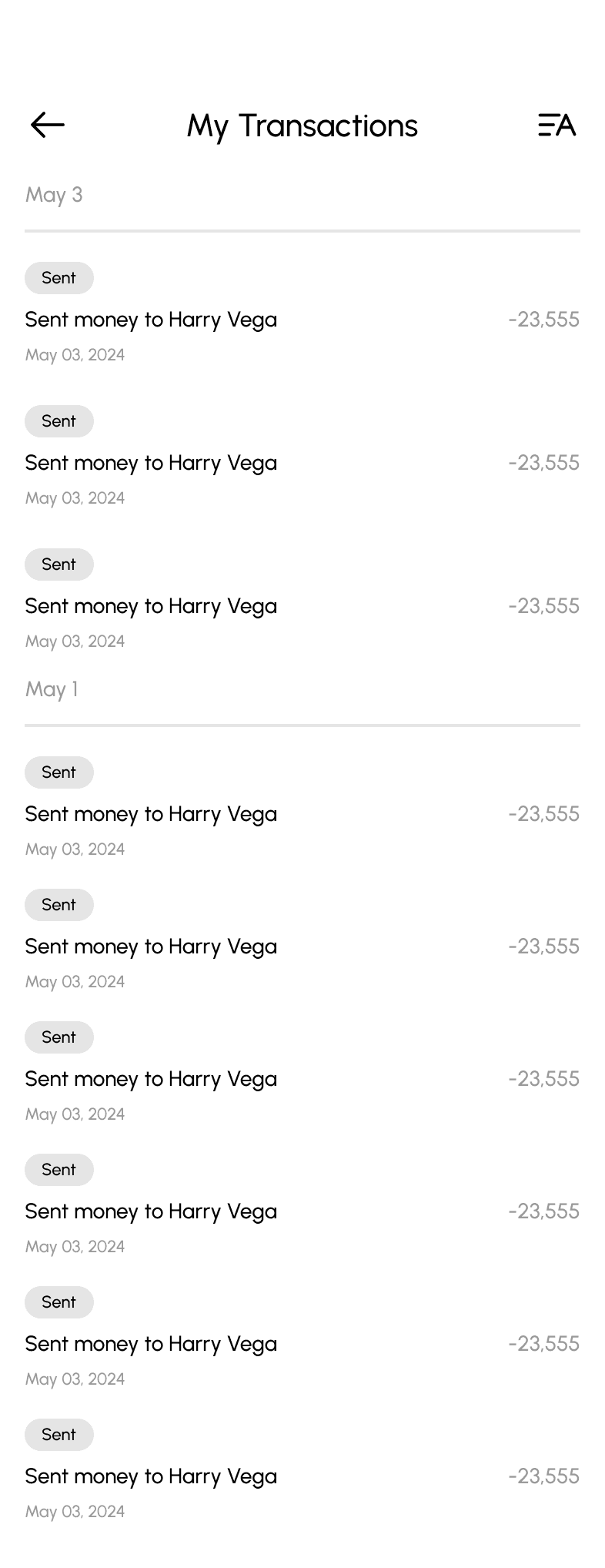
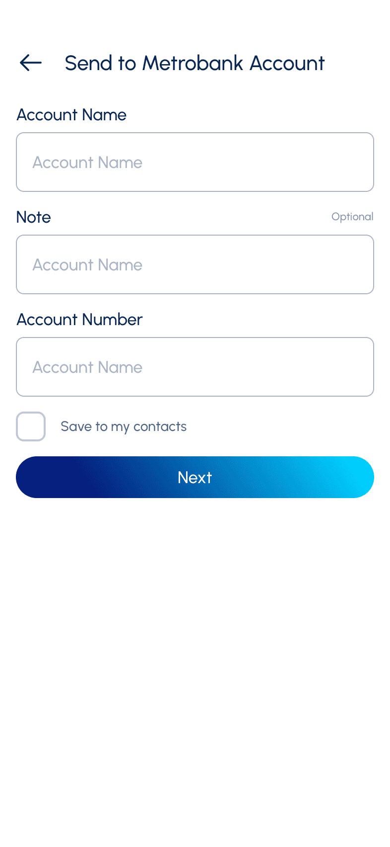
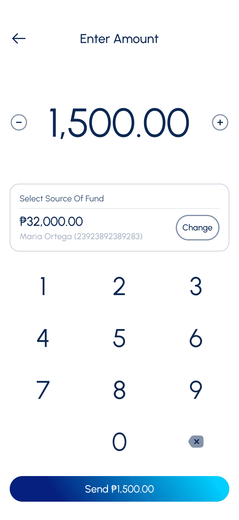
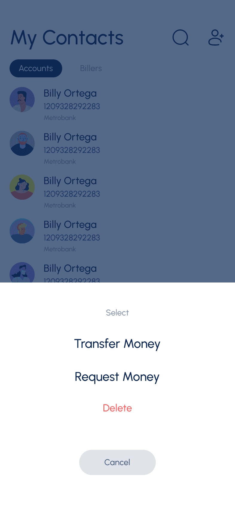
Difficult way sending money
Bad button usabilit, feels to small
Repeated navigation
No search bar in some interaction where I have to find names such as bank
Shortcuts and navigations are basically the same
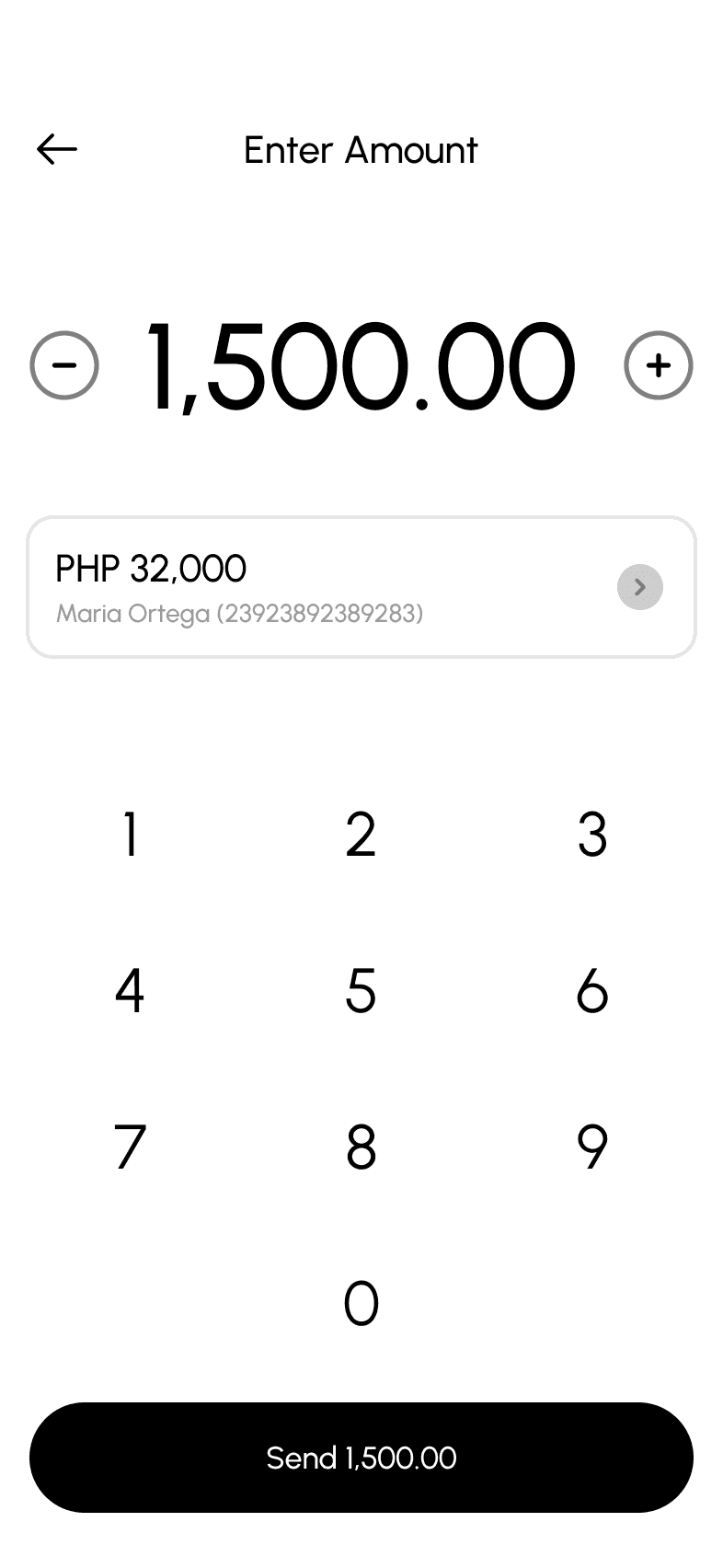
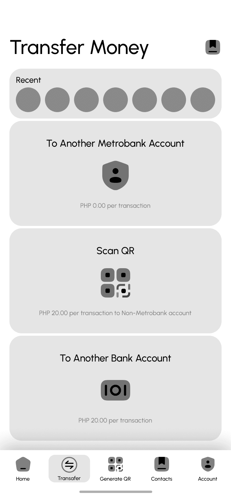
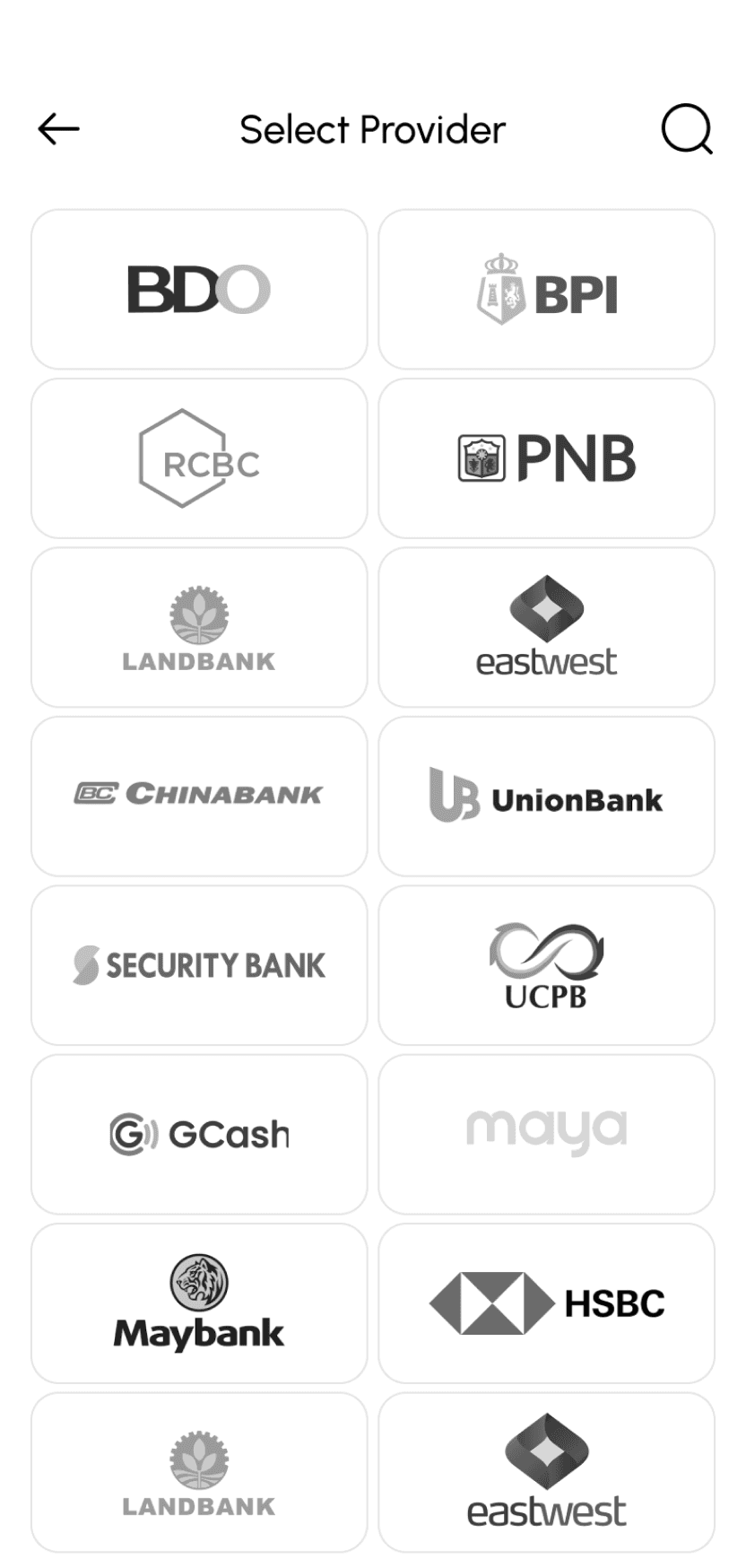
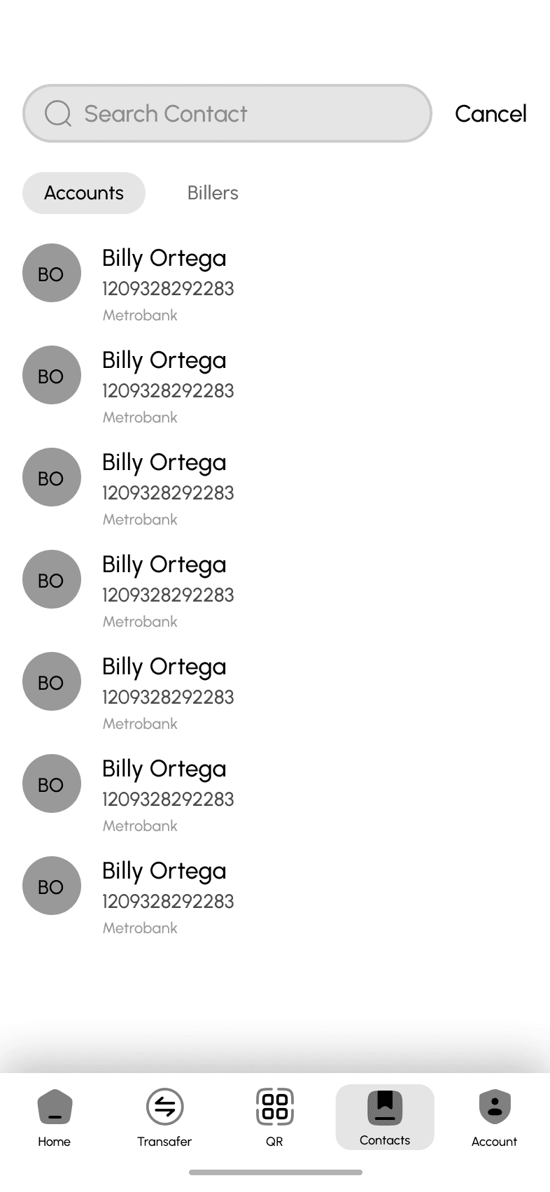
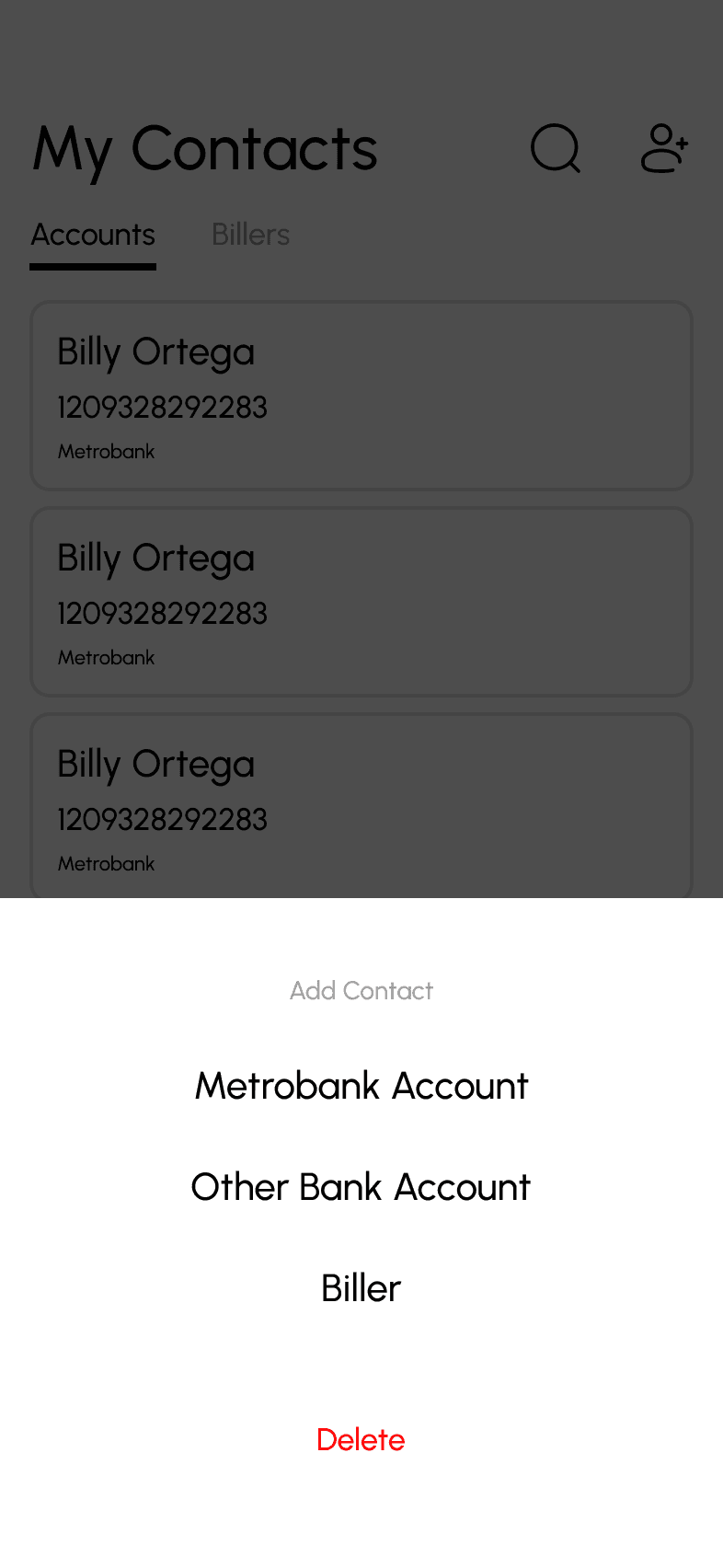
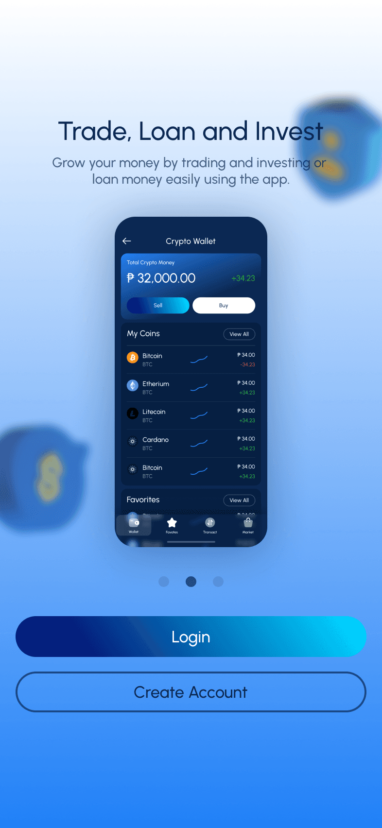
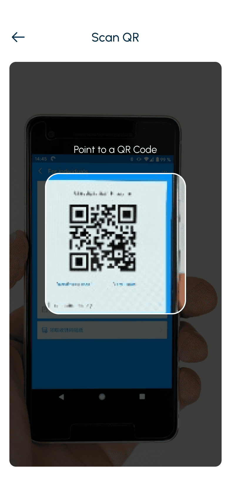
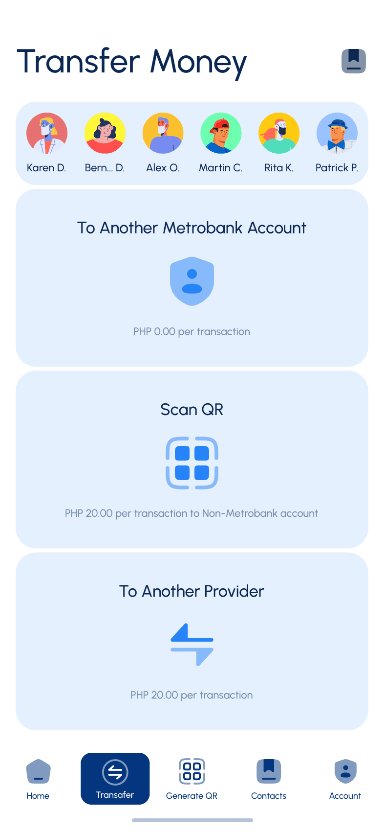
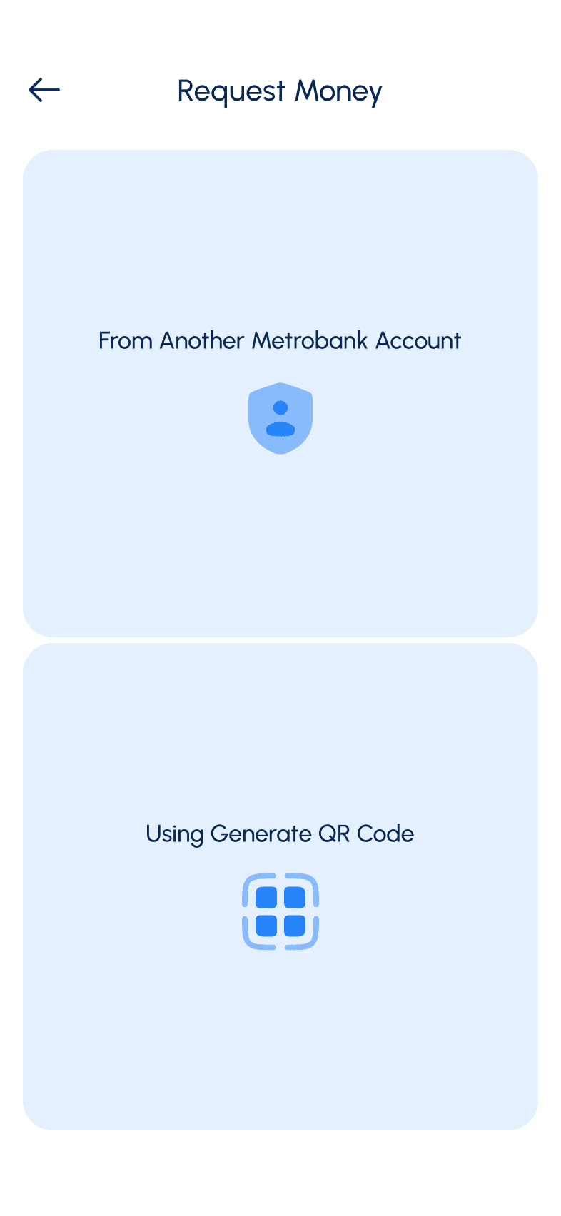
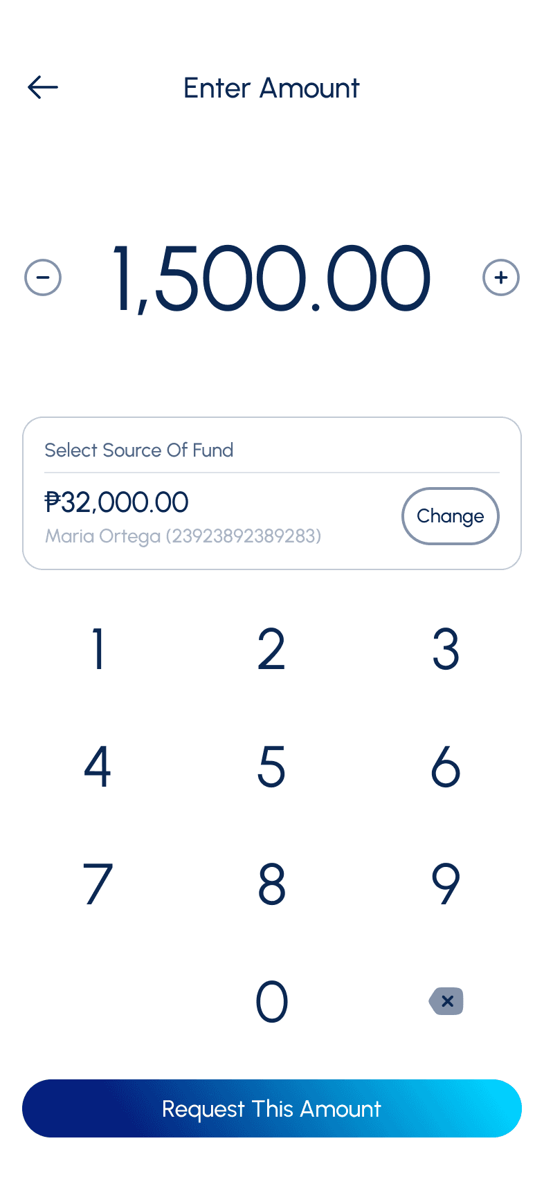
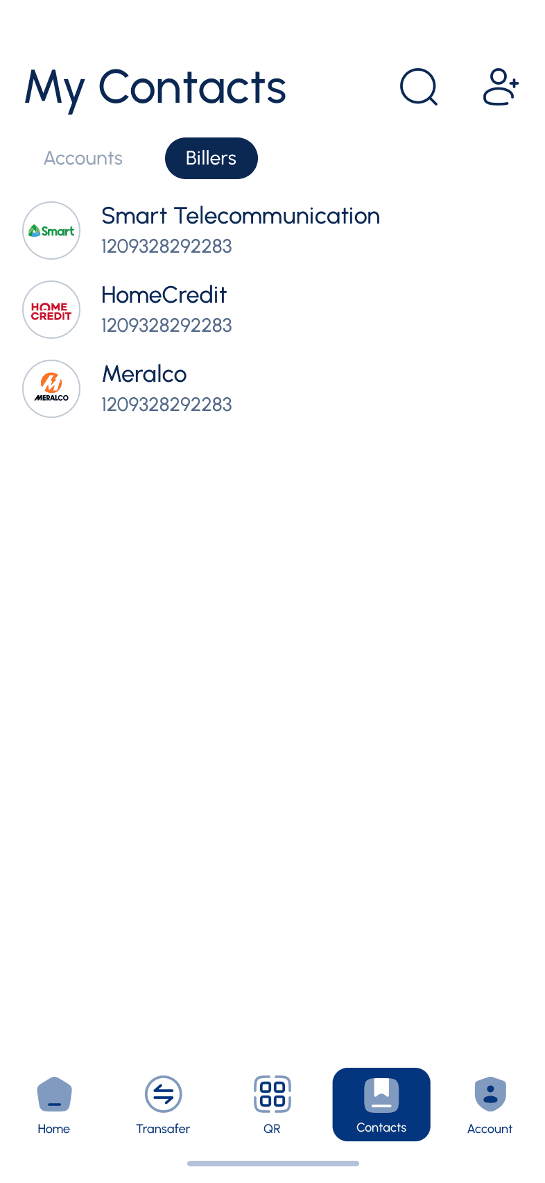
Take advantage of using QR Code when sending or receiving money
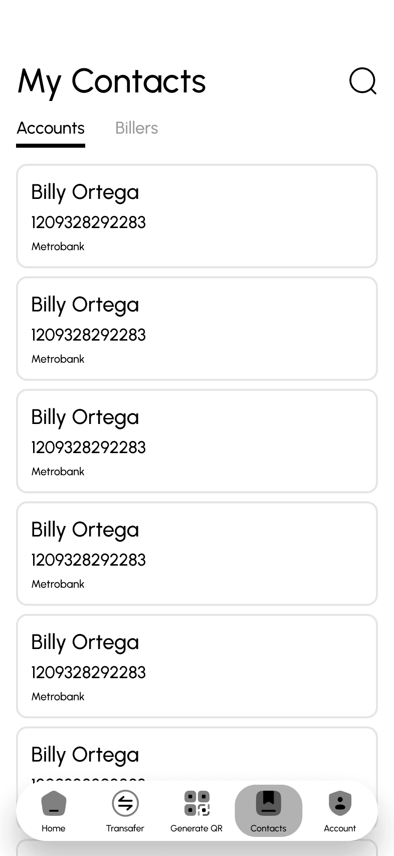
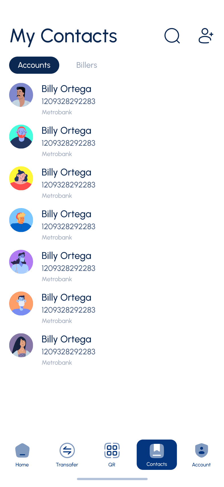
Create a favorite section to whom user frequently make transactions
Make hierararchy better
Make cohesive UI elements based on brand guideline
Make existing bank features more visible such load and insurance
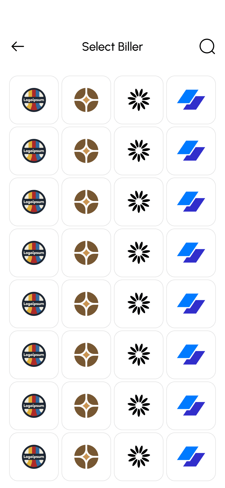
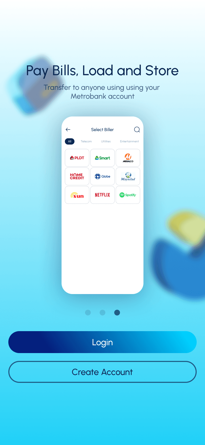
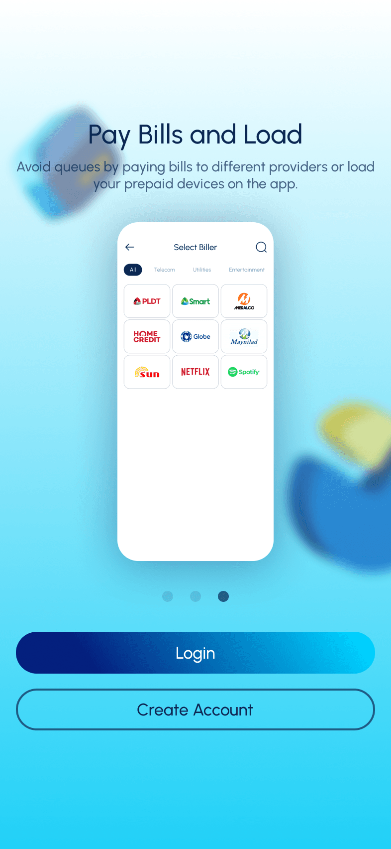
Combine billers and pay bills
Move to dashboard essential features
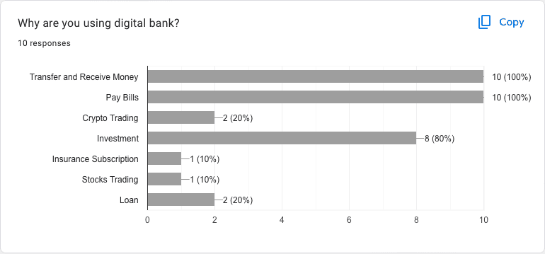
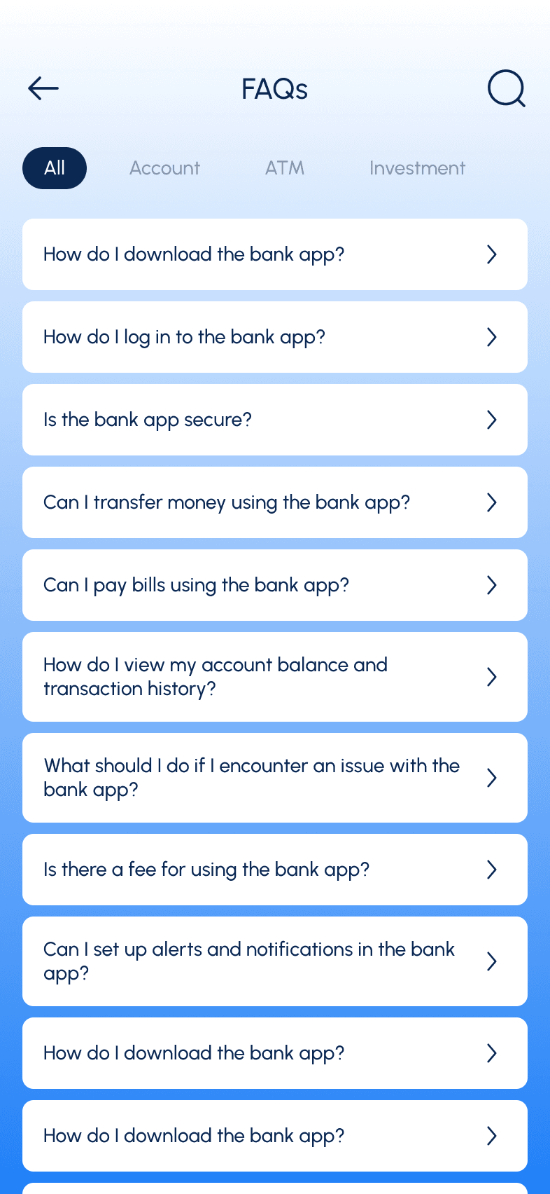
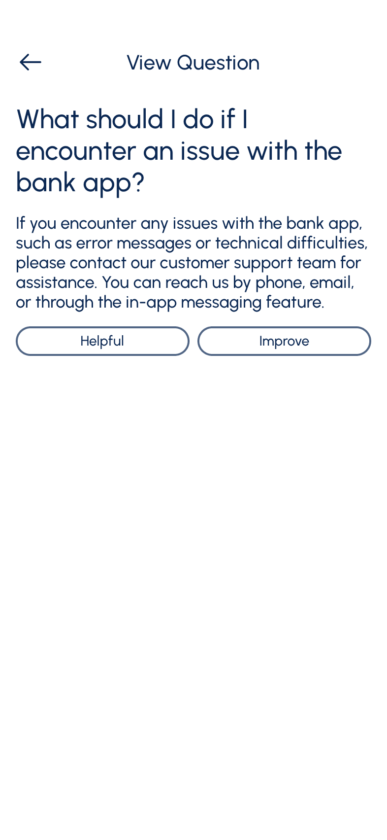
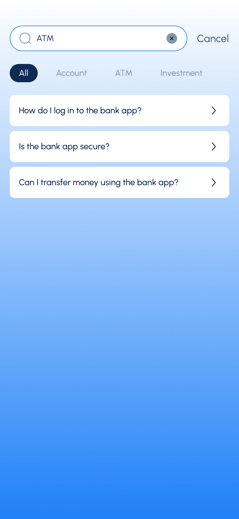
Features Analysis
Features
BPI
Unionbank
Gcash
Maya
Biometrics Login
OTP Login
Loan Online
Pay Bill and Buy Load
Set transaction limits
Online Support System
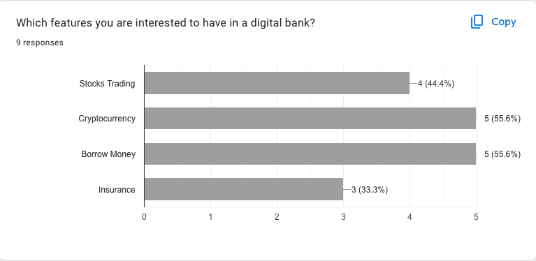
Crypto Trading
Stocks Trading
Create Bank Account
Insurance
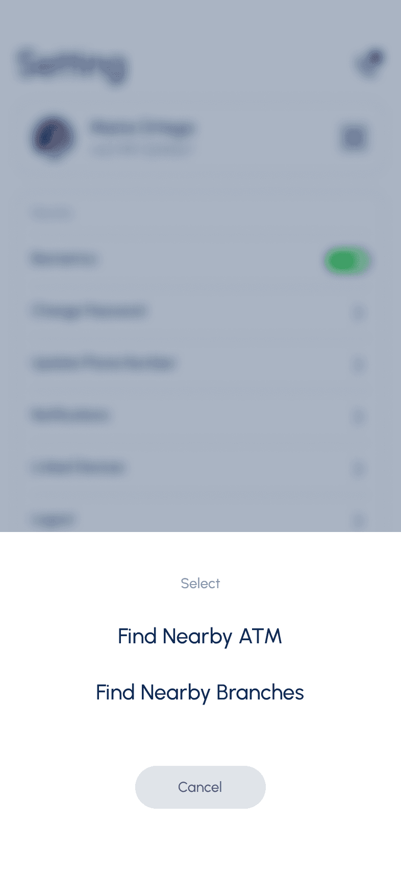
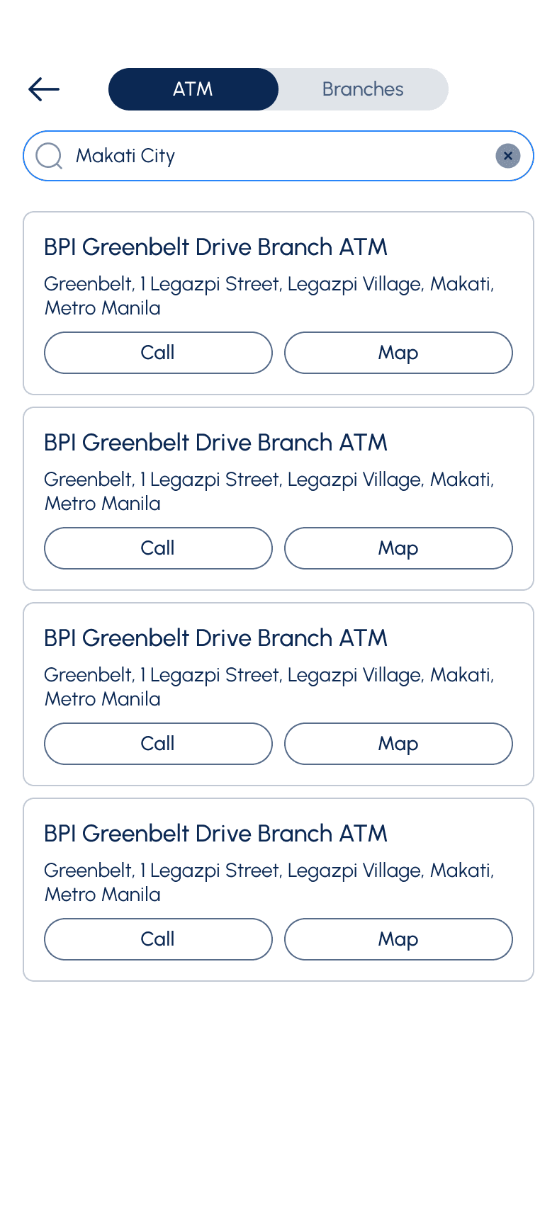
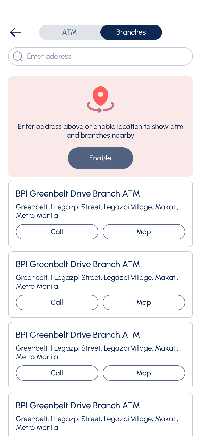
ATM Locator
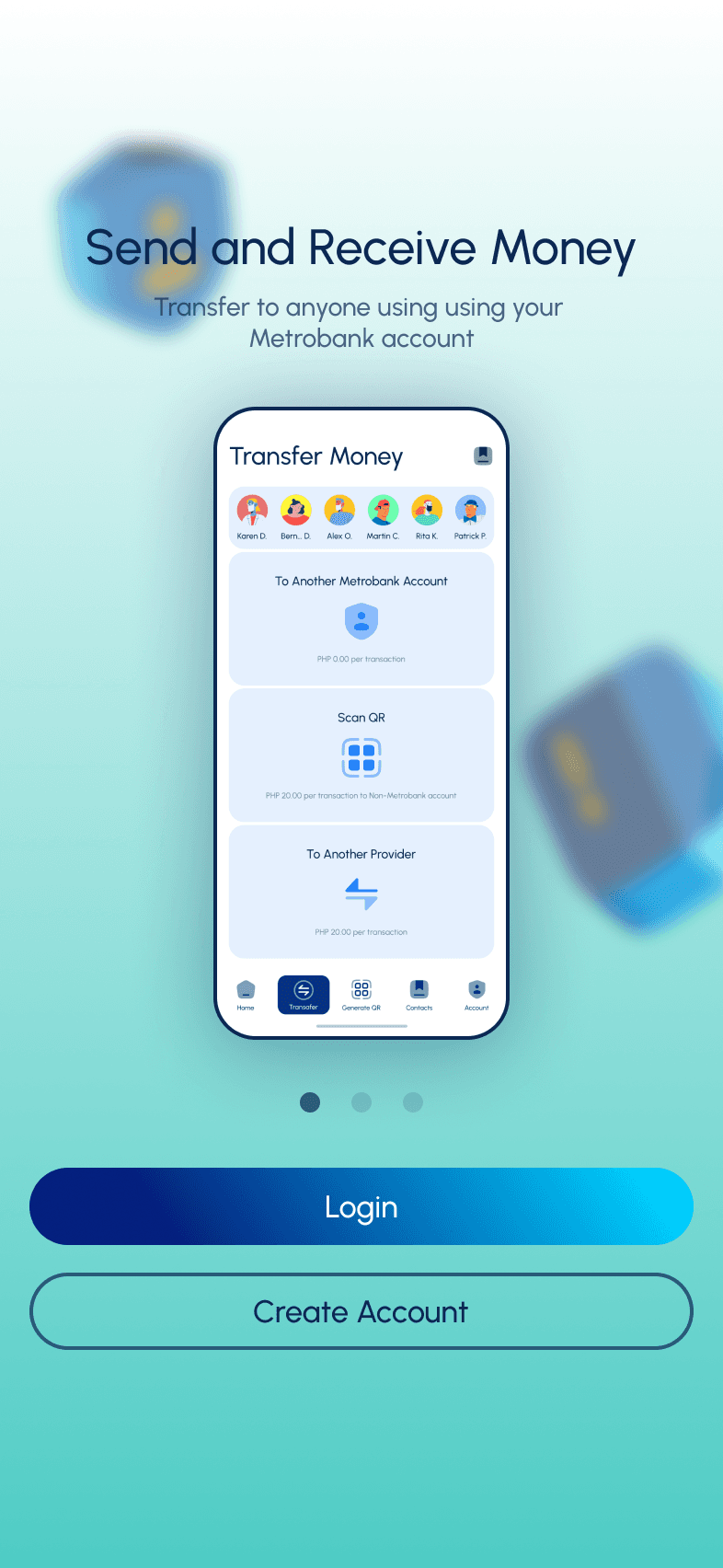
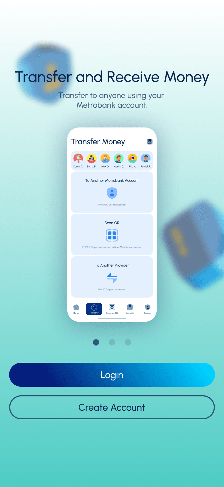
Receive Money (QR)
Send Money (QR)
Investment
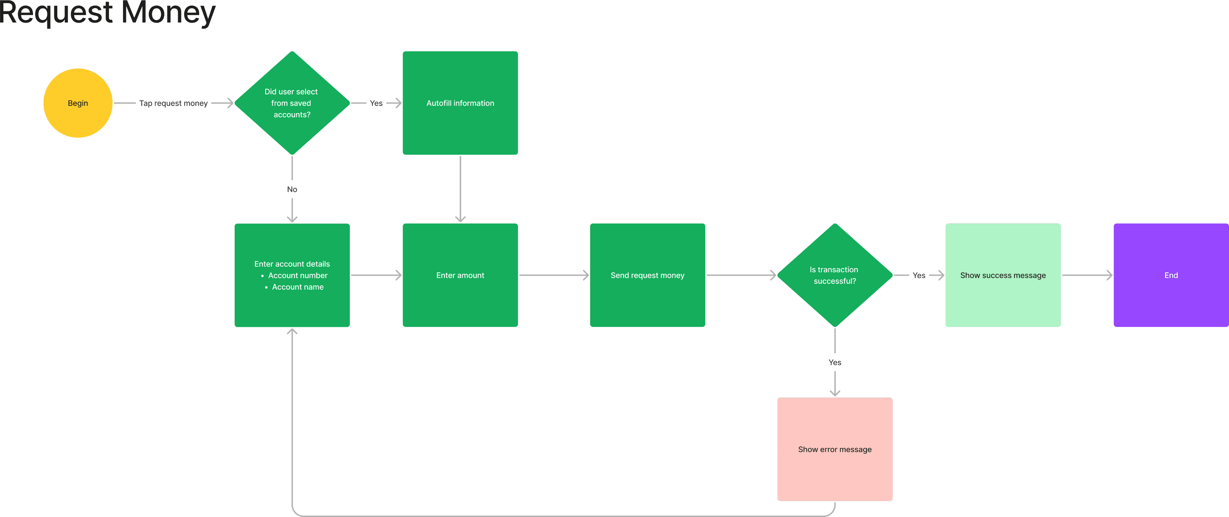
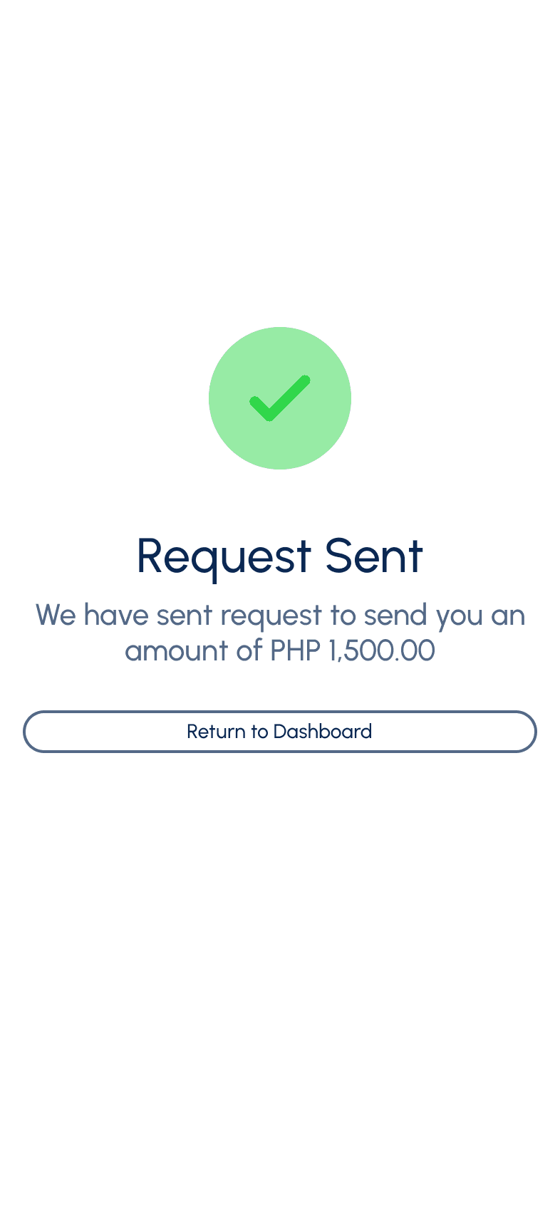
Request Money
The Challenge
Improve the usability of the their existing product
Add features that will make the app more valuable to it’s users
Add features that will capture new kind of user
Make the visual design updated and up against the competitions
Innovate and improve the flow of the product
Make better information architecture to help user easily achieve their goals
Discovery
Persona
Using personas helps empathize with users and understand their situation and point of view when using the product. This is helpful in improving the product and shaping it in a way that will resonate with them.

Maria Rodriguez, 32
Marketing Manager
•
Tech-savy
About
Maria Rodriguez is a marketing manager working for a multinational corporation in Manila, Philippines. She leads a busy lifestyle, juggling her demanding job, social activities, and personal interests. Maria is financially savvy and values convenience and efficiency in managing her finances.
Goals
I want to be able to pay my bills within the app
I want to make seamless transaction using QR code
I want to safely access my account using Biometrics
I want to be able to contact the bank in case of scam and fraudulent
I want to easily track my daily transactions
Pains
I want to immediate access my account without entering password and constantly tapping use of biometrics
I want to immediate access my account without entering password and constantly tapping use of Face ID
Upon entering the app, I feel that it could be improve by immediately going to screen that shows important data
“I need banking solutions that fit my fast-paced lifestyle and help me achieve my financial goals efficiently.”

Alvin Dela Rosa, 68, M (New User)
Retired Engineer
•
Technophobe
About
Alvin Dela Rosa, 68, M (New User) is a 68-year-old retiree living in Quezon City, Philippines. He has recently retired from a long career as a government employee and now enjoys spending time with his family and pursuing his hobbies. Mr. Dela Rosa is traditional in his banking preferences but is open to embracing new technologies if they are easy to use and offer convenience.
Goals
I want to make investment using the app
I want to make make it easy to pay purchases
I want to easily transfer money to another bank account
I want to easily find the people I often make transaction to
I have to get notifcation if I receive my pension using notification
Pains
Apps is difficult to use because texts are not legible
Most apps offer too much, I am looking for the basic essential tools that will make my transaction fast
“I prefer banking solutions that are simple, reliable, and easy to use. It's important for me to feel confident and secure in managing my finances, especially during my retirement years.”
User Stories
Listing all the user stories or features that are expecting to see in the product.
Story
Solutions
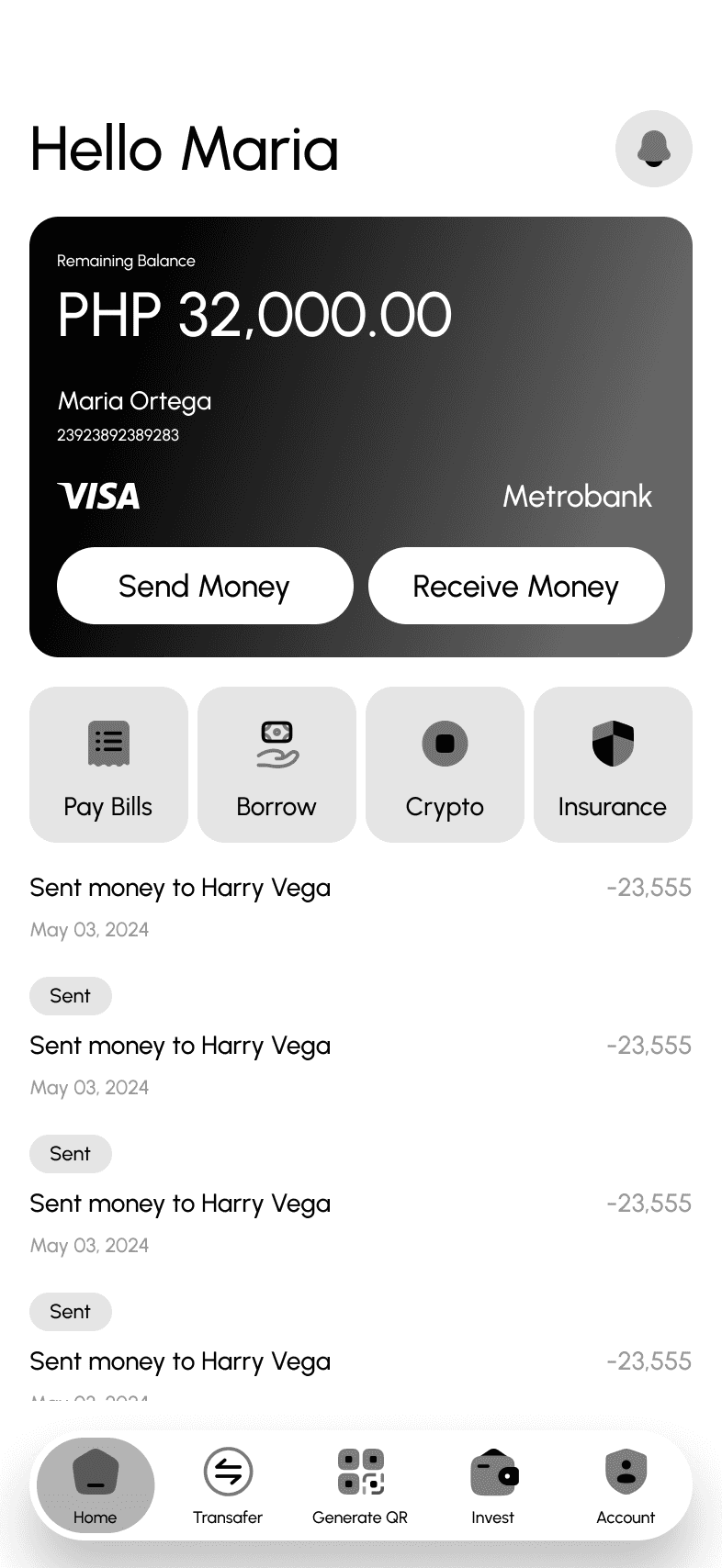
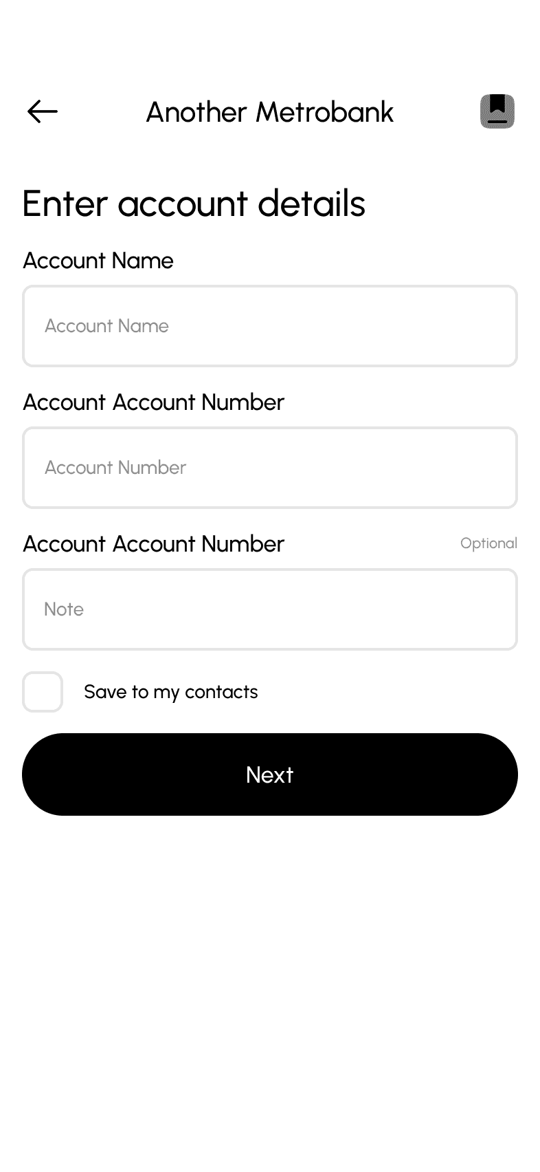
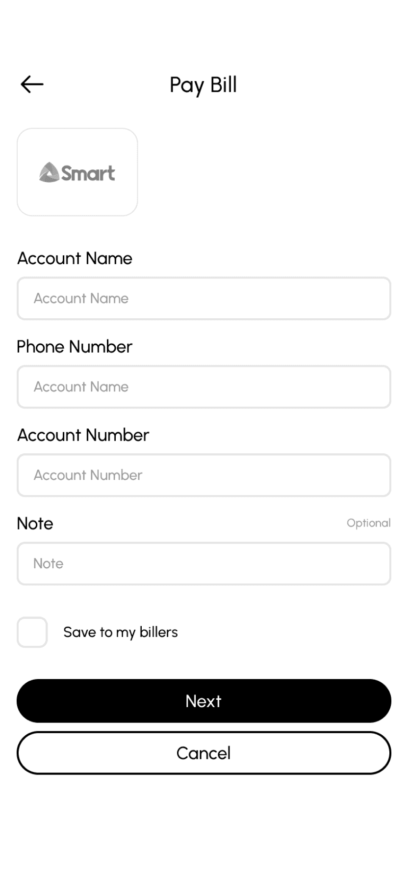
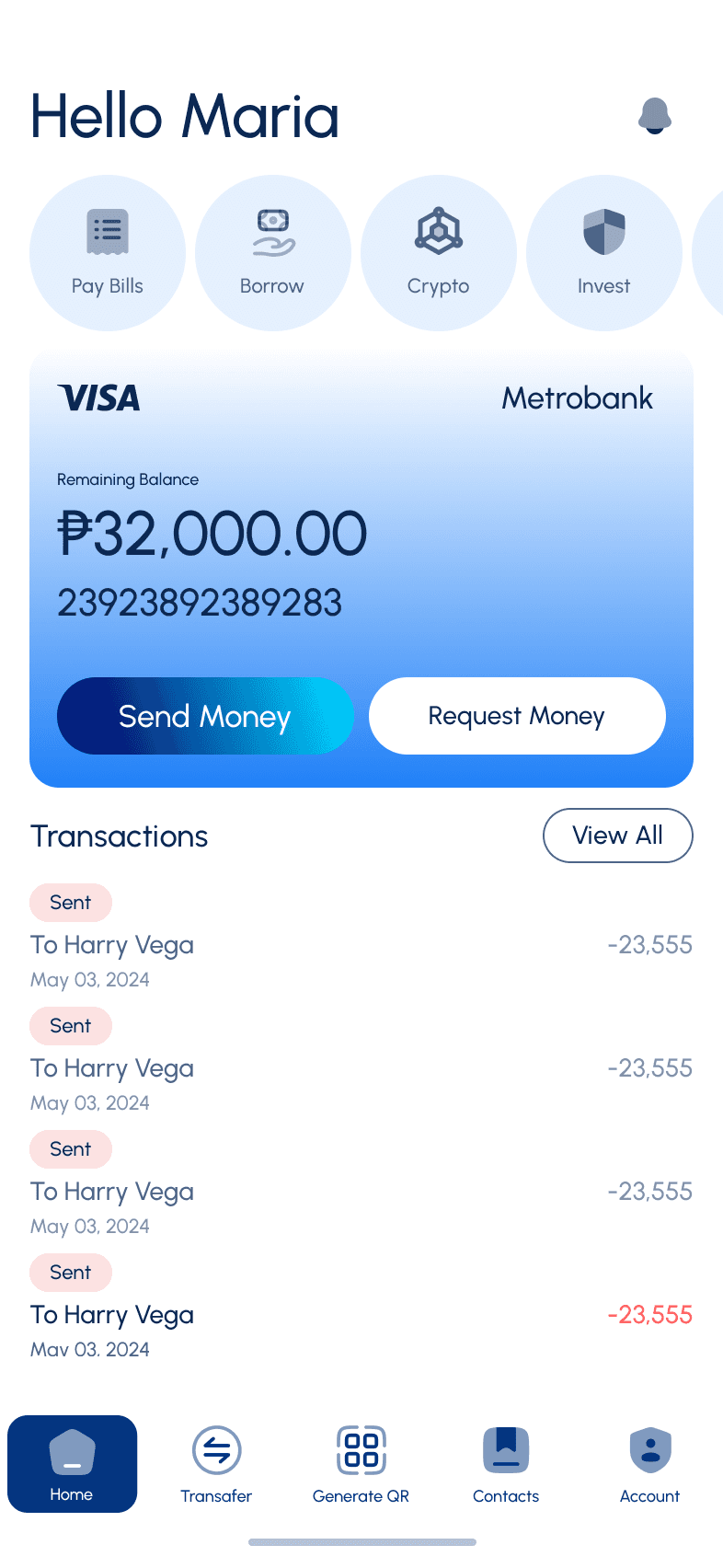
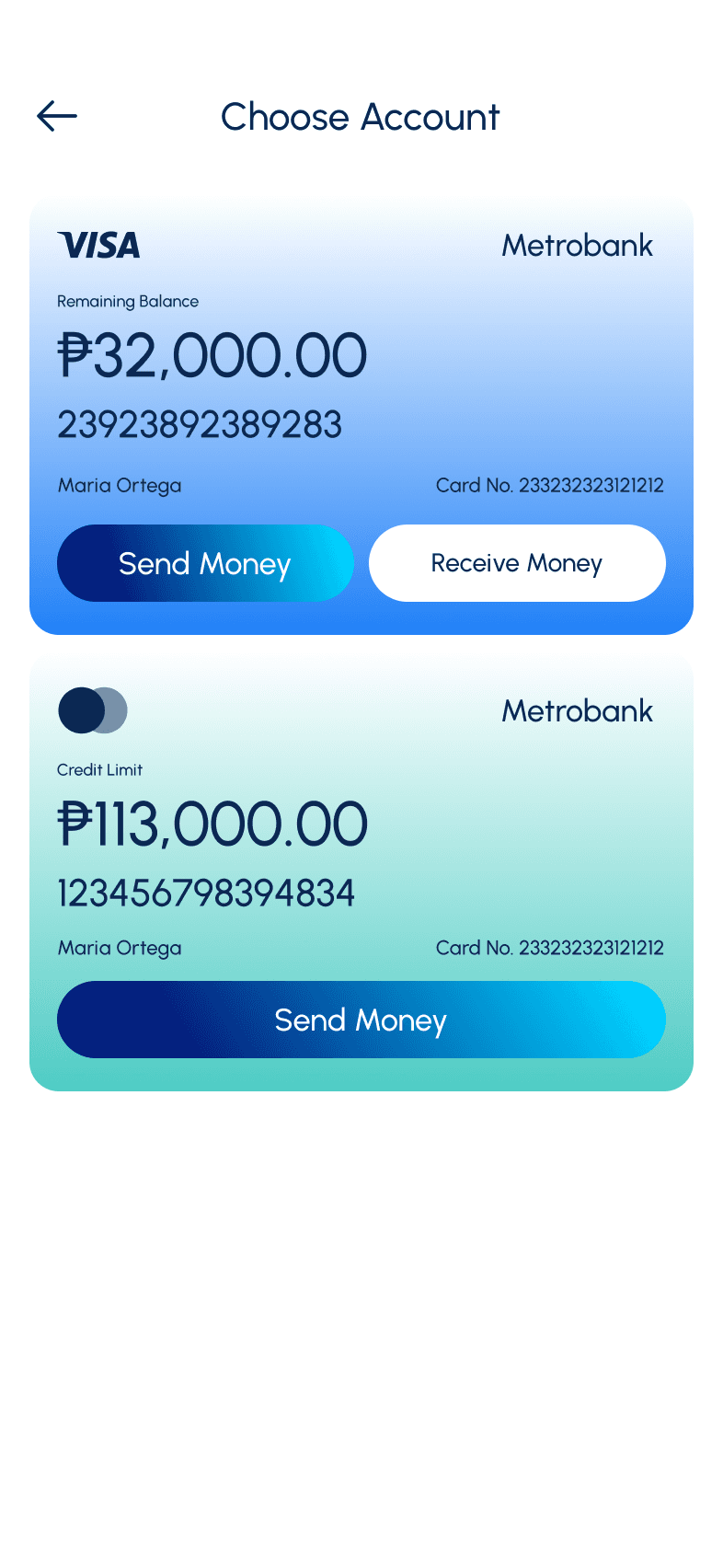
I want to be able to pay my bills within the app so I don’t have to use other apps to do it
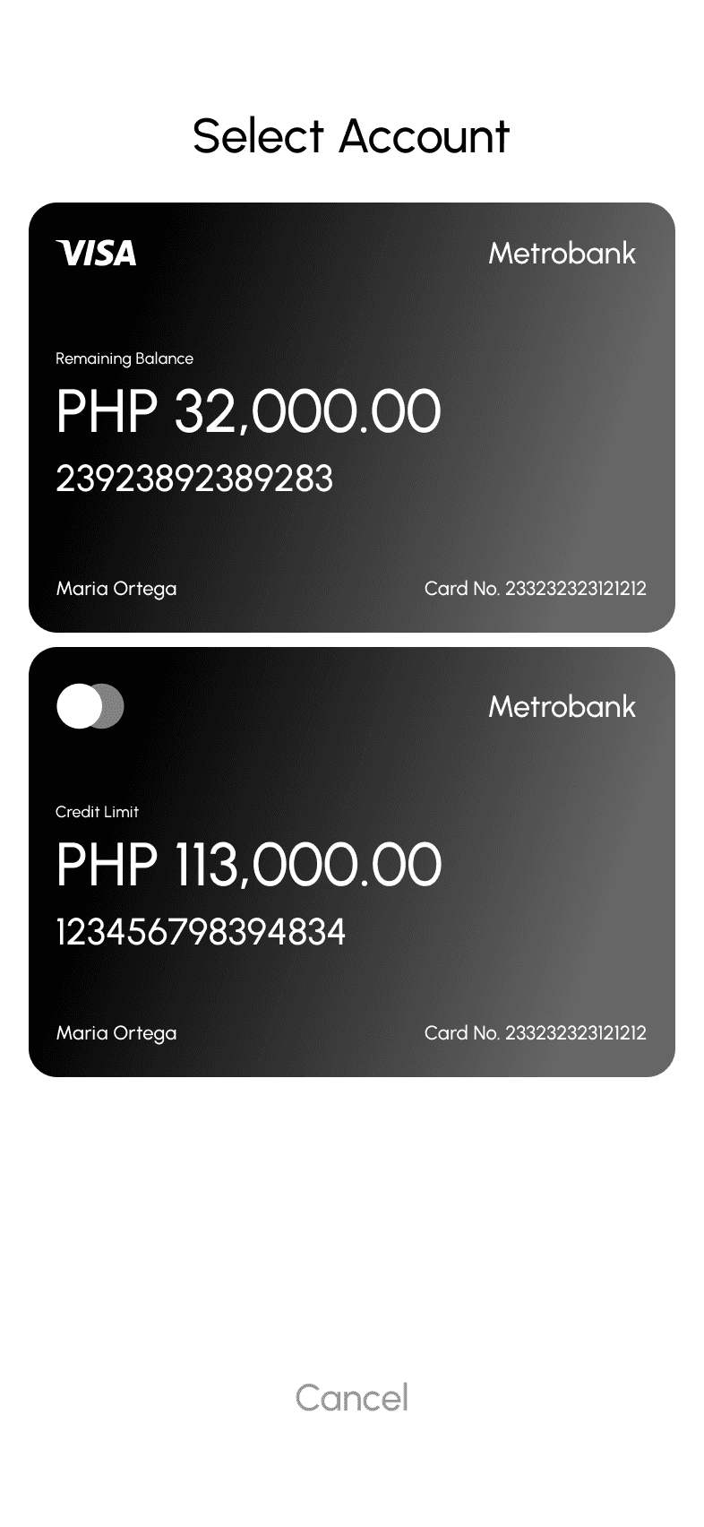
Show account balance on top area
Add their name and account number
Maybe show also their last previous transaction
I want to see my credit card outstanding balance so I know if there is an amount that I have to this month
Show on homescreen their outstanding balance
Perhaps show aswell their current limit
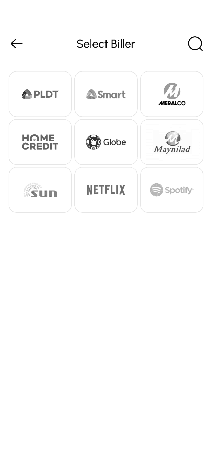
I want to be able to pay my bills within the app so that I don’t have to use other banking apps or go to payment centers
Add pay bills
Give user option to save a billers they often make transaction to\
Maybe add notification if they have to pay a biller on specific day
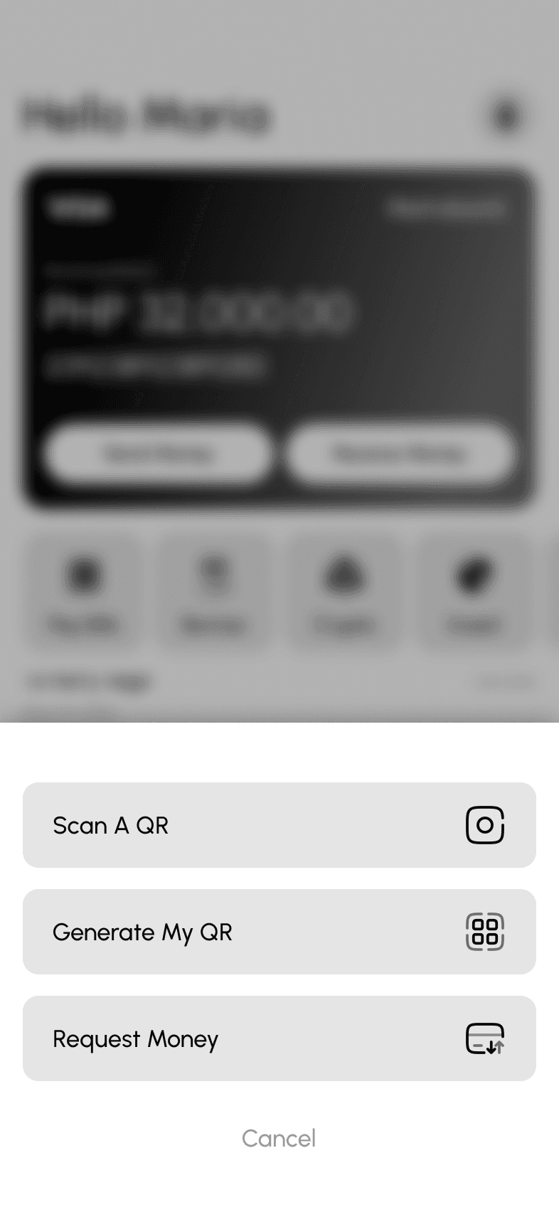
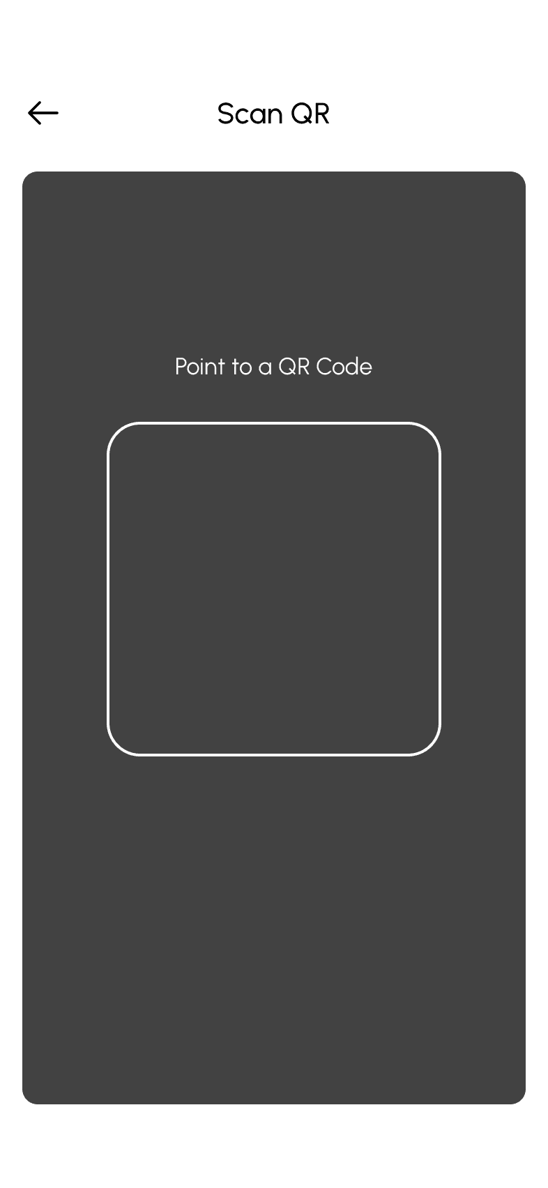
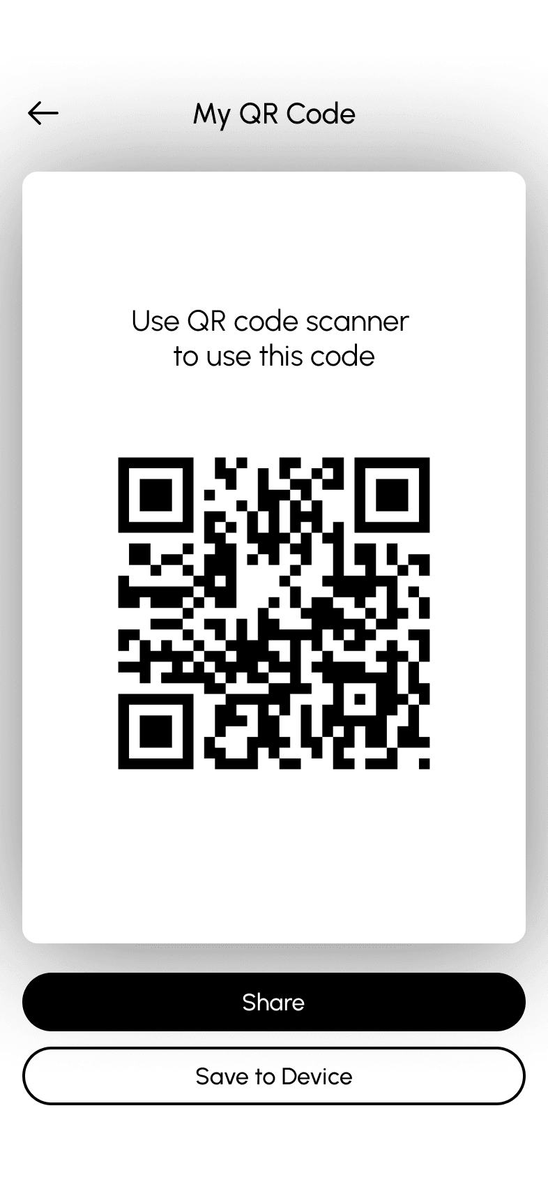
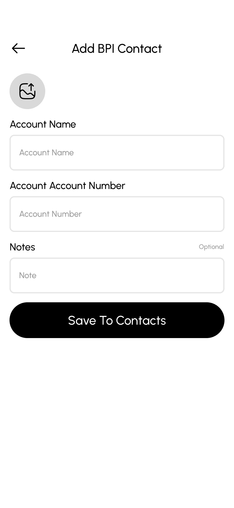
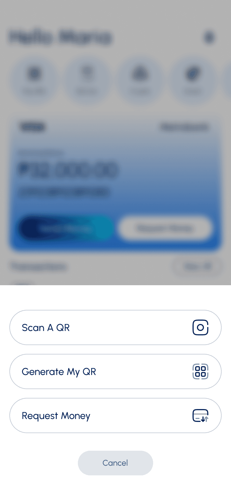
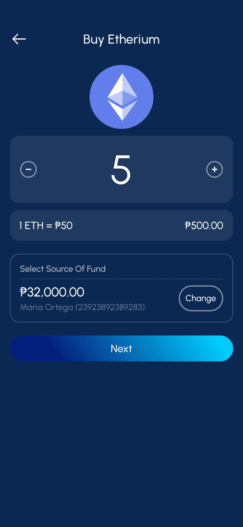
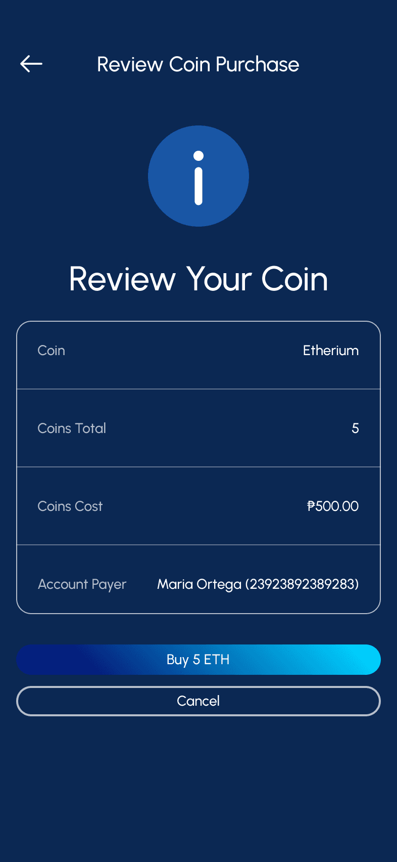
I want to make seamless transaction using QR code so I don’t have to share my account number
Allow to receive or send money using QR Code
Add scanner when sending money using QR
Allow to import a QR if they don’t want to use their camera
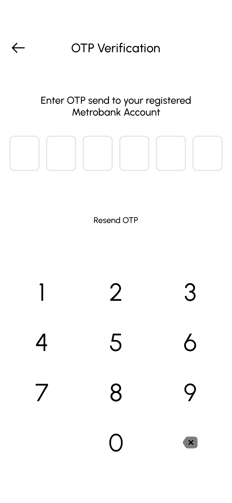
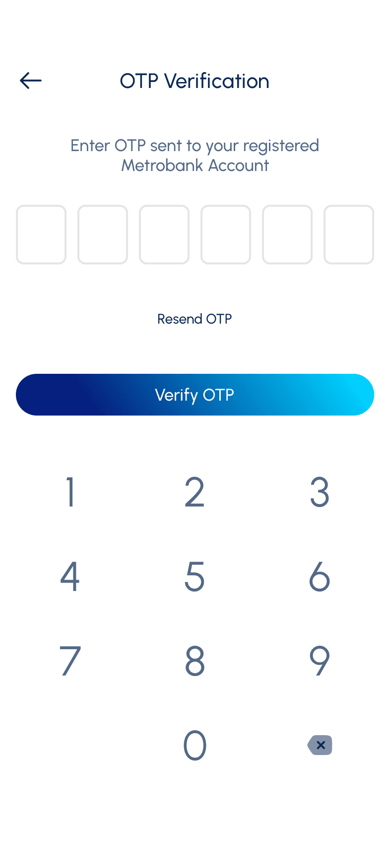
I want to immediately access my account without entering password and constantly tapping use of biometrics
Send OTP to phone number
Give option to set their Biometrics
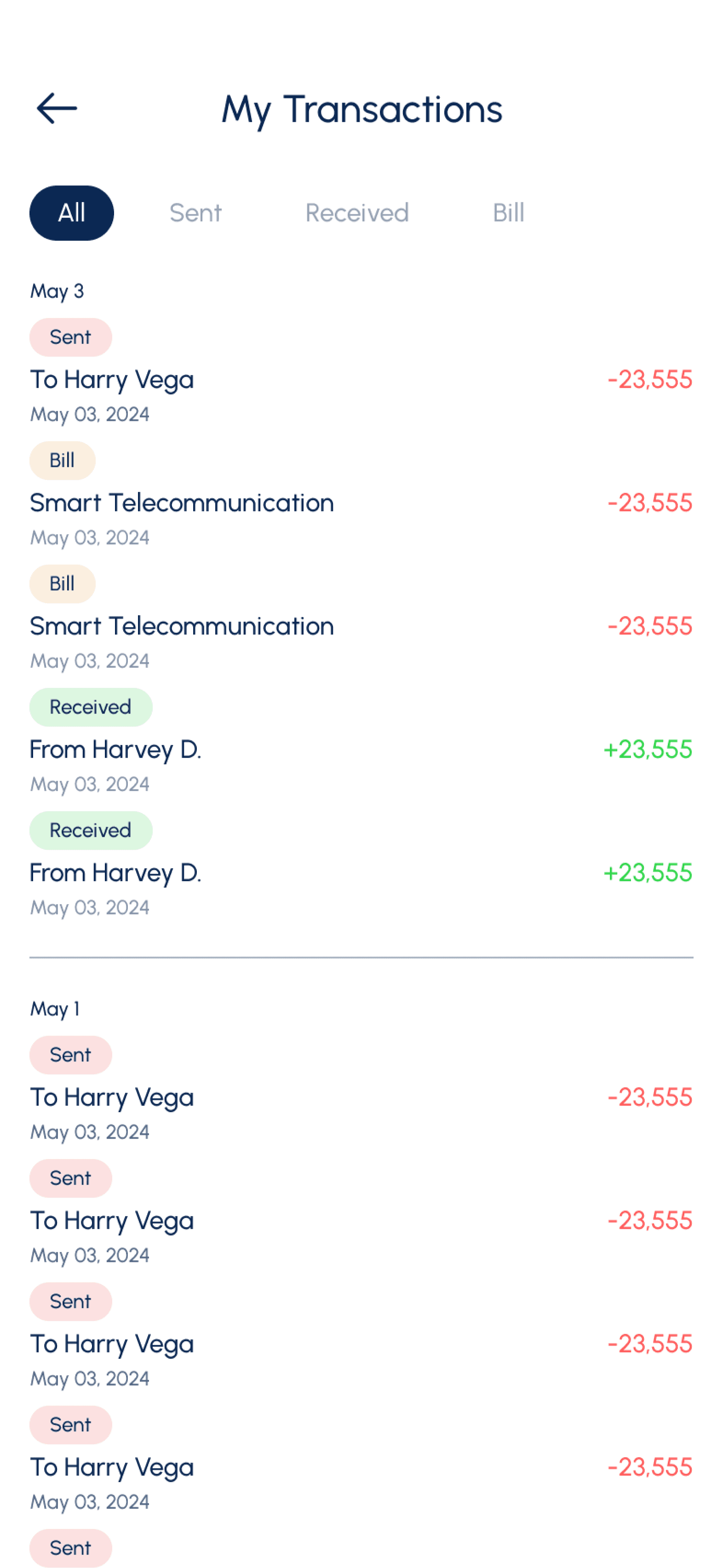
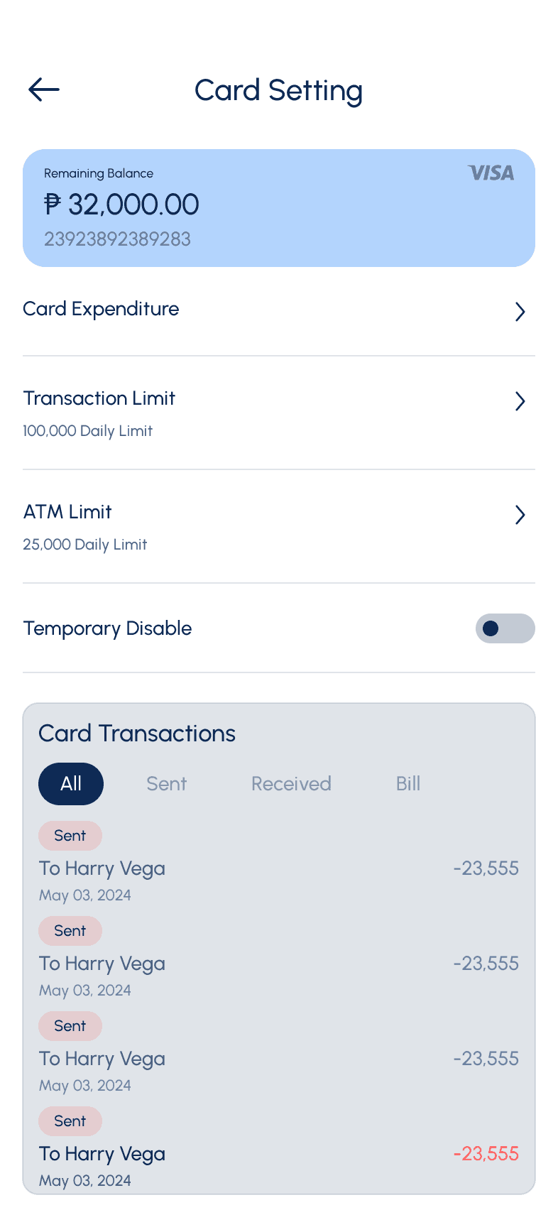
I want to easily track my daily transactions so I can view expenditure today
Add transaction screen
List all the transactions done for today
Allow user to filter based of specific date range
Give them option to down the transaction history
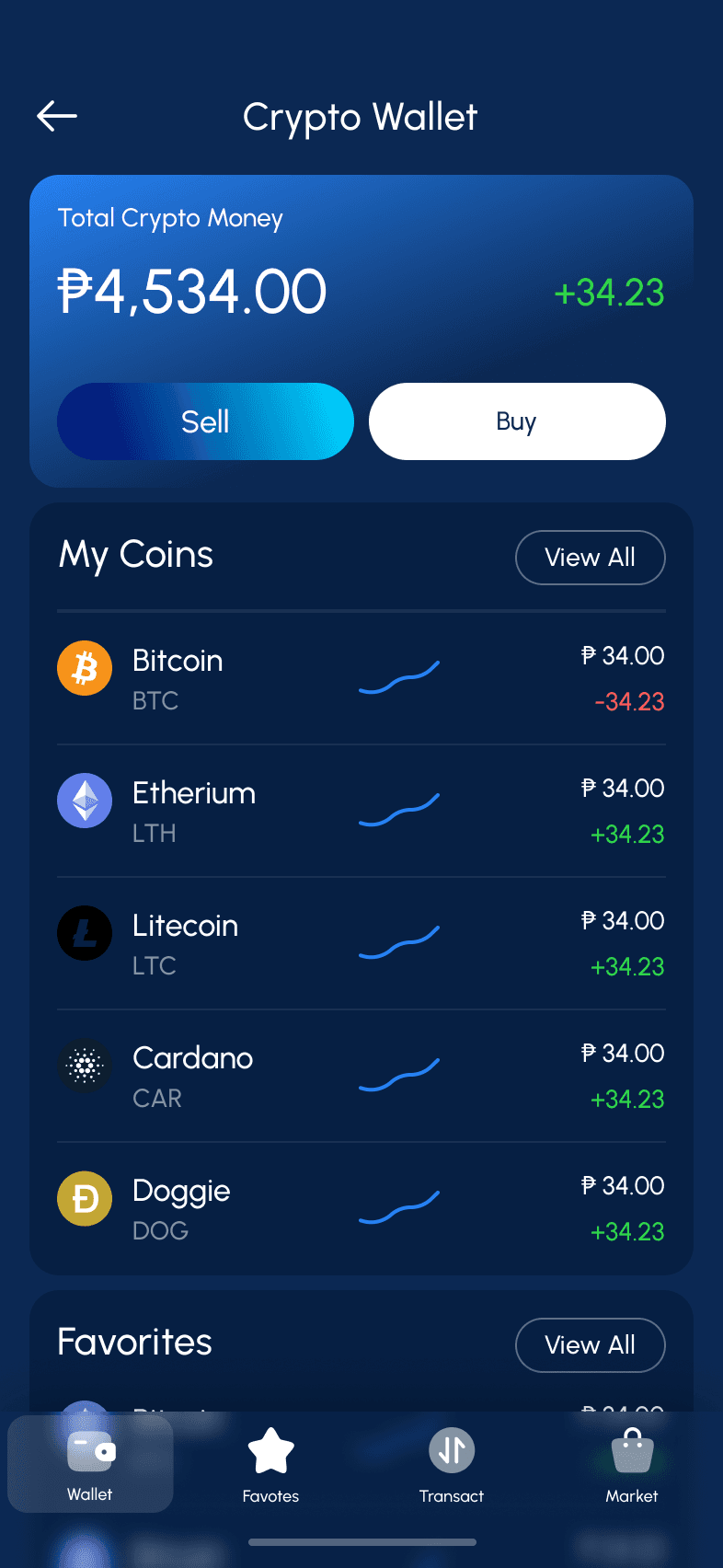
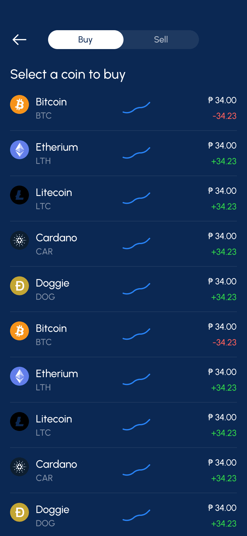
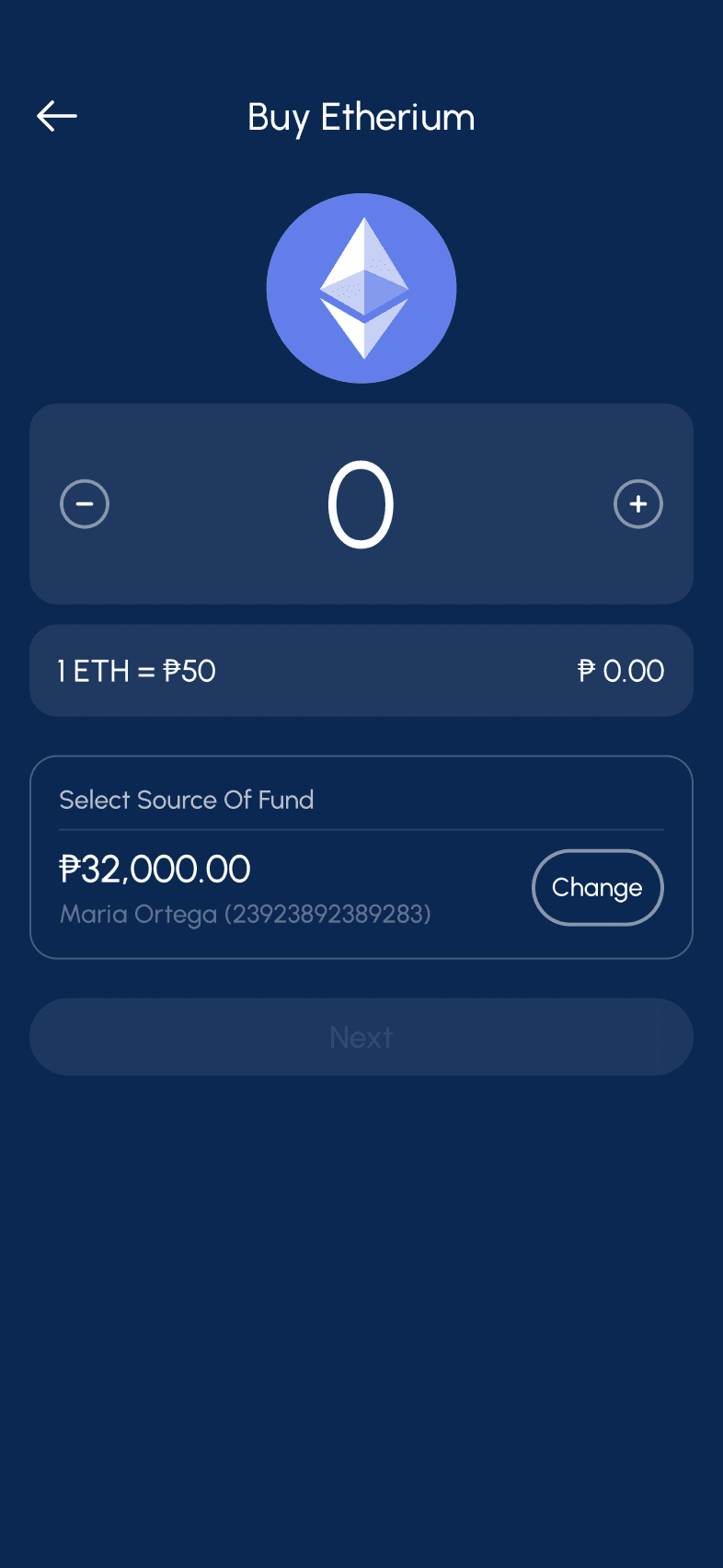
I want to do trading such as stocks and crypto currency
Add transaction screen
List all the transactions done for today
Allow user to filter based of specific date range
Give them option to down the transaction history
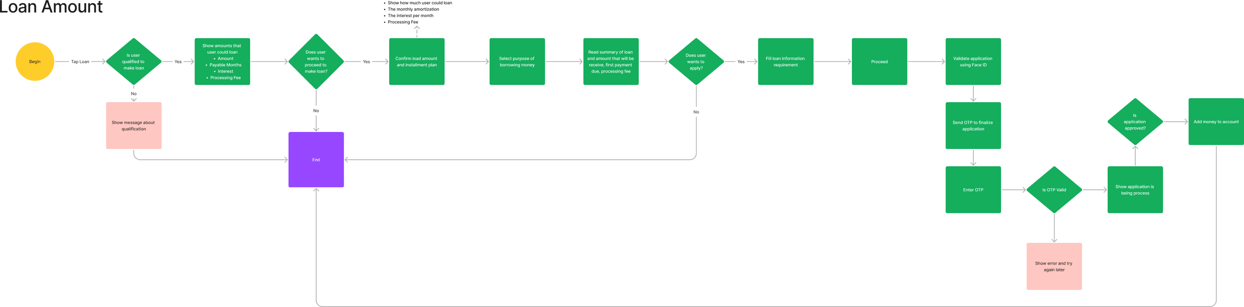
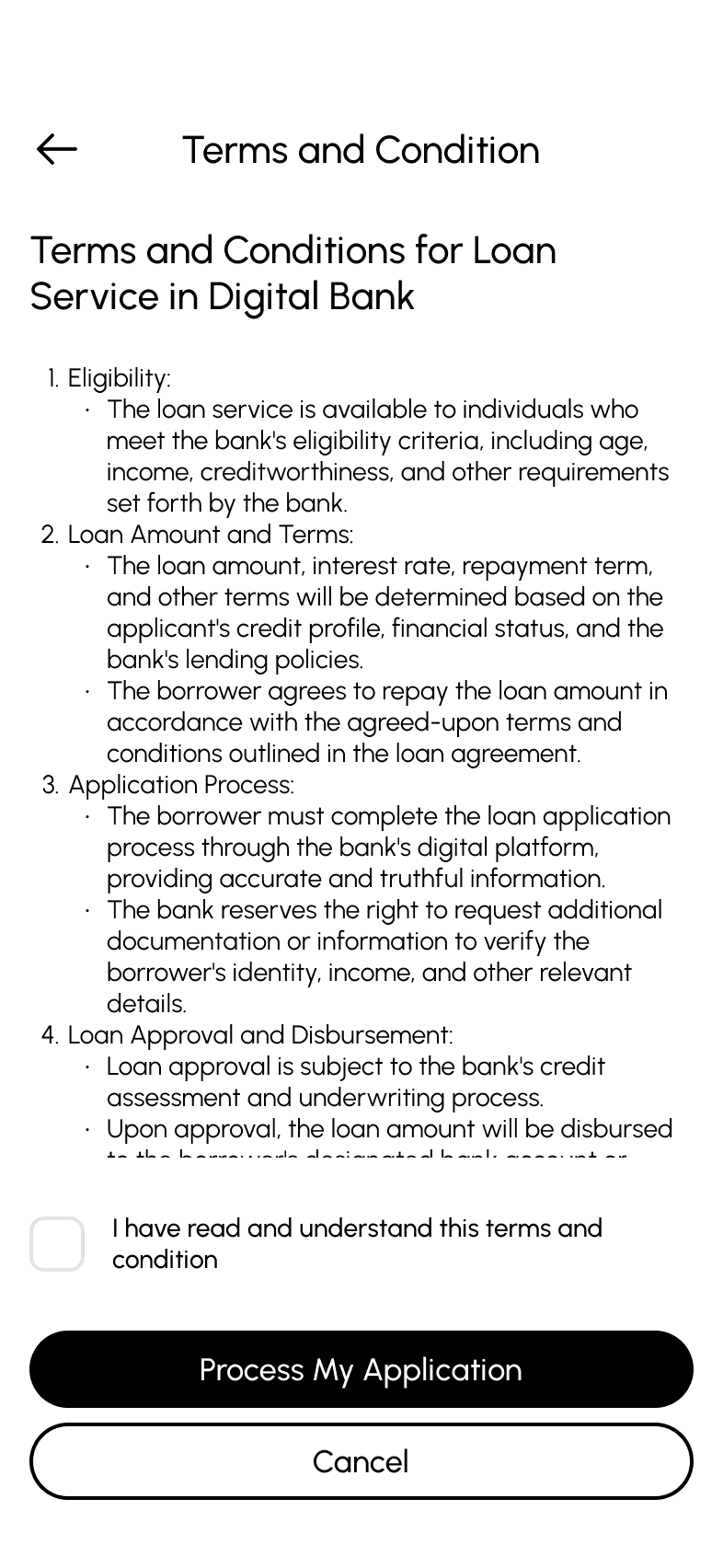
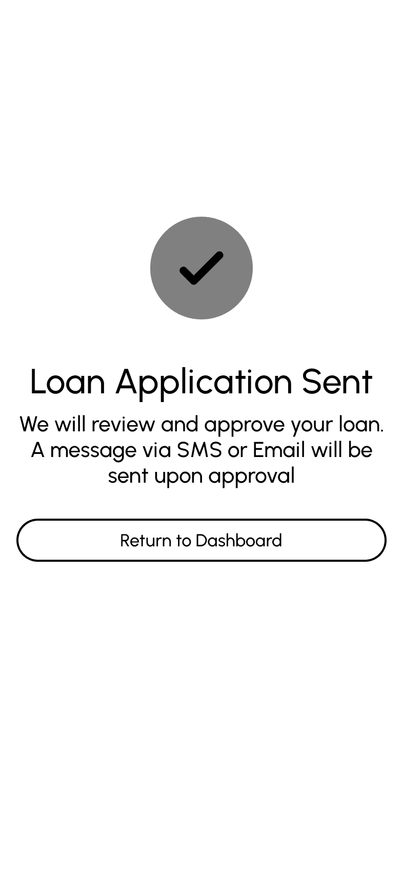
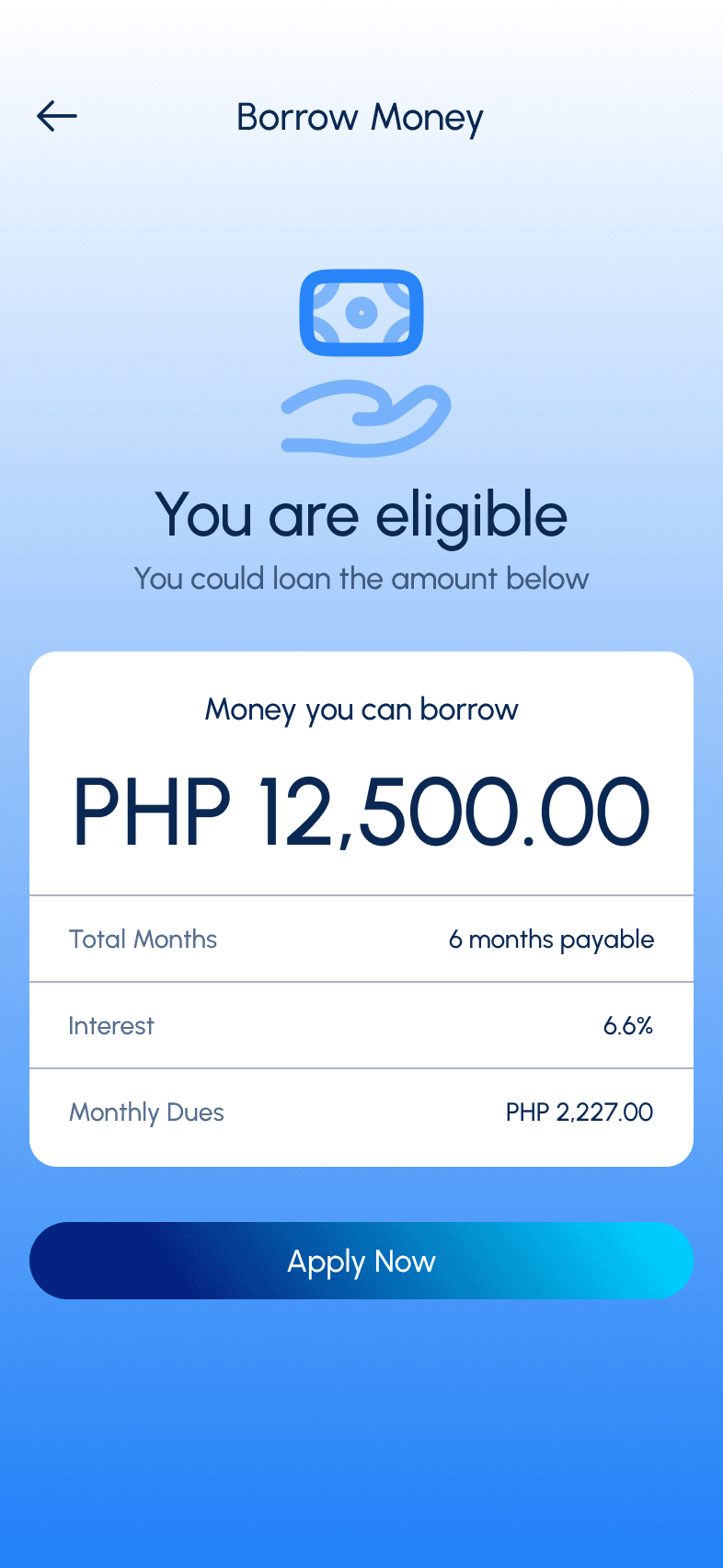
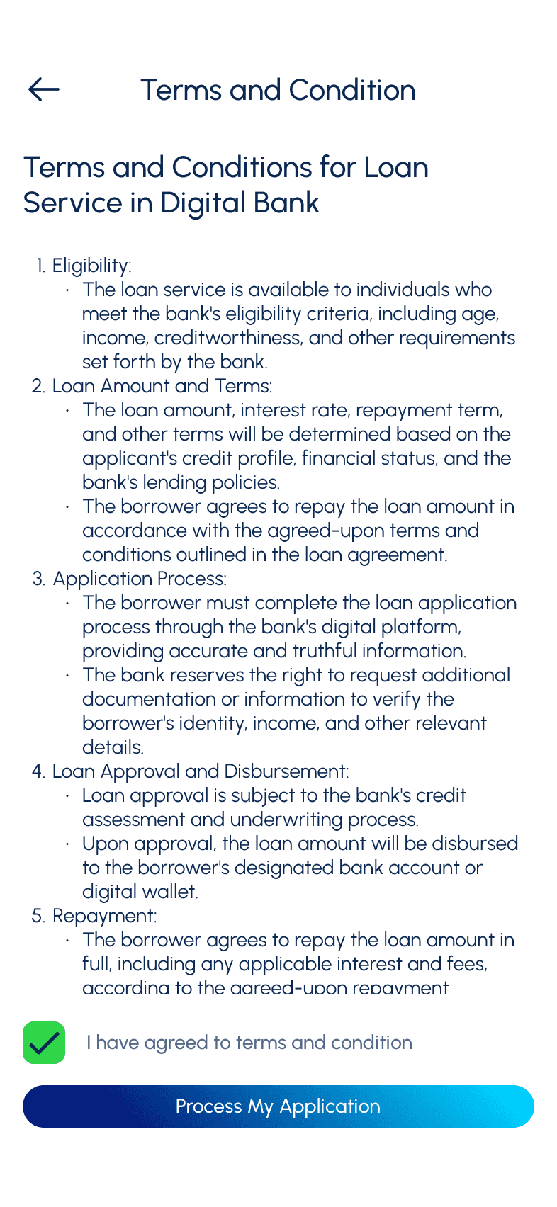
I want to make loan so I could borrow money immediately in case of emergency
Add transaction screen
List all the transactions done for today
Allow user to filter based of specific date range
Give them option to down the transaction history
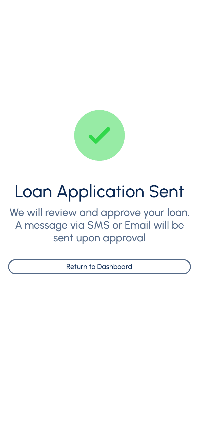
I want to get notified when I there is transaction in my account so I can immediately see if someone hacked my account
Give notification setting
Give them option to get notification via SMS, Email or directly on their phone
Content Sorting
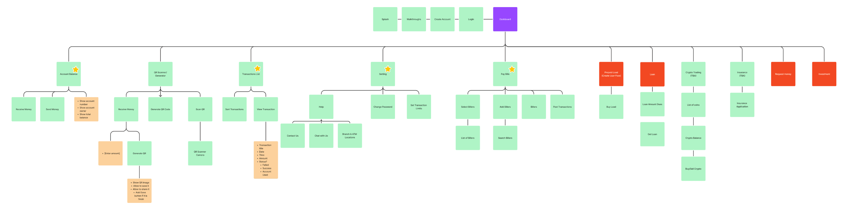
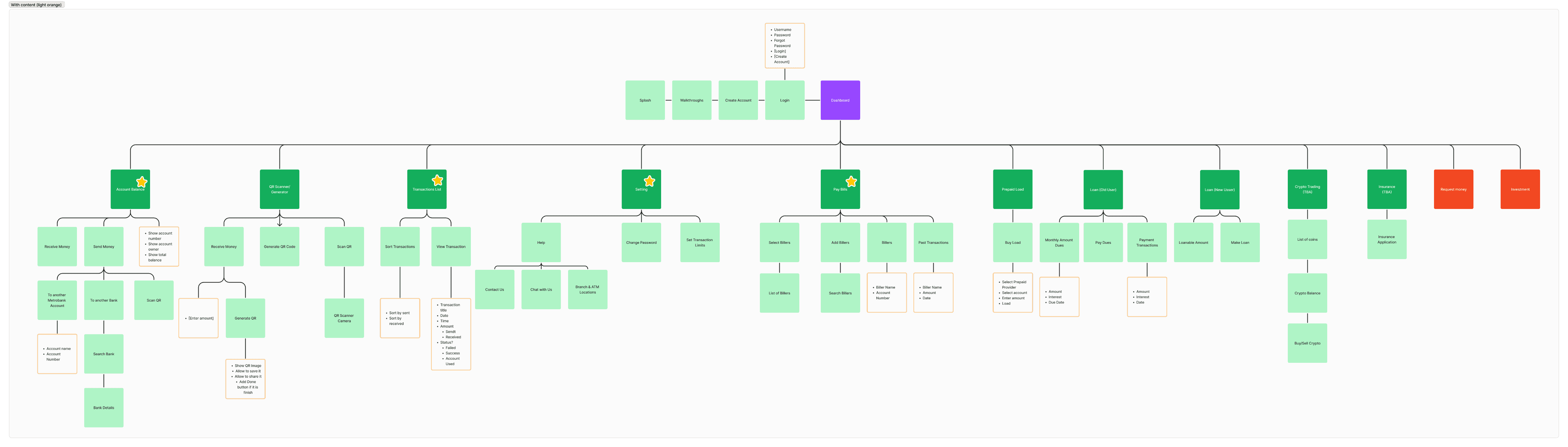
During this phase, the team start by listing all the potential screens and content gathered from research, and later organize them into a set of screens. The team then sorts and organizes all the content, turning it into the information architecture of the product.
After listing all screen drafts, the team would organize them by grouping into categories, understanding the priorities, and refining until the information makes sense.
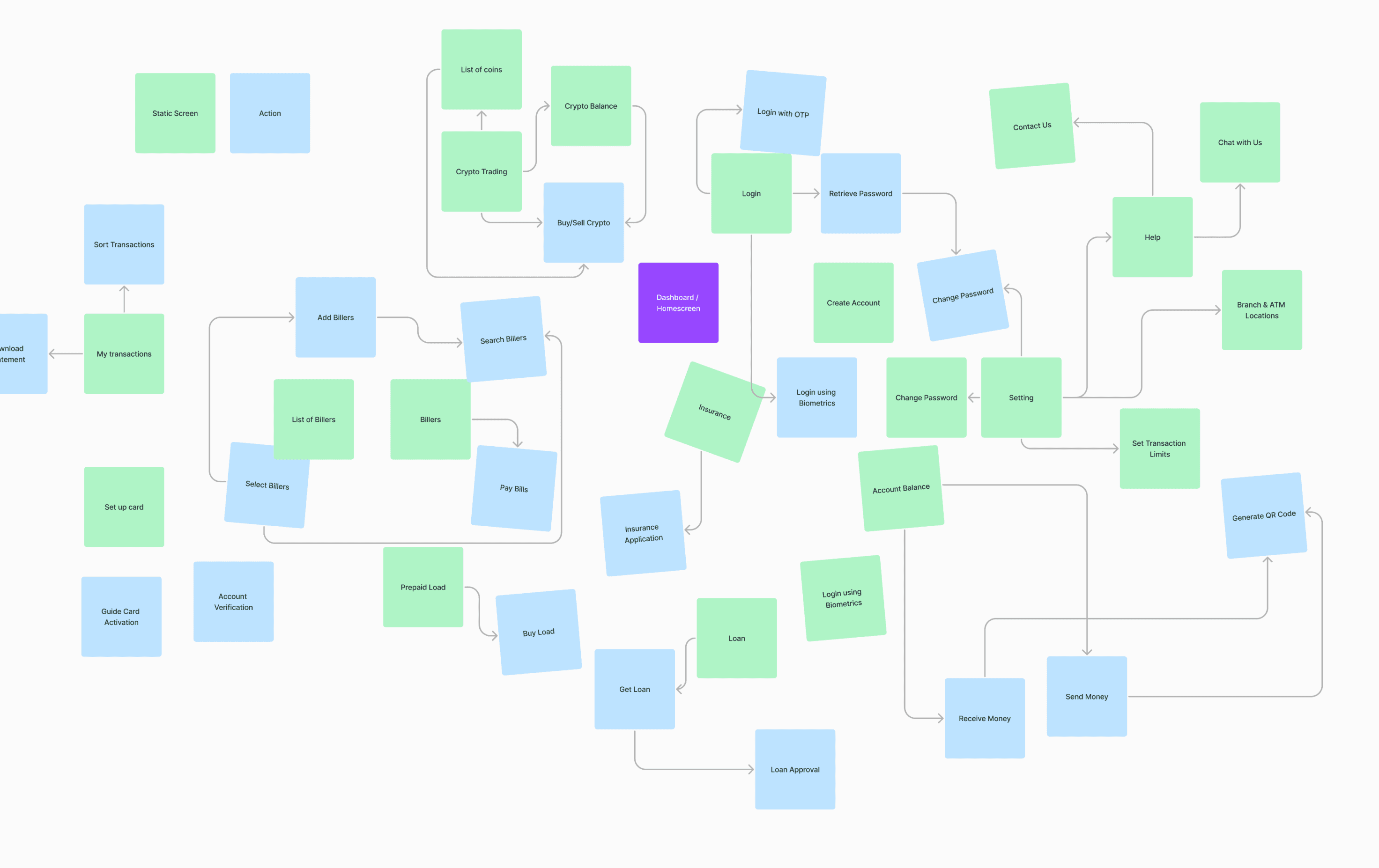
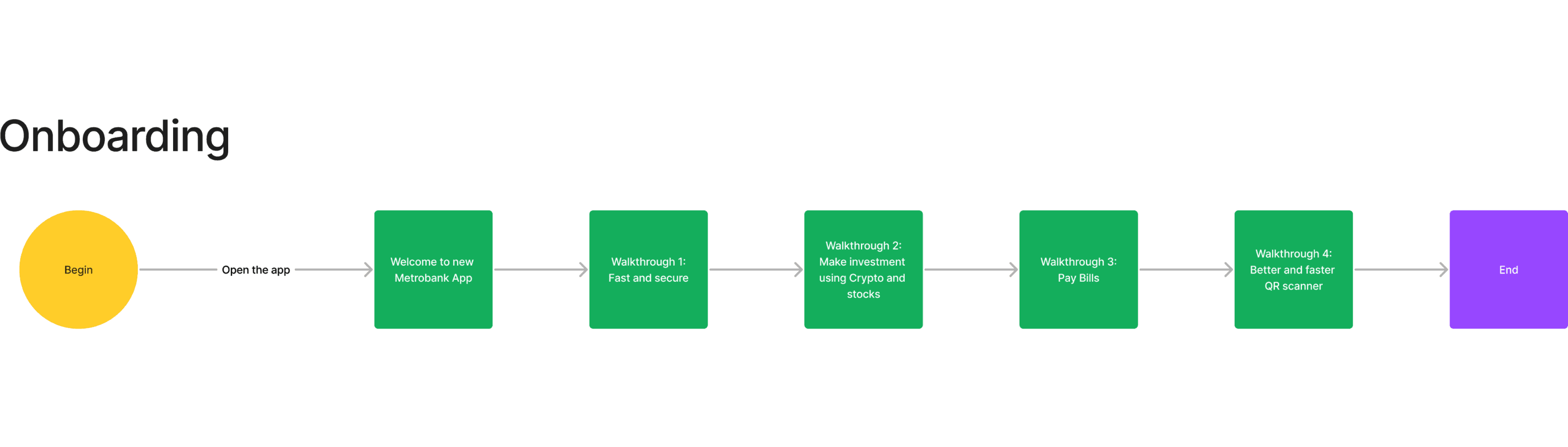
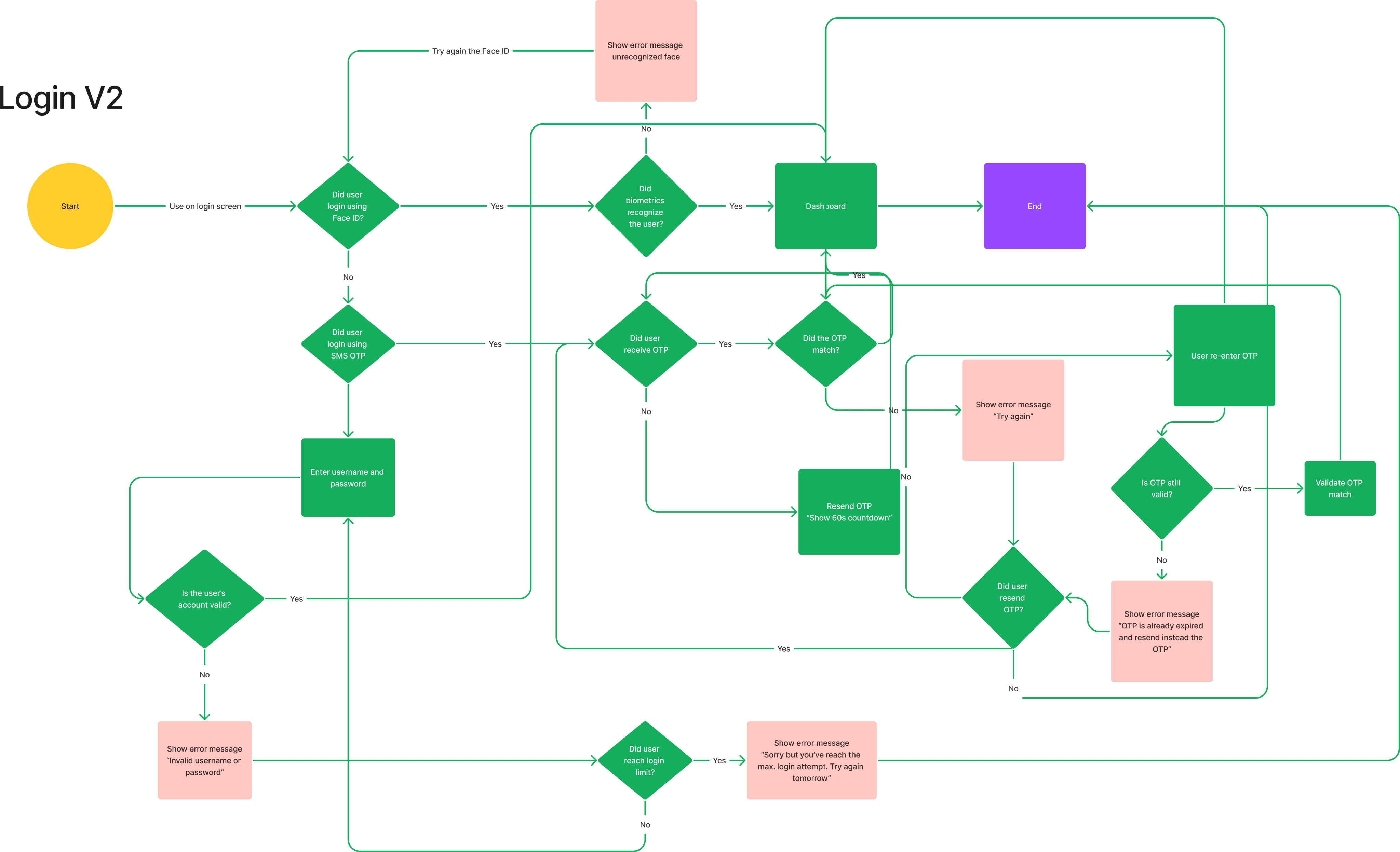
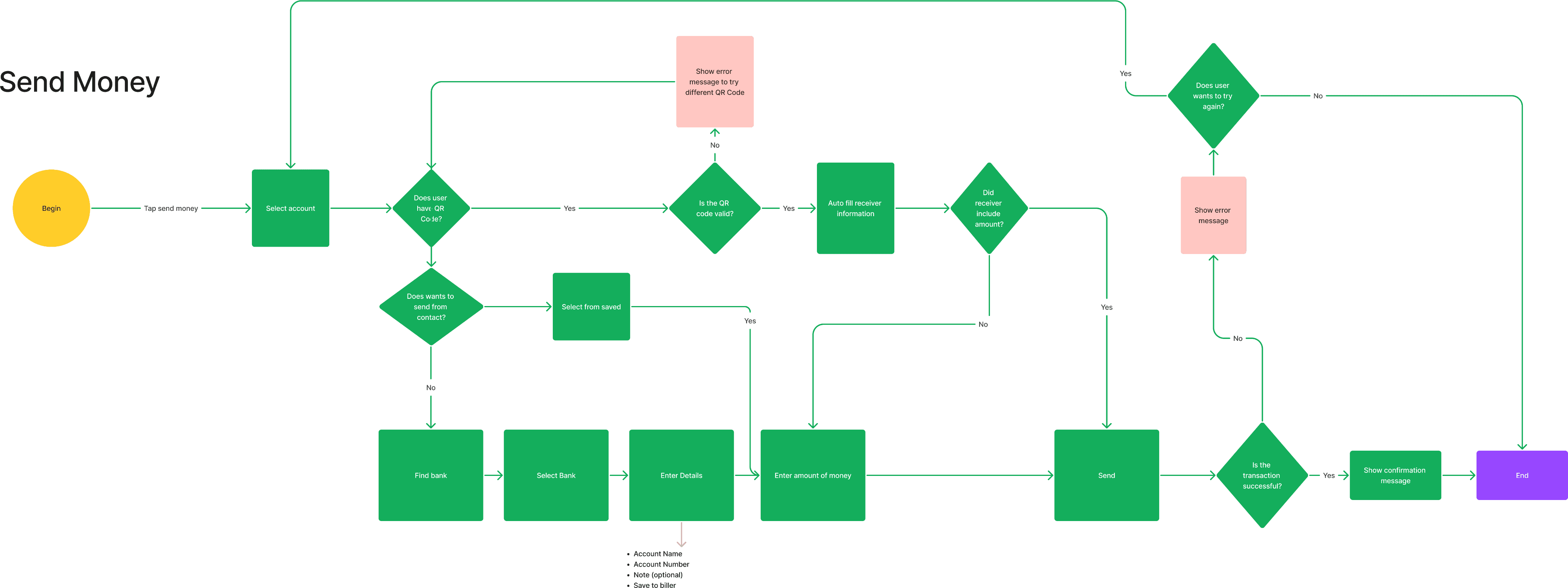
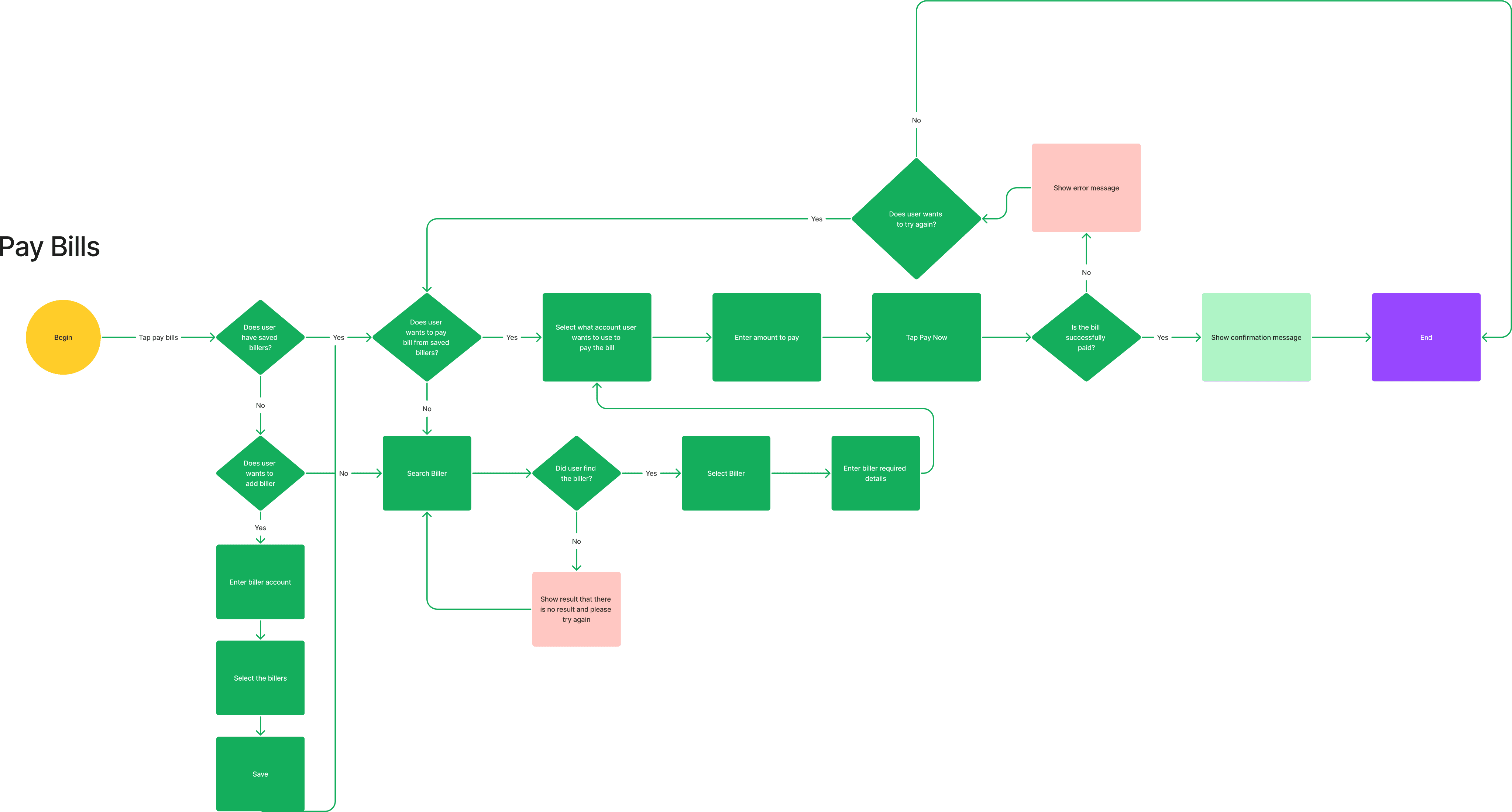
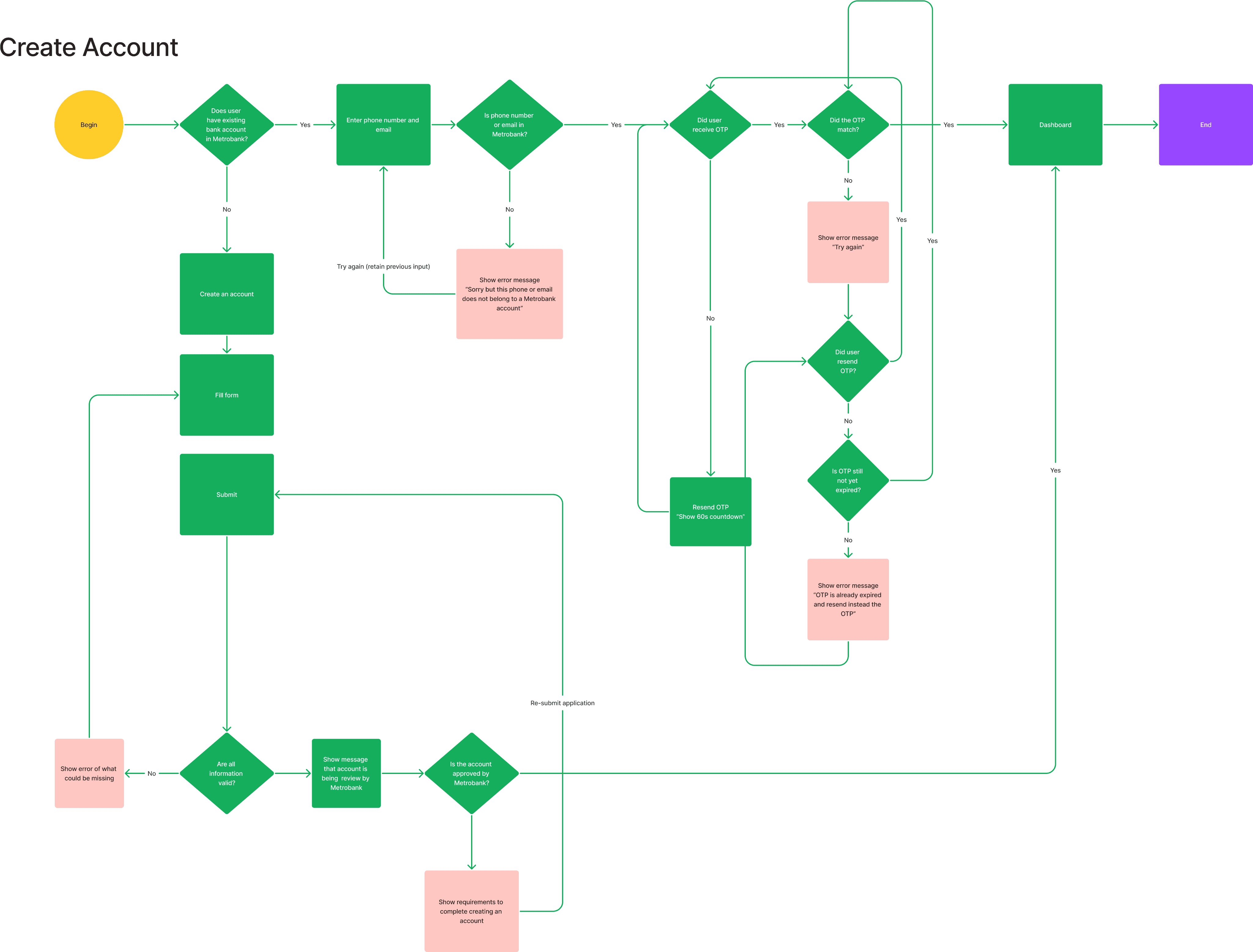
User Flows
Team would create the flow essential interactions that user would be doing frequently when using the app.
UI Patterns
UI patterns are based on user mental models. Curating UI patterns from the same industry enhances usability, ensuring that the design we create follows familiar patterns for users. This is particularly helpful once wireframing begins.
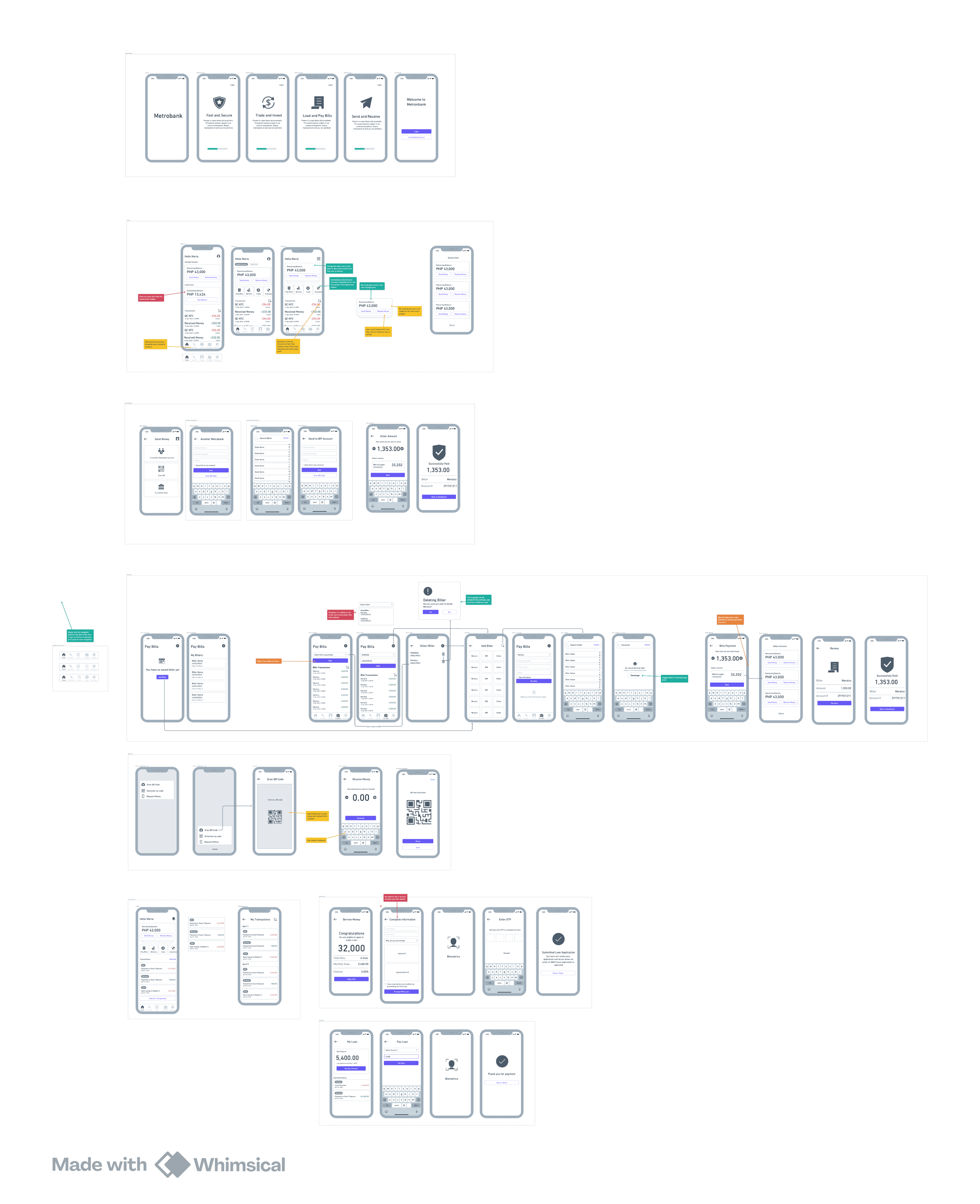
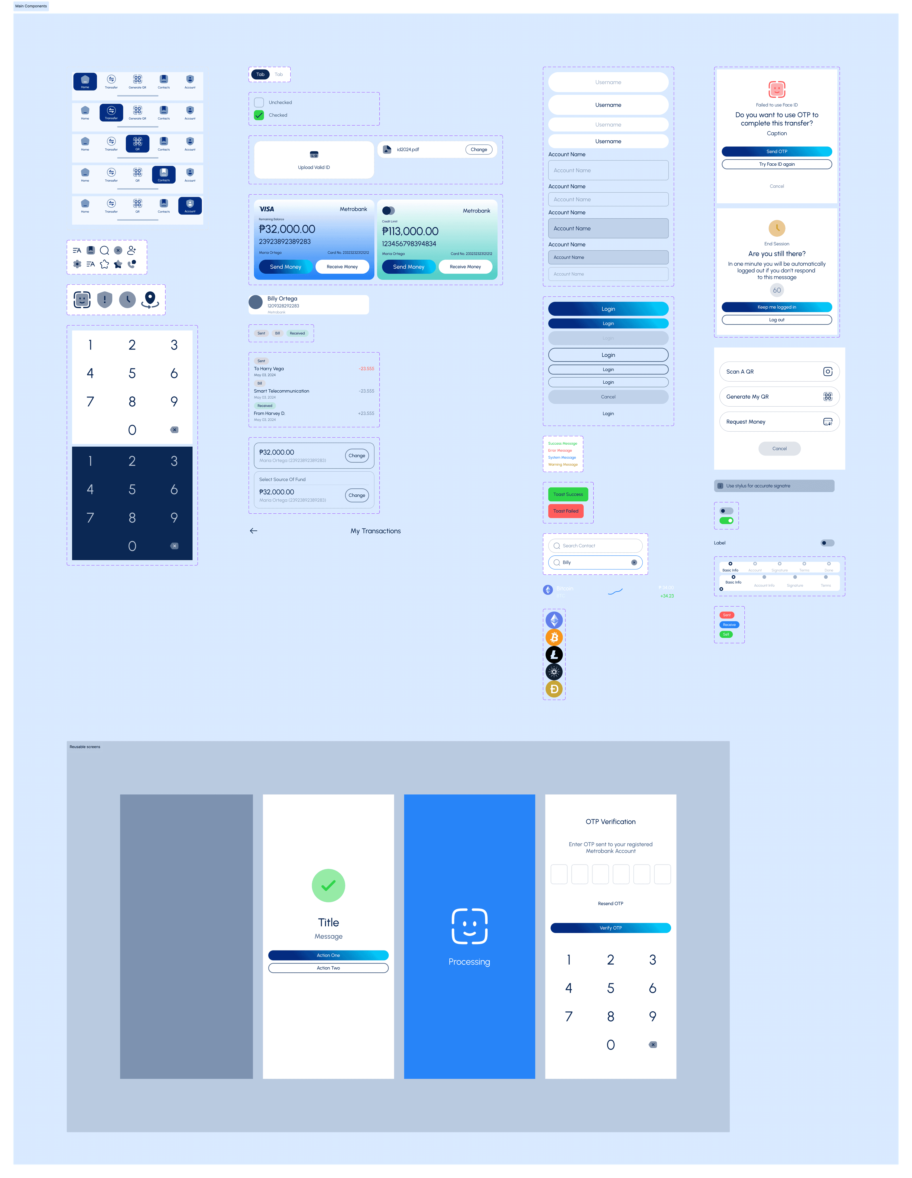
Lo-Fi Wireframes
Lo-fi wireframes are more like an exploration of possible versions of layouts per screen. They are supposed to be straightforward and use tools that won’t distract the team with visual design elements. Doing this helps the team design UI based on interaction rather than visual aspects, which is something addressed in another phase
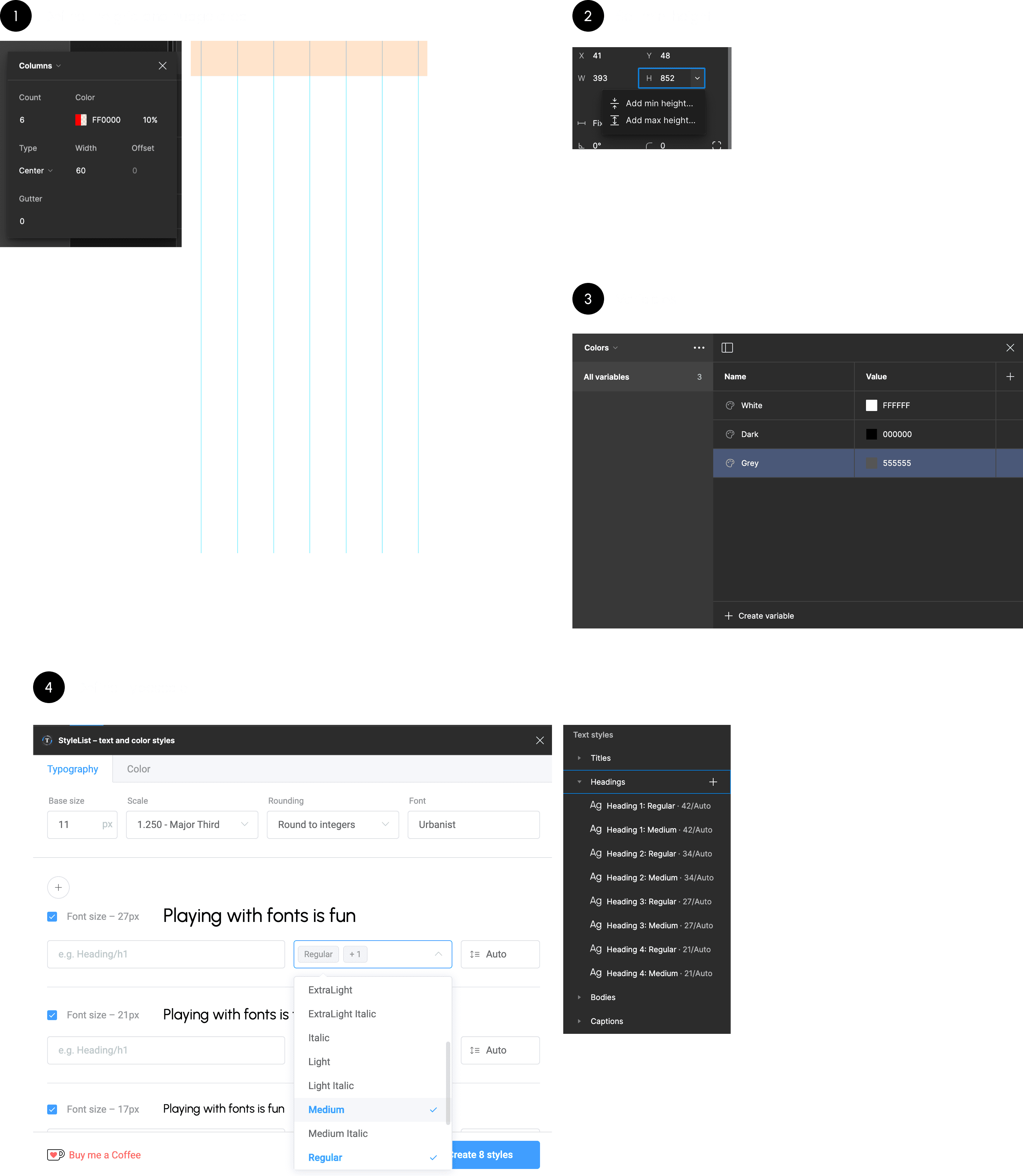
Project Set-up
Preparing to convert Lo-Fi to Hi-Fi wireframes involves setting up the Figma file to facilitate working with design elements such as typography, variables, autolayout, and grid.
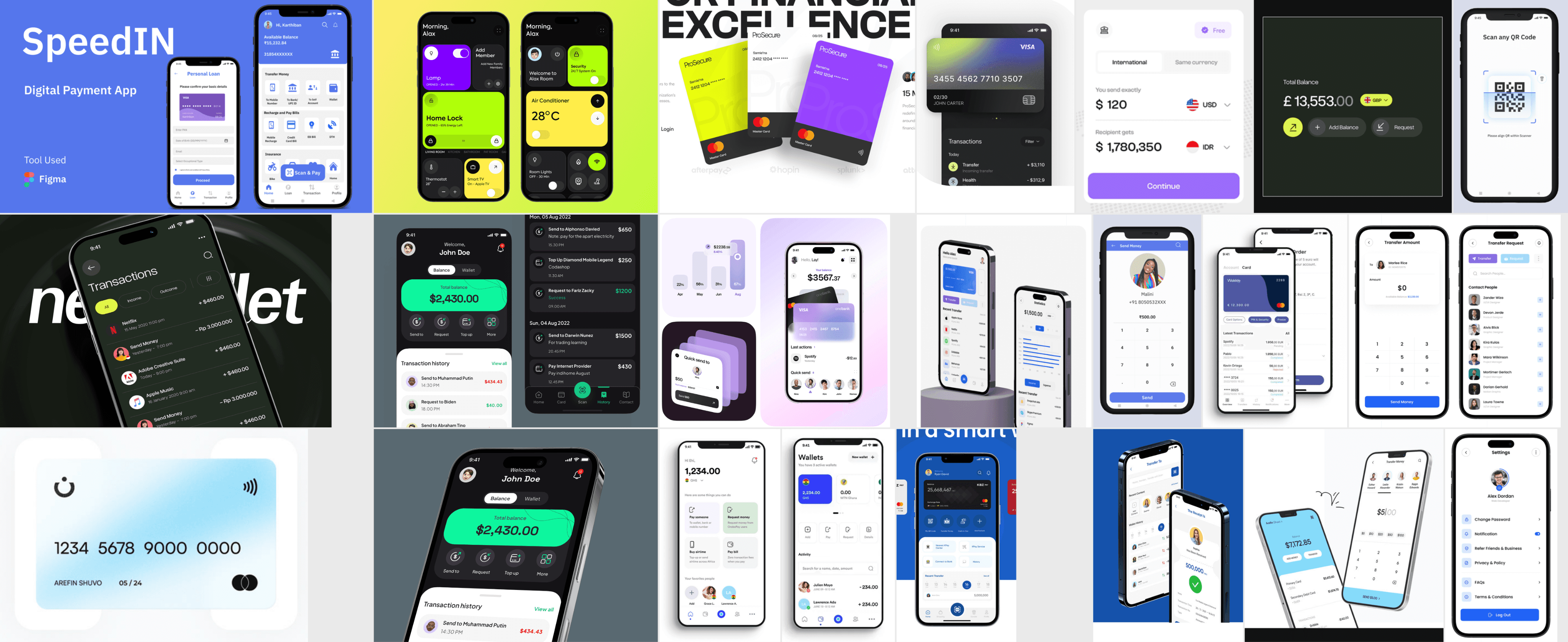
Hi-Fi Wireframes
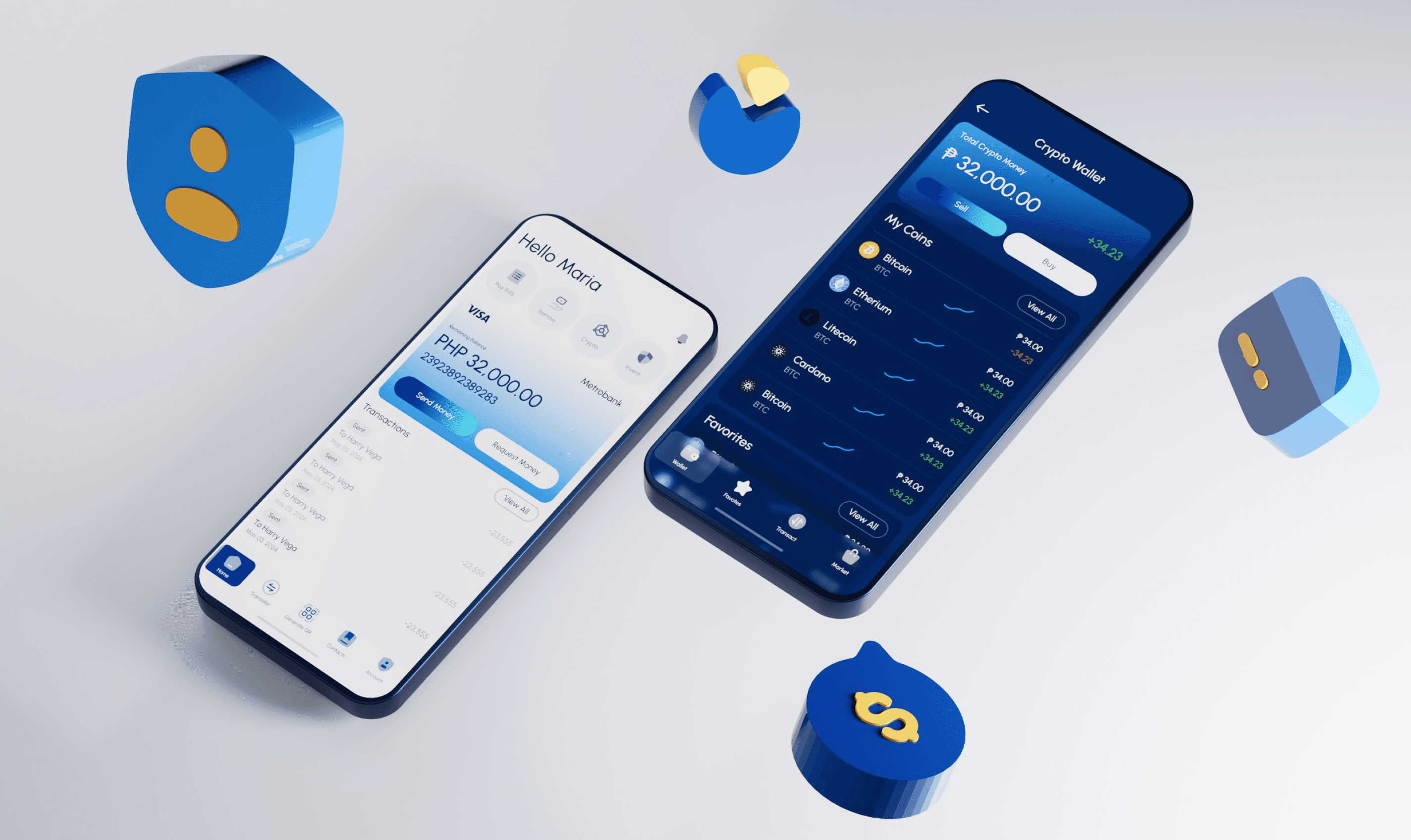
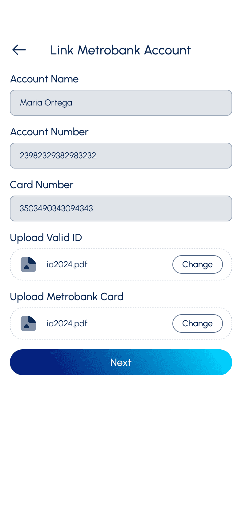
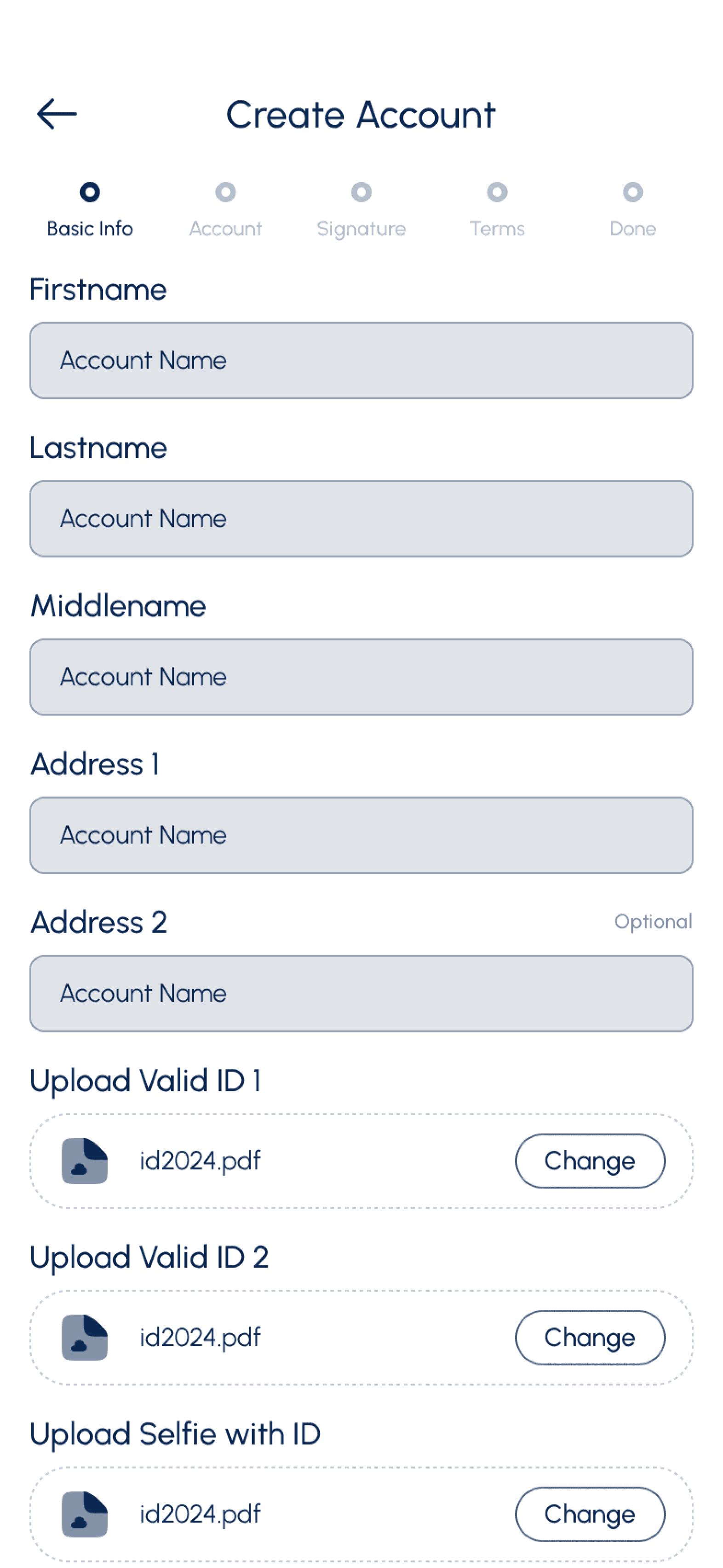
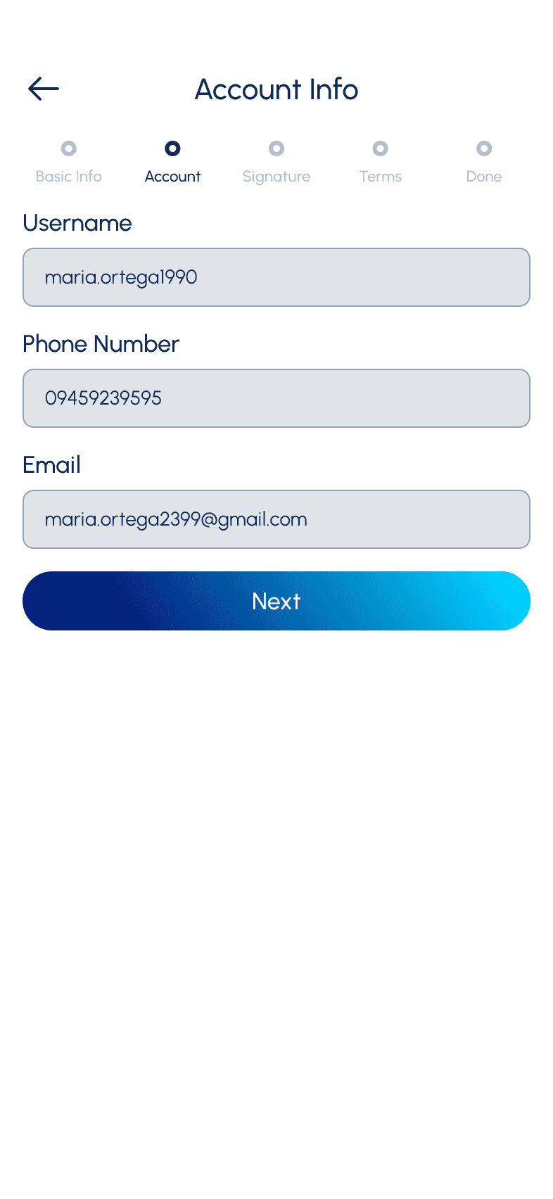
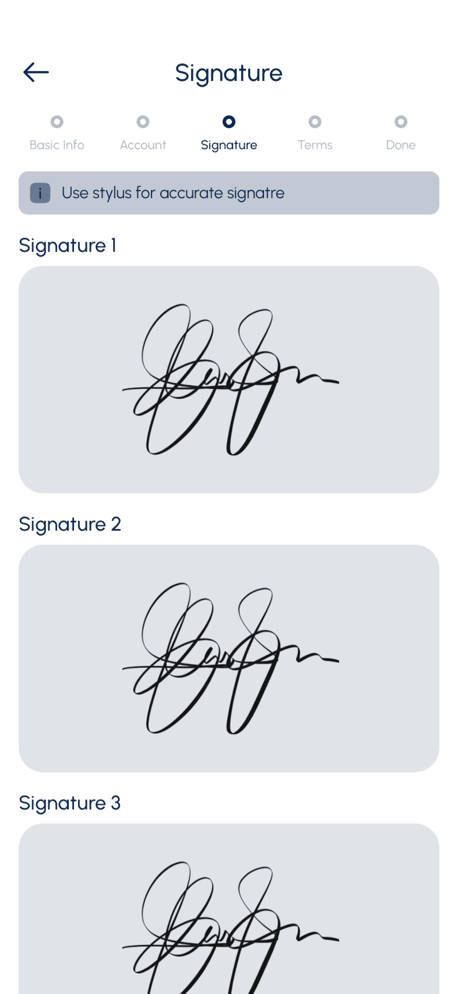
List of Hi-Fi wireframes.
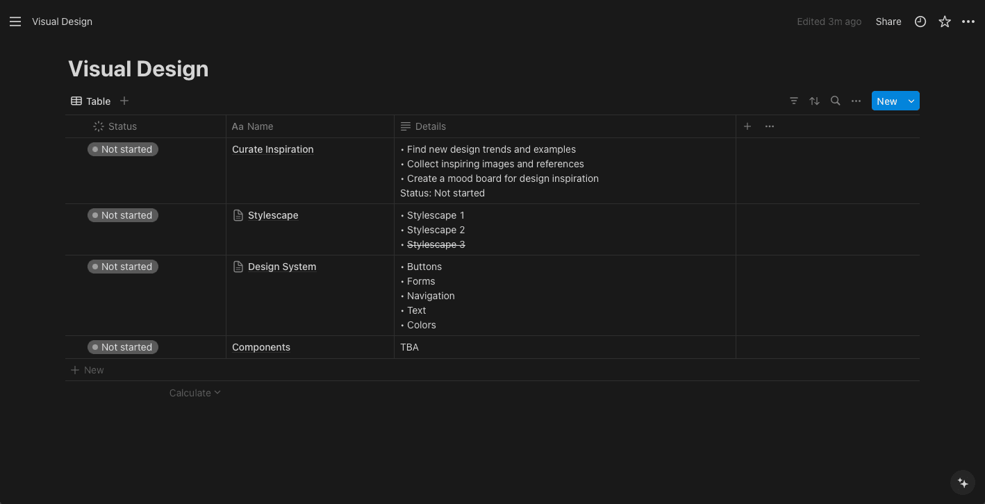
Visual Design
Planning
During planning, we list all the possible components and UI elements that will be part of the design system. This helps the team understand which elements will be repeated frequently and which ones need variants.
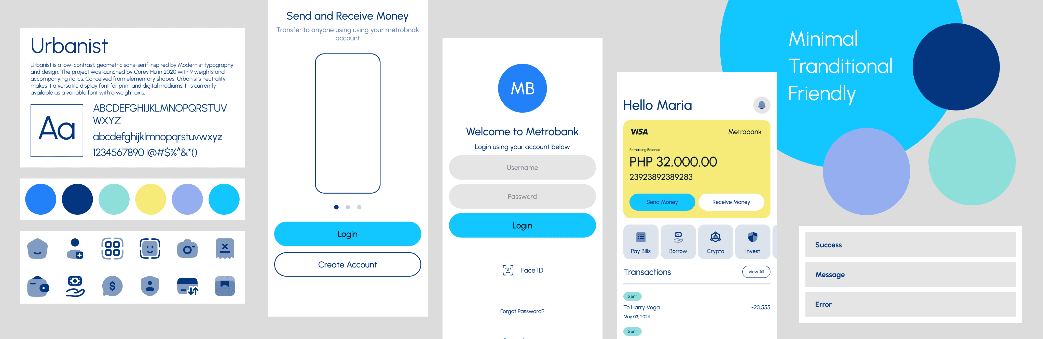
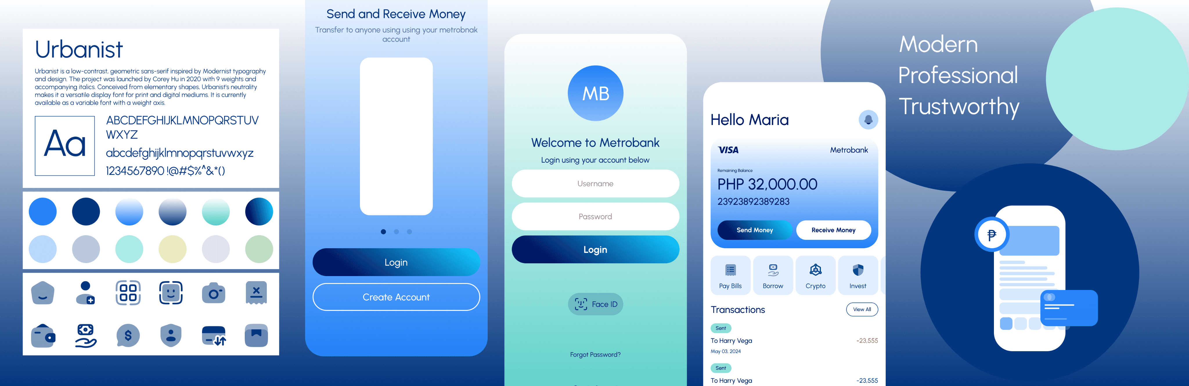
Stylescape
To provide stakeholders with an overview of options for the visual direction and look and feel of the product. The final visual design of the UI will be based on client preferences.
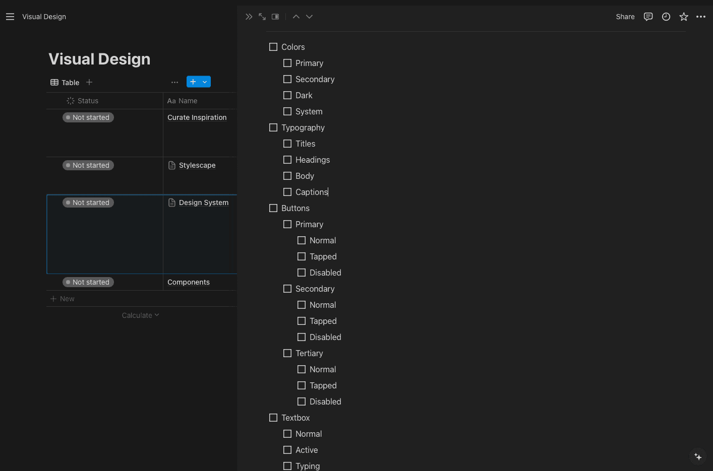
Design System
The very basic elements of design system are colors, typeface and the essential UI elements such button, text and basic states. Eventually this will expand as the project progress by adding other elements based on the UI. Not having this when doing Hi-Fi Prototype would make it very time consuming to convert the wireframes into visual design.
Urbanist
Urbanist is a low-contrast, geometric sans-serif inspired by Modernist typography and design. The project was launched by Corey Hu in 2020 with 9 weights and accompanying italics. Conceived from elementary shapes, Urbanist's neutrality makes it a versatile display font for print and digital mediums. It is currently available as a variable font with a weight axis.
Extra Light
Medium
Thin
SemiBold
Light
Bold
Regular
ExtraBold
Title
Heading One
Heading Two
Heading Three
Body Main
Body Small
Caption One
Caption Two
Filled

Clicked State
Ghost
Clicked State
Disabled
Placeholder
Typeing something
Success
Error
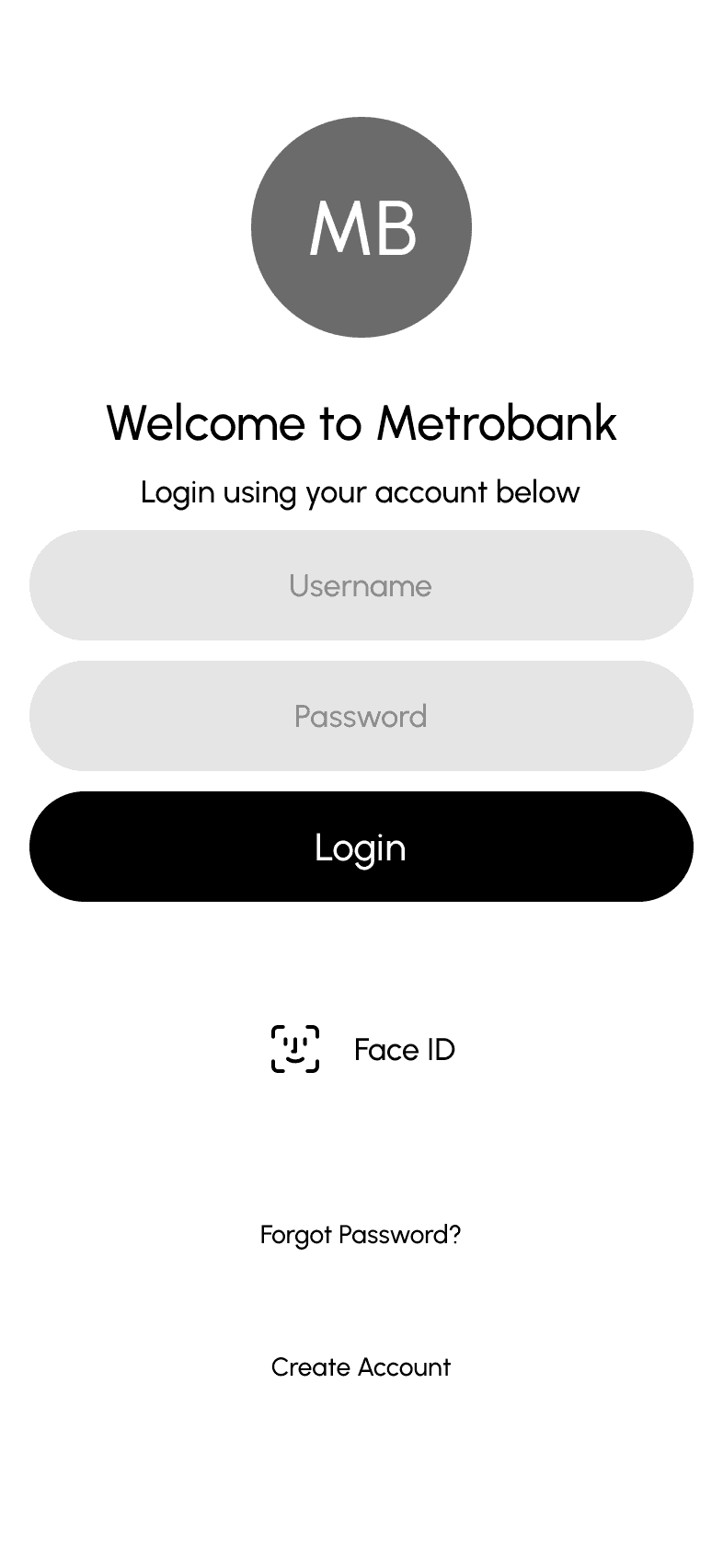
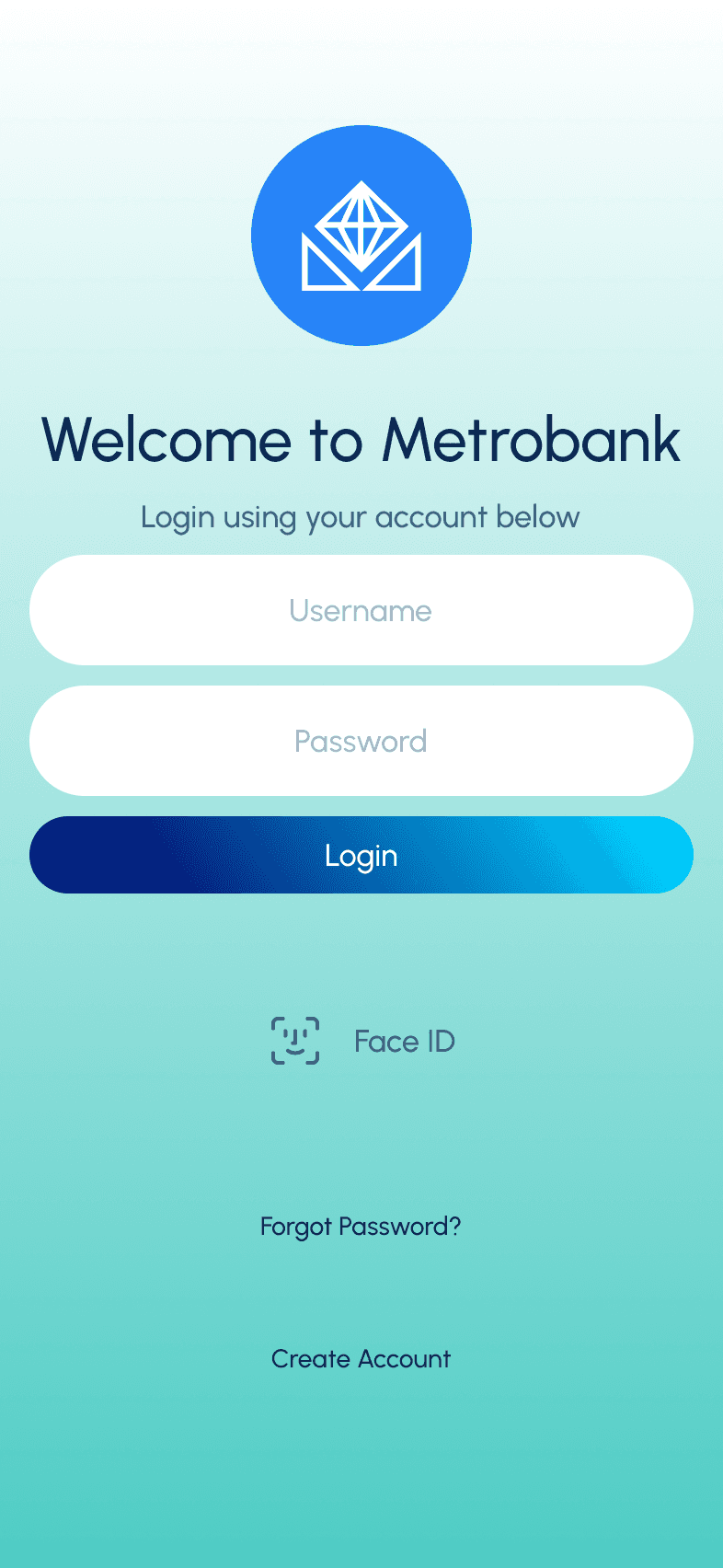
Login
Username
Password
Forgot Password?
Login
No account yet? Create one
Result

Feel free to connect for inquiries
Thank You!
"I appreciate the time you've spent to reach this point!"
Portfolio Crafted By
Ramil Derogongun
made with 😘 using
Figma x Framer
© 2024